Personal Project: Edges
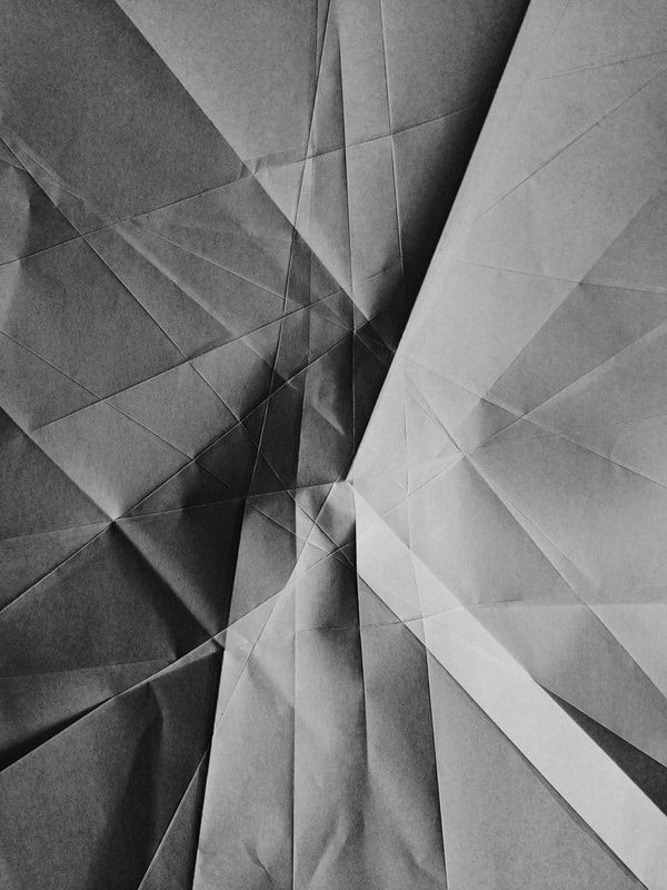
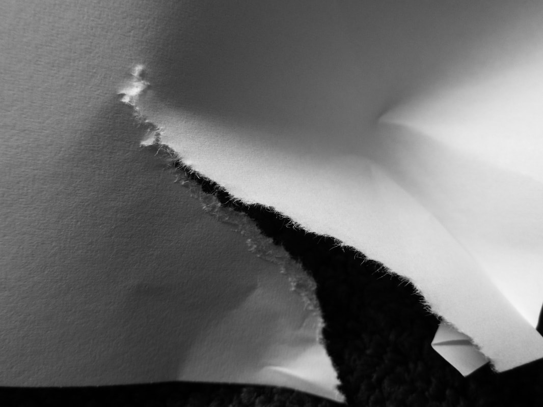
Paper abstractions
Check out the resources on this web page:
https://www.photopedagogy.com/abstract-forms.html
https://www.photopedagogy.com/abstract-forms.html
- Compare and contrast the photographs of paper made by Jerry Reed and Francis Bruguière. What are their similarities and differences? Choose one image by each artist to illustrate your ideas. Explain how you would attempt to re-make one or both of these images? What materials, equipment and tools would you need?
- Choose one other artist's photographs of paper on this page to research. Make a Gallery of images and write your thoughts about one image in particular. Why is it effective?
- Using a simple backdrop, phone torch, Bridge camera, make a series of 20 photographs of a single piece of plain paper. You may manipulate the piece of paper in any way you like but think carefully about how you can create increasingly complex compositions. Try one or two simple folds first.
- Create a Gallery of your images on your Edges page and evaluate them. Choose the most and least successful pictures you have made an explain your selection.

There was a time when we thought it was just enough to photograph objects at eye level but then we began to move around, to climb mountains, to soar in airplanes and drop to the bottom of the sea. An we took our camera with us everywhere, recording whatever we saw.
-- Osip Brik, 1926
|
|
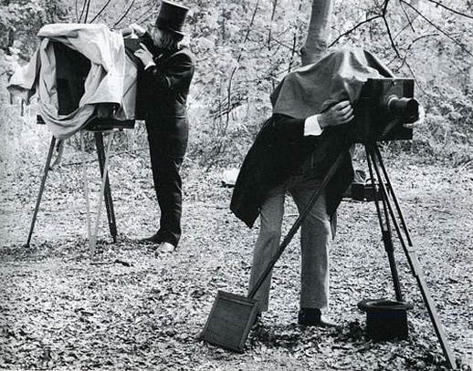
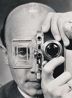
The image on the left shows two nineteenth century photographers using their large format plate cameras. The image on the right shows a modern photographer from the first half of the twentieth century using a small, handheld Leica film rangefinder camera. How might the invention of these smaller, lighter cameras have changed the behaviour of photographers? What new kinds of photographs could they take?
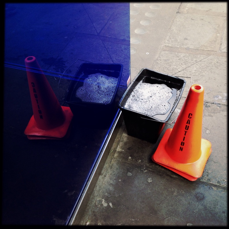
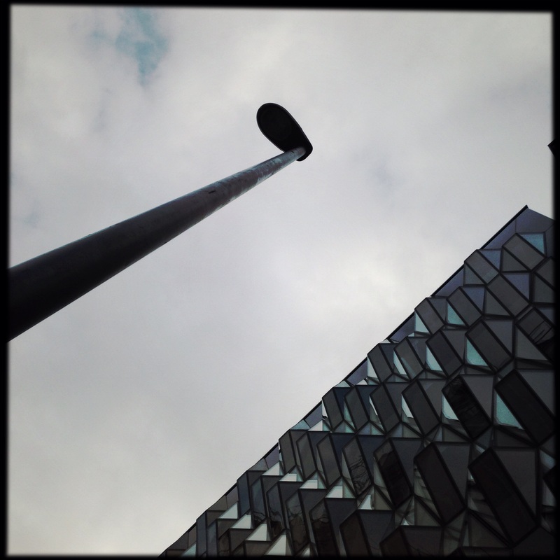
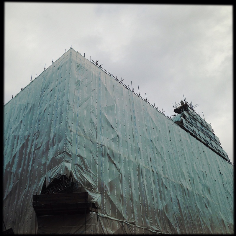
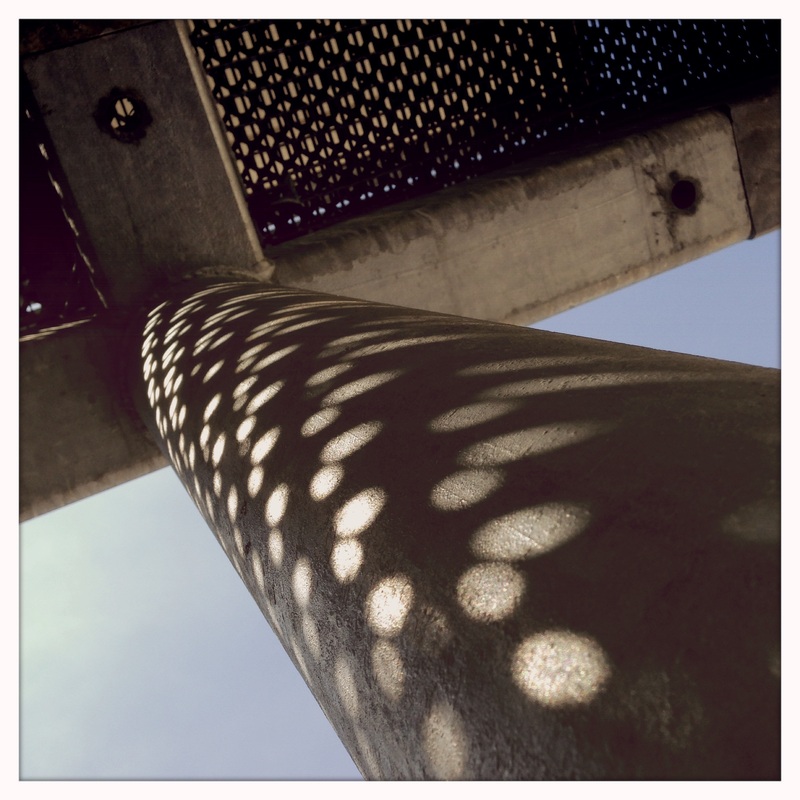
Looking up. Looking down.
Take a look at the photographs in this slideshow. The photographs were taken in the first half of the 20th century by artists who were excited about the ways in which photography transformed the world around them, creating a 'New Vision'. The world is three dimensional and always changing as we move through it. It doesn't have edges. We can adjust our view of something by moving our eyes, changing our position, shifting our heads etc. But when you take a photograph, the world becomes still and flat. A photograph places an edge around the thing photographed. Things in the background can appear to be on the same level as things in the foreground.
These photographs are taken from unusual perspectives, looking up and down at the world at a dramatic angle. The photographer has carefully considered his/her point of view. The resulting pictures seem quite strange. We are not used to seeing the world in this way. There are lots of different types of edges in these photographs.
These photographs are taken from unusual perspectives, looking up and down at the world at a dramatic angle. The photographer has carefully considered his/her point of view. The resulting pictures seem quite strange. We are not used to seeing the world in this way. There are lots of different types of edges in these photographs.
Here is an example of some ways in which you might develop your ideas about 'Edges' in photography both in and outside school. We will be doing some experiments together but it's really important for you to continue to experiment individually in order to to consolidate your understanding, practice using your camera and experiment with new approaches. When you photograph between lessons in school and at home, make sure that you document your work on the 'Edges' page of your website.
Beginning to research the theme 'Edges'
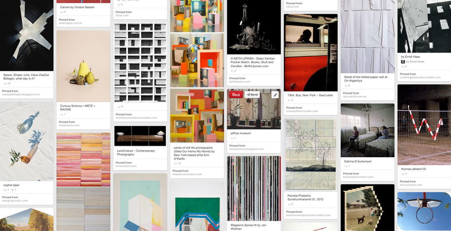
I have created a Pinterest board of links to images that relate to the theme of 'Edges'. Click the image below to see it.
Set #1: School Edges
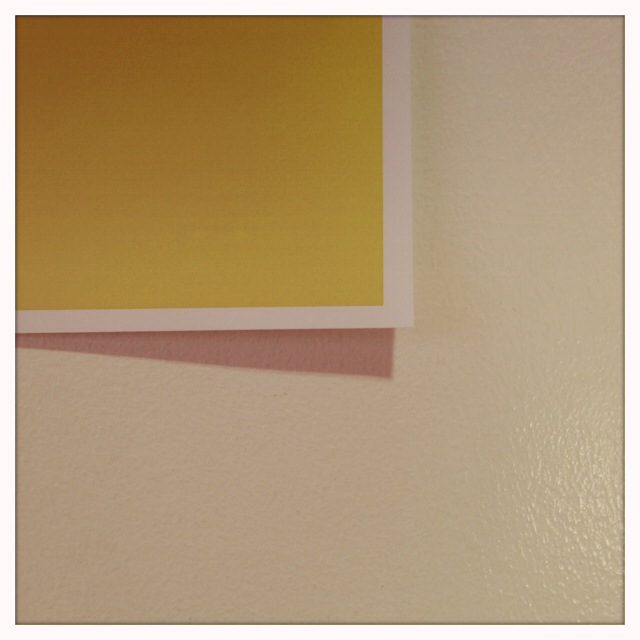

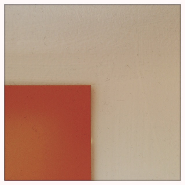


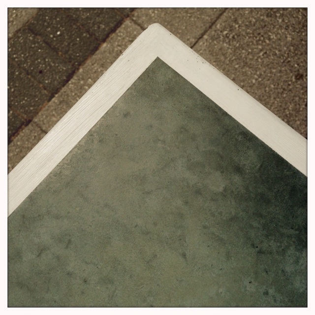

WWWI noticed that there were lots of signs and displays in school so I photographed the edge of the sign against the wall or display board. I tried to keep the edges parallel with the edge of the photo. The pictures are quite simple but effective because you can't always see what the object is so the idea of edges is very clear. My other idea was to photograph the edges of the school building. It was a bright sunny day so there were strong shadows. This created a strong contrast between the object in the foreground and the background. I tried to create compositions featuring triangular shapes. I think this worked really well.
|
EBISome of the signs pictures are a little out of focus because I was too close to the surface and my iPhone's camera wasn't able to find the focus. The filter and lens I used in Hipstamatic created a slightly desaturated look to the images. I think this worked better in the light than inside where the photos are sometimes too grainy and the colours not strong enough.
|
Set #2: Art Room Edges
My second set of images was taken in one of the art rooms. I was interested in the chance arrangement of objects on tables, shelves and windows. Students' work, equipment and resources were competing for attention so I photographed things that grabbed my attention from quite a close angle to emphasise their abstract qualities. I wanted the pictures to be slightly mysterious. I used my iPhone and the Hipstamatic app again. I like the square format and the desaturated tones created by the combination of the Ray Mark II lens and Blanko film.
|
|


|
|
What next?
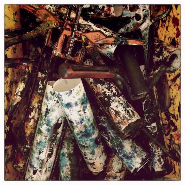
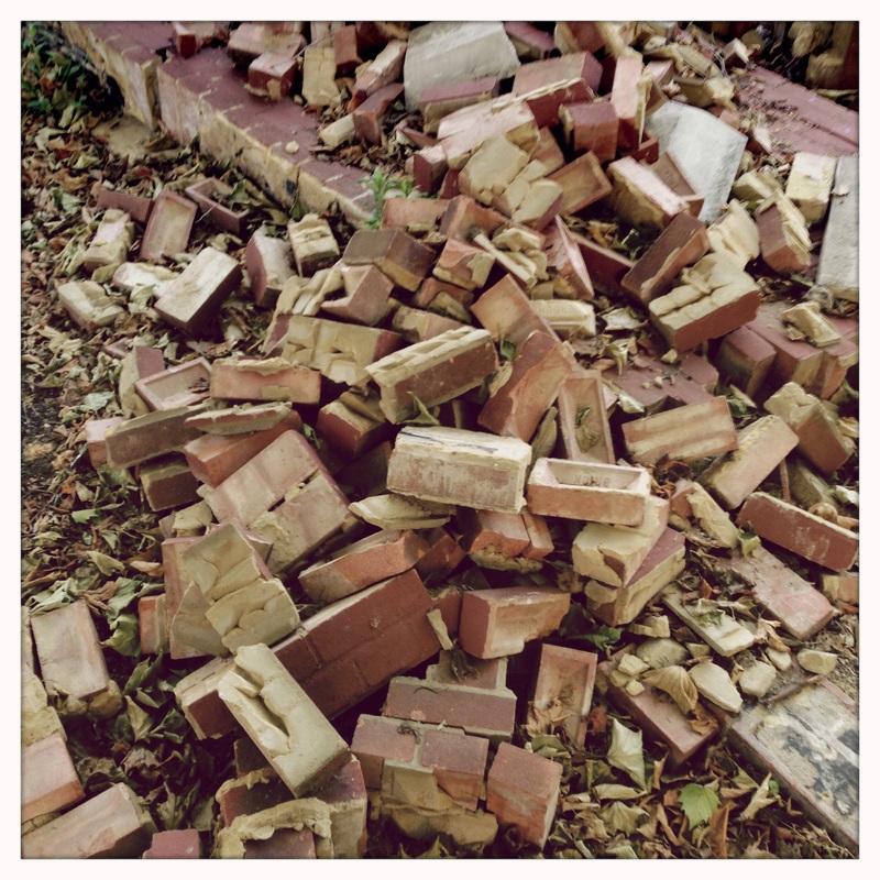
I am going to look for more images like this - chance arrangements of objects - and photograph them to reveal their edges E.g. pencil shavings, paint left in sinks, food waste etc.
Research: Keith Arnatt
These images are entitled 'Pictures from a rubbish tip'. Arnatt has photographed items in the tip fairly close up so that we can't really tell much about the context. In a review of an exhibition at The Photographers' Gallery, Sophie Arkett writes:
"The series 'Pictures from a Rubbish Tip' (1988-89) is a body of work devoted to images of decomposing food, some in their plastic wrappers, some naked; all of which have a delicate, almost transcendental, beauty. Arnatt uses the medium of photography with the sensibility of a painter. Colour is important to him, and this comes out in one image depicting a strip of bacon and a piece of eggshell against a backdrop of plastic partially obscuring a pink floral pattern behind. But it is not the inventory of items depicted which makes this picture arresting, it is, rather, a certain undefined quality, perhaps the way the light falls on the objects, or the way the plastic conceals and mutes the things behind, in this instance, making a composition of rubbish appear as if painted in the manner of a Flemish painting. Perhaps it is because the effect of making what could be described as dirty plastic appear as fine gauze or muslin, or the care with which these items of rubbish are composed: each is attributed with a value by its relation to the others. What ever it is, Arnatt has transformed the unwanted into something, at least pictorially, highly desirable." |
I have highlighted in bold the phrases in this review that I think are important in relation to Arnatt's photographs:
|
Set #3: Edgeland
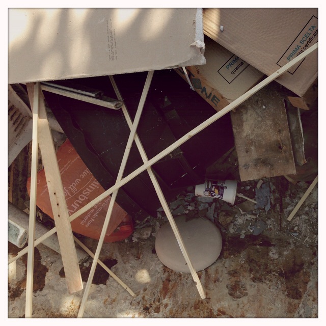
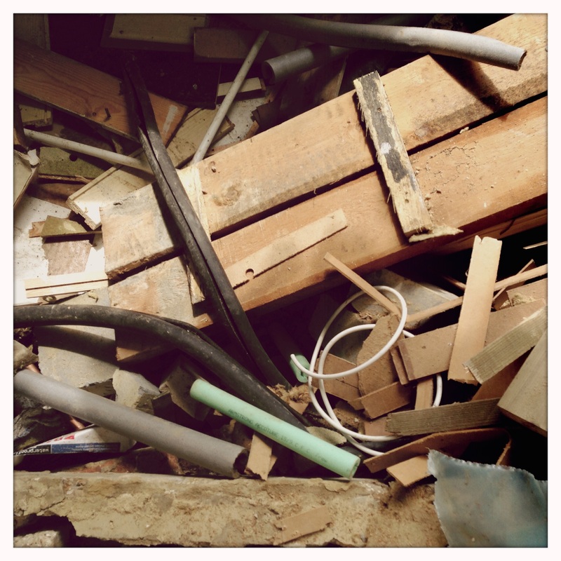


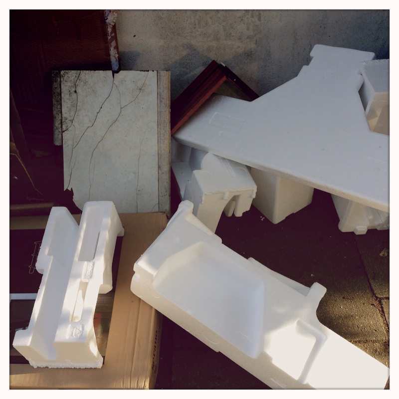
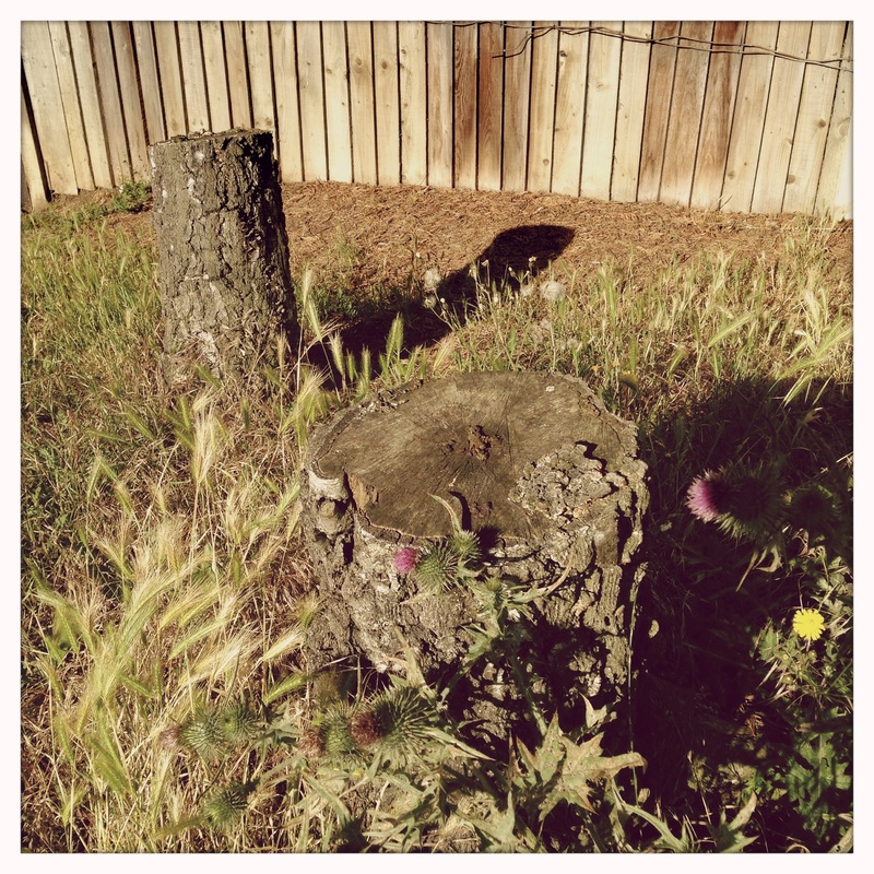
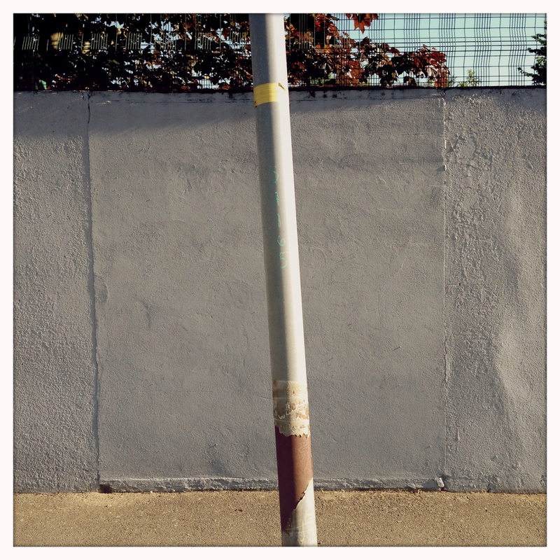
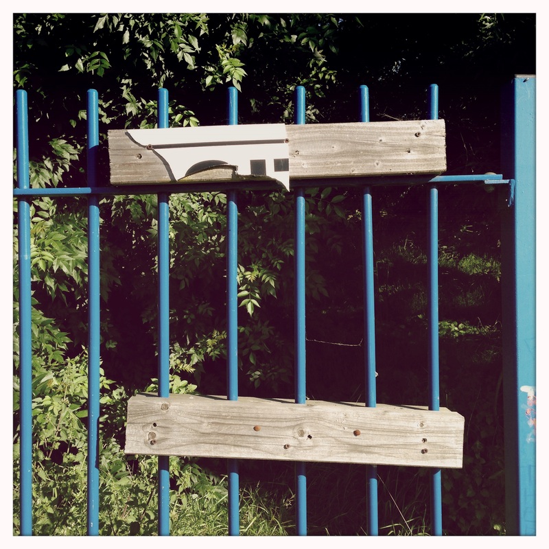
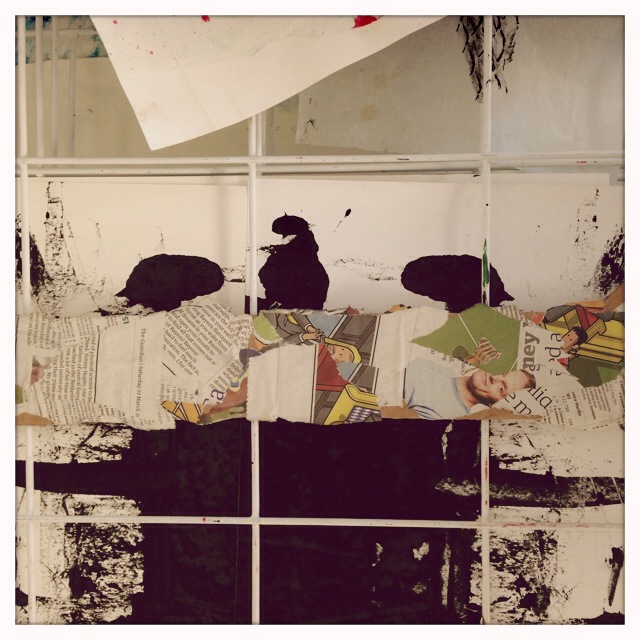
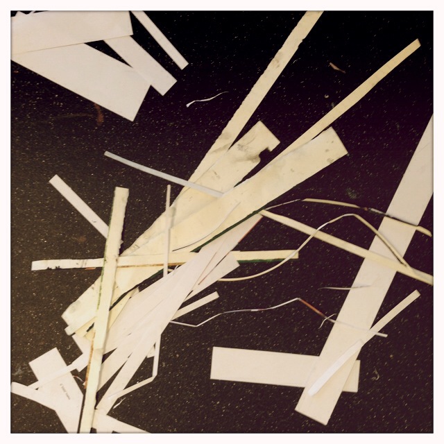
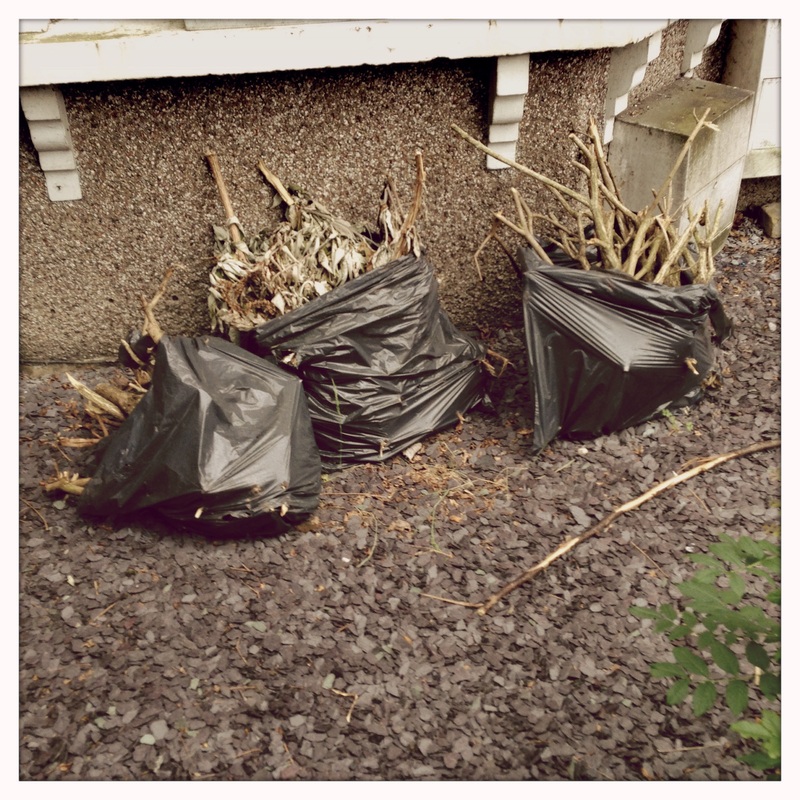
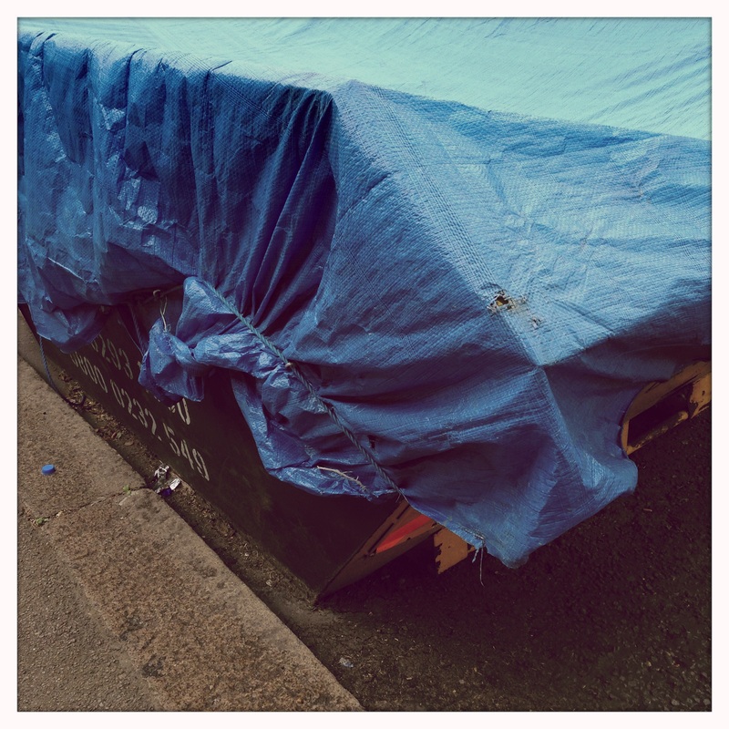
These images were mostly made close to my home. I tried to look really hard at the ordinary or overlooked features of the local landscape. I was interested in anything broken or abandoned. I looked in skips at the chance arrangement of objects in them, on the roadside, along fences, against walls. This idea of edges is less about the shapes of particular objects and more related to the edges of the places where we live, the Edgelands, and what ends up there.
First Final Piece
I really like enjoyed taking this last set of pictures and the idea of the Edgeland so decided to edit the set down to three images, creating a triptych. Triptychs are often religious works of art and even when artists like Francis Bacon have used this format for displaying non religious works of art, there is always the association with the idea of famous old alter pieces.

Evaluation
WWWI'm really pleased with these three images. I like the different viewpoints and camera angles. For the first one I had to crouch down to position the plastic lid stuck in the fence as if it could be a setting sun. I raised my iPhone above head height for the picture of the damaged road sign against the sky. The splattered paint and can involved looking down. In each case I felt as if I had noticed something beautiful in the ordinary or unremarkable. This arrangement of the images with the relatively empty composition of the sign in the centre and the mostly green and much more textured images of grass either side works well I think. Each of the images is about different ways of thinking about and seeing edges in the world around us. They were also all taken within a hundred yards of each other.
|
EBIAlthough the square format and particular settings of the Hipstamatic app on my iPhone have produced interesting results, I think I need to experiment now with a different format, other equipment, techniques and processes.
I intend to research the work of the artists named in the question, beginning with Laszlo Moholy-Nagy and Jed Devine. |
Idea: Diptychs
A diptych is made with two related images. I was walking to school this morning looking for edges. As I passed the bus stop I noticed that a can of paint had been spilled on the floor. It had dried in a really interesting shape and the strong morning light cast geometric shadows across it. I liked the combination of the shape and the shadows. Very soon afterwards a van pulled up at the traffic lights. It had a tinted window which was pulled half way down. The light shining through the window cast a half coloured shadow on the floor. I quickly took a picture of it.
These images are related for several reasons:
I am planning to continue to look for pairs of images like this as I develop my response to the theme of Edges.
These images are related for several reasons:
- they were taken within a minute or two of one another in a similar location
- both are taken from a standing position looking down at the floor
- both images focus on the shapes of shadows and their edges caused by strong sunlight
I am planning to continue to look for pairs of images like this as I develop my response to the theme of Edges.
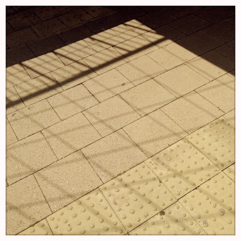
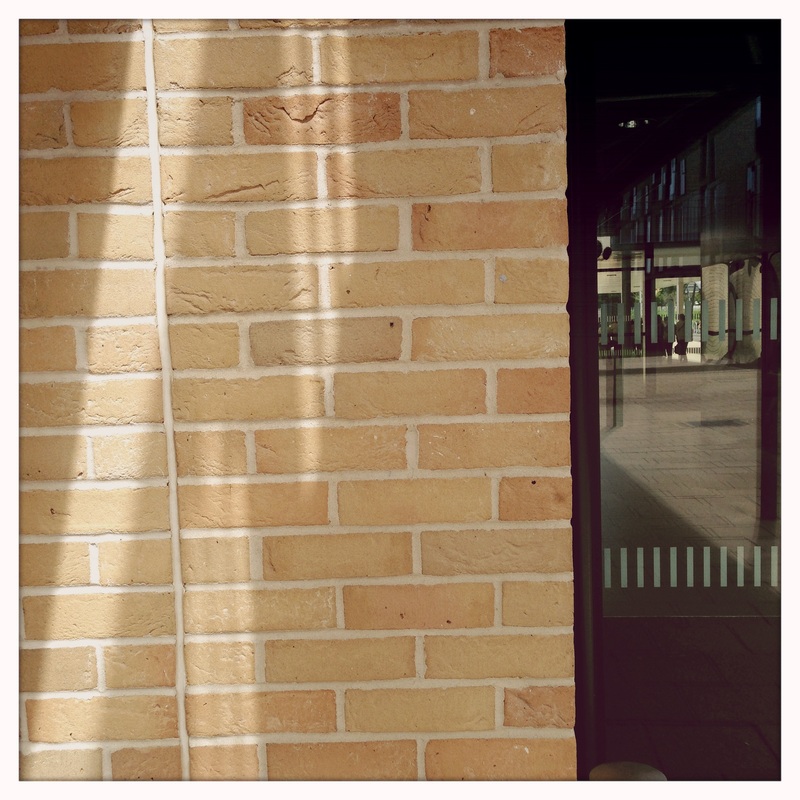
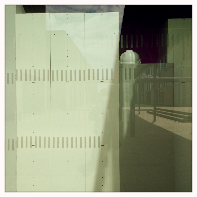
Set #3: Concrete, Metal & Glass
These images were shot in school on a bright, sunny afternoon. I was attracted to the contrast between the shadows and reflections and the hard, sharp edged surfaces.
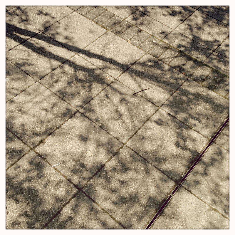
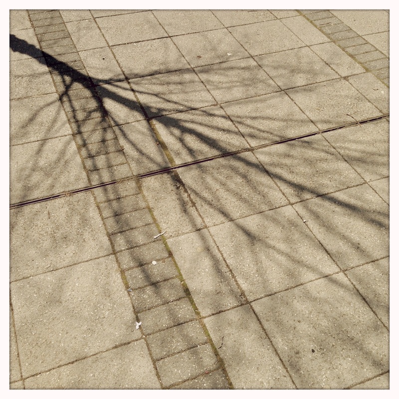
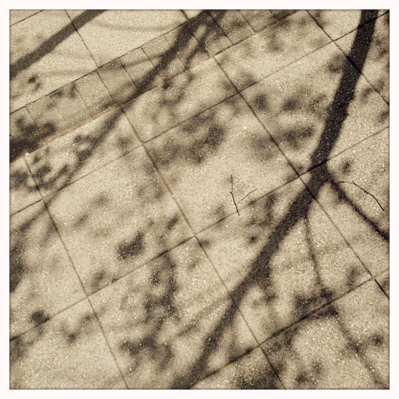

Tree Shadow Diptych


Abandoned Objects Diptych

Another set of Edges
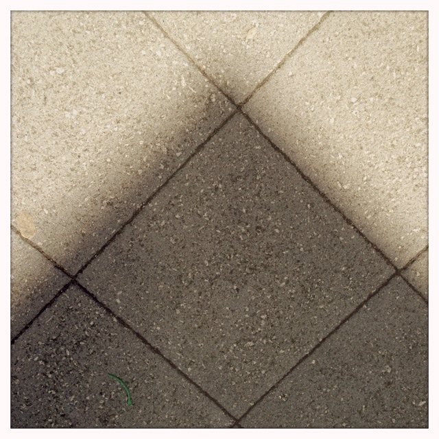
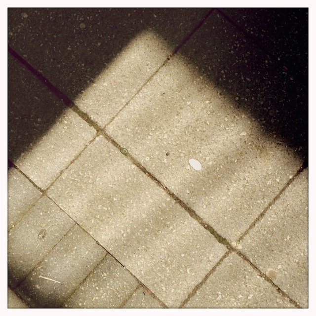
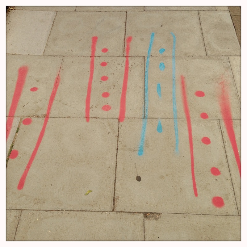
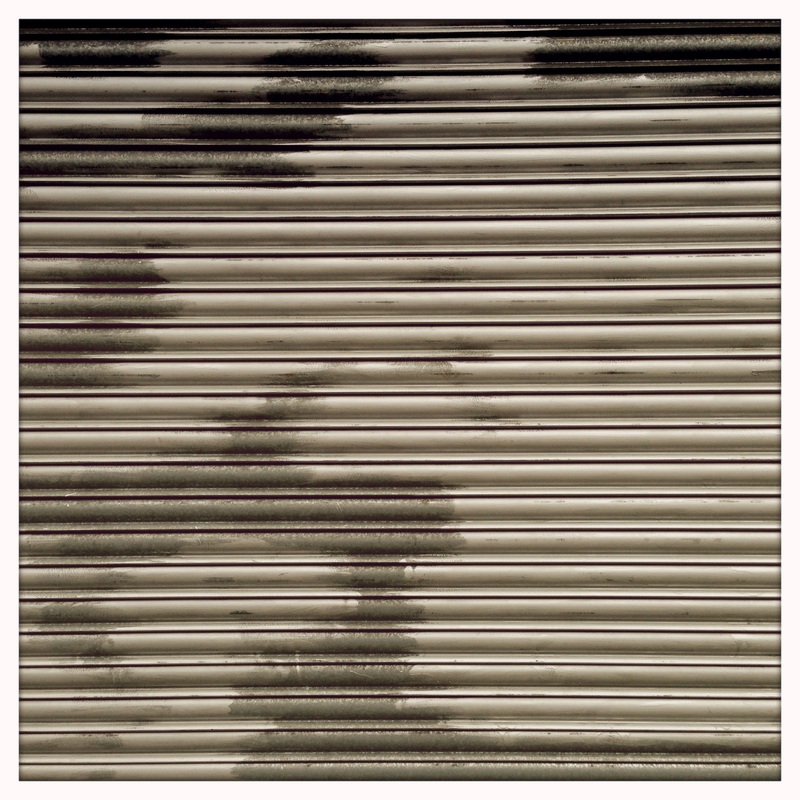
These images were take on a walk near where I live. I tried to notice things that had been left on the street, patterns, repetition and the quality of the light.


Research: Laszlo Moholy-Nagy
|
|
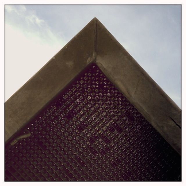
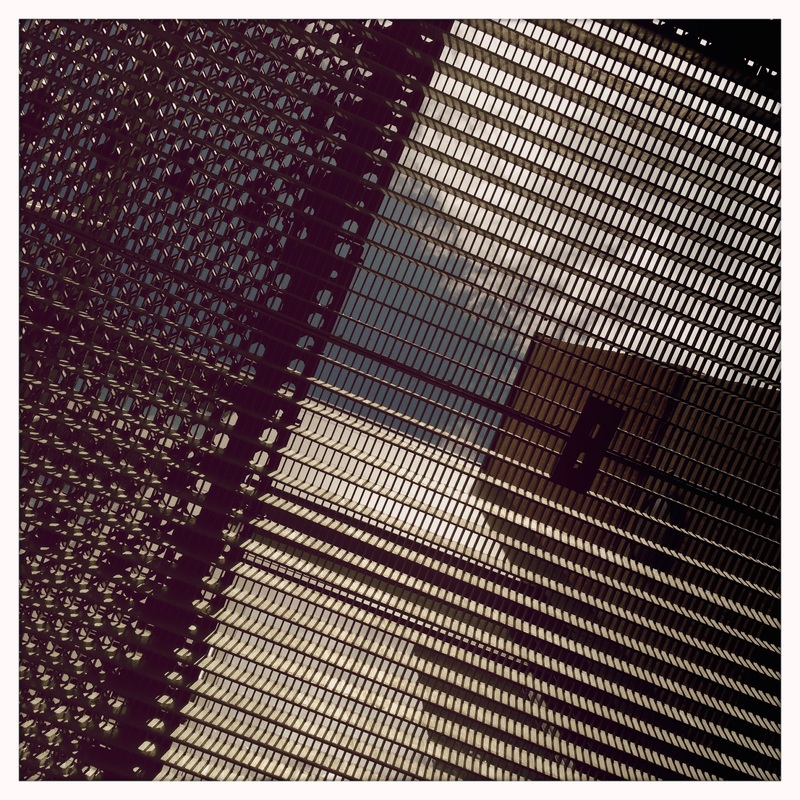
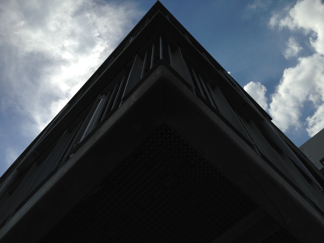
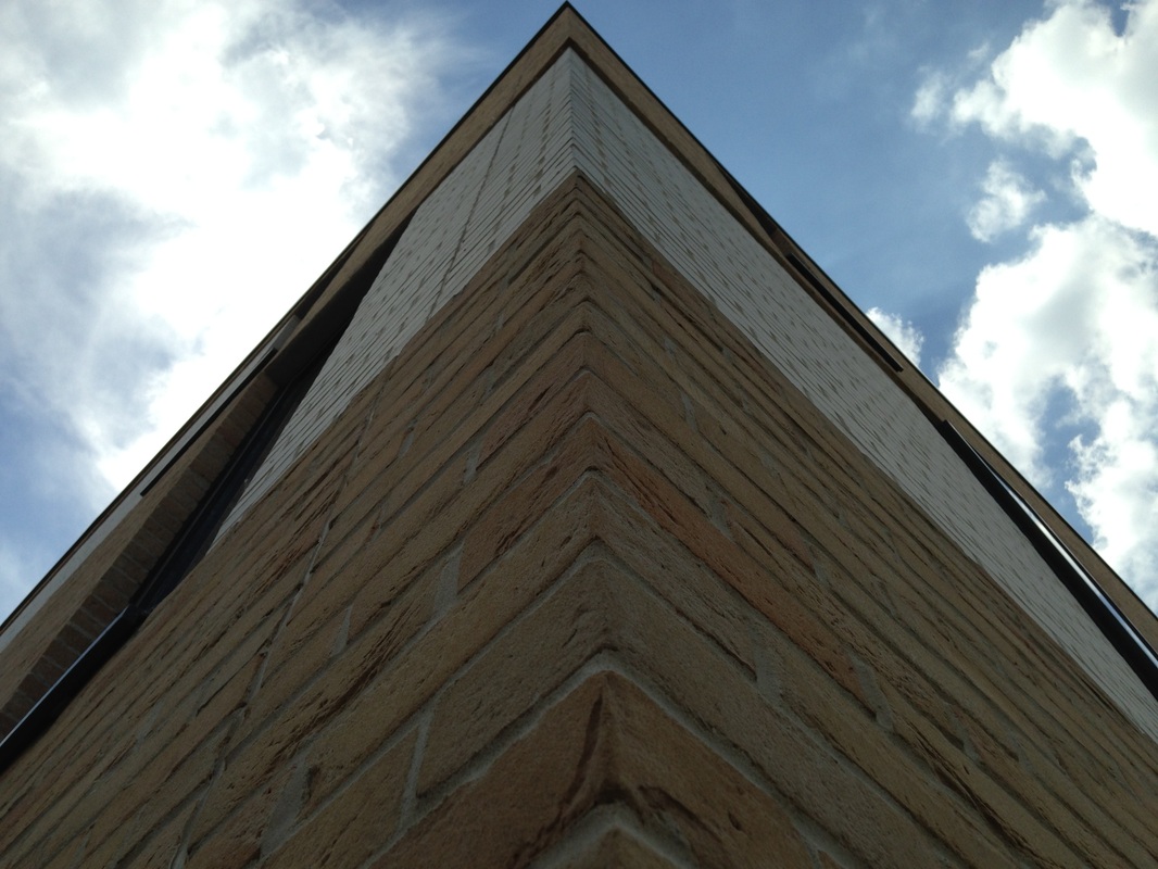
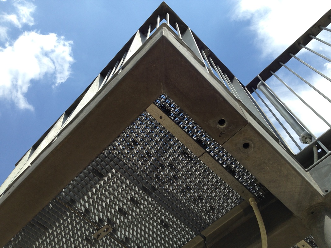
Looking upMoholy-Nagy liked photographing buildings close-up from the ground. He chose modern buildings with sharp, clearly defined edges and simple shapes. Sometimes he included a figure to give a sense of scale. When you stand close to a tall structure and look up the perspective is exaggerated. The resulting images can be quite abstract.
Idea:Take a series of images looking up at different types of buildings. Arrange in a grid for comparison.
|
|
|
Looking downAs well as looking up, Moholy-Nagy took a lot of photographs from a high vantage point looking down at his subject. Again, this distorts our sense of space so that we concentrate on the abstract or formal qualities of the image - line, light, pattern, shape and form etc.
Idea:Take a series of pictures looking down at the floor. Concentrate on patterns, shadows and the edges of pavements and roads.
|
|
|
Moholy-Nagy carried out lots of experiments in the darkroom. He made a series of photograms in which the objects are almost unrecognisable. I like the combination of small and large objects and the way that some objects appear translucent. The final picture in this slideshow looks like a double exposure.
Idea:Create a series of abstract photograms in the darkroom using scraps of materials found in school. Experiment with creating double exposures of dogital scans of these images.
|
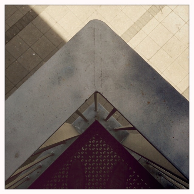
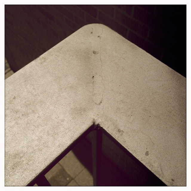
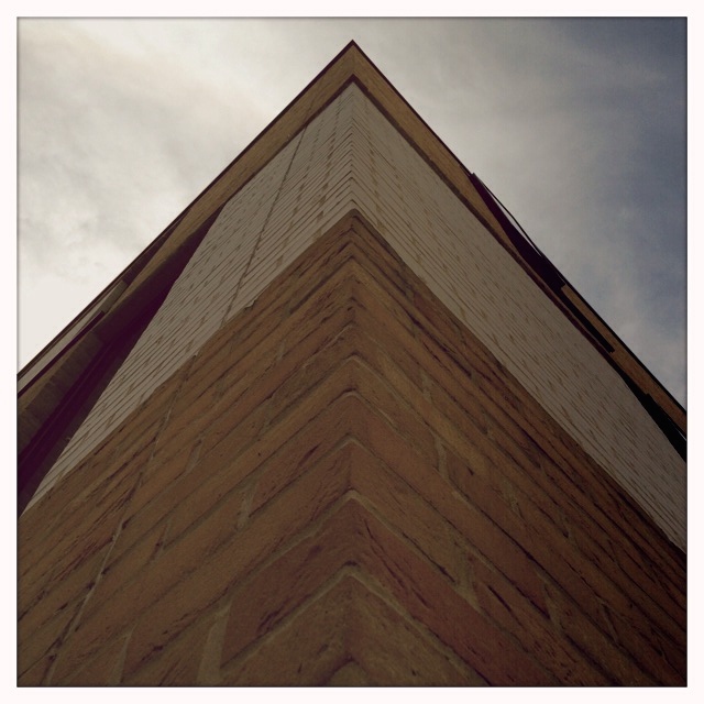
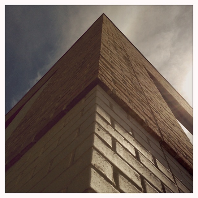
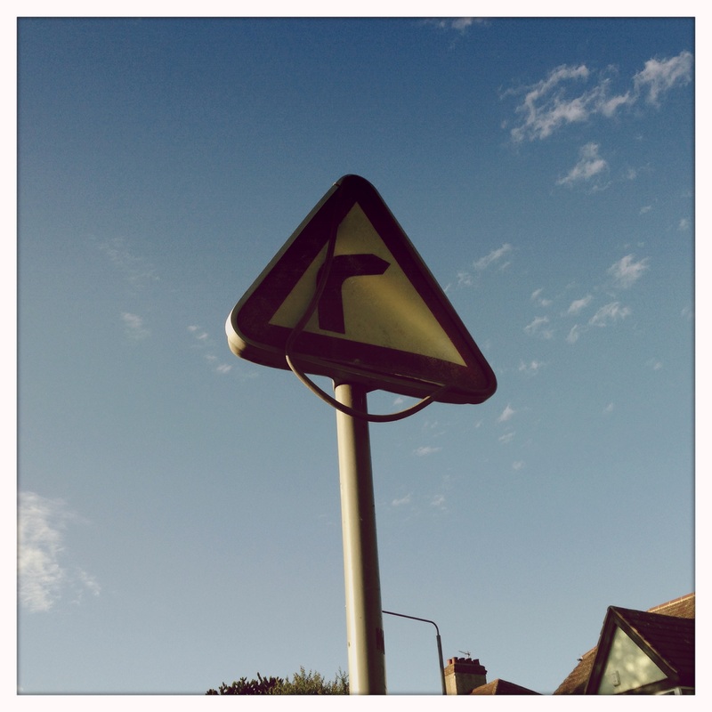
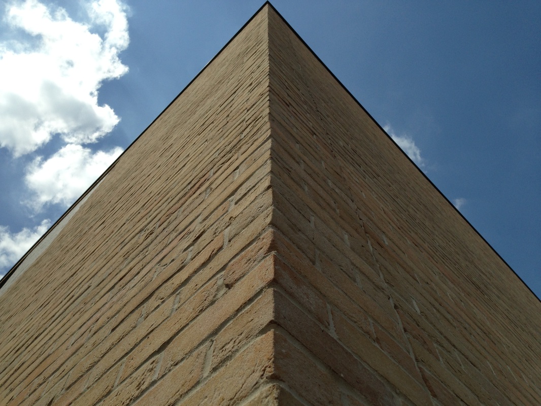
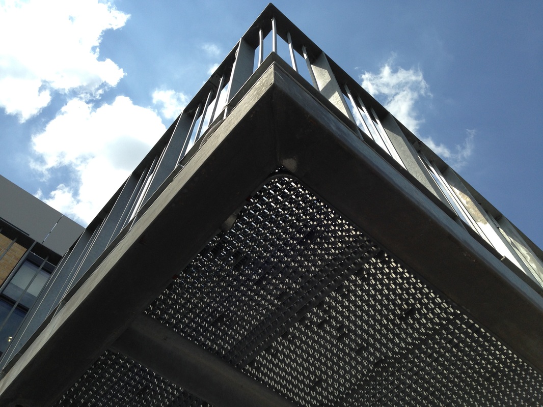
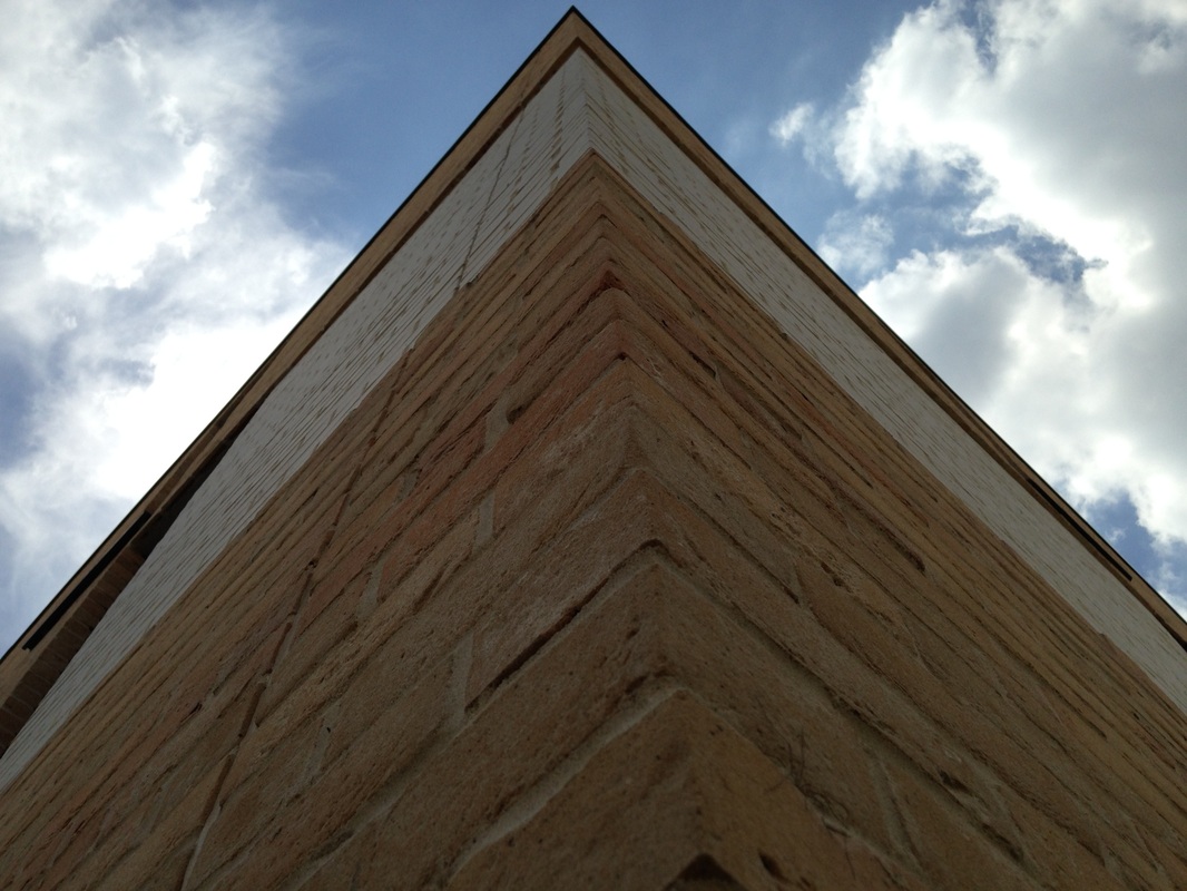
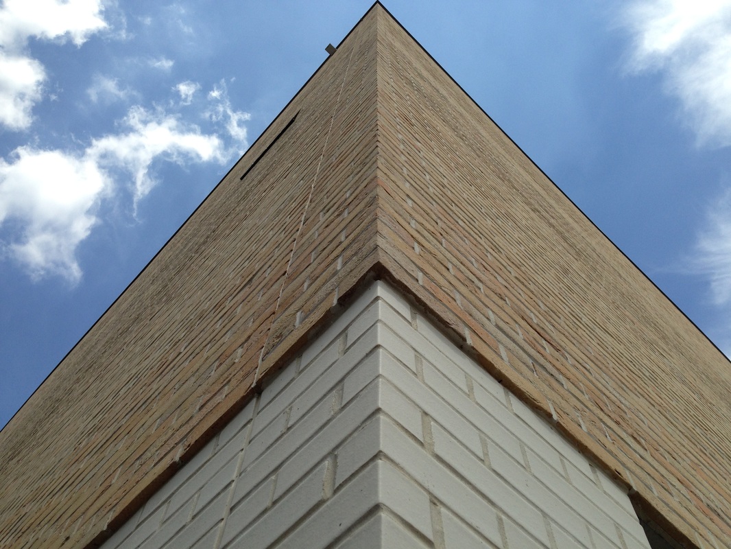
Looking Up
Inspired by Moholy-Nagy's pictures of buildings I took these images of the school, standing close to the building and looking straight up. I tried to make the composition the same in each one, placing the apex of the triangle in the centre of the image.
|
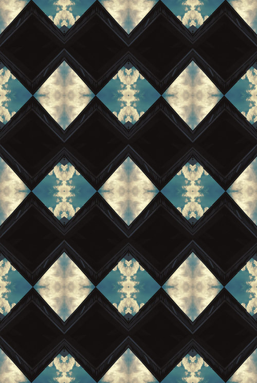
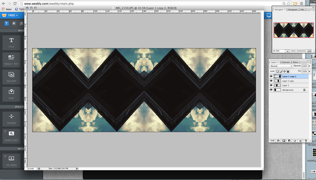
I then used an editing app on my phone to apply a more dramatic filter to the image. When I imported it to my computer I realised that I had saved it upside down accidentally. However, this made the image more abstract and mysterious and the edges even more stark. I decided to play around with the picture in Photoshop, repeating an flipping it to see what kinds of patterns I could create. The result of these experiments is displayed below. I'm going to try a similar process with another image to see how these work out as a series. 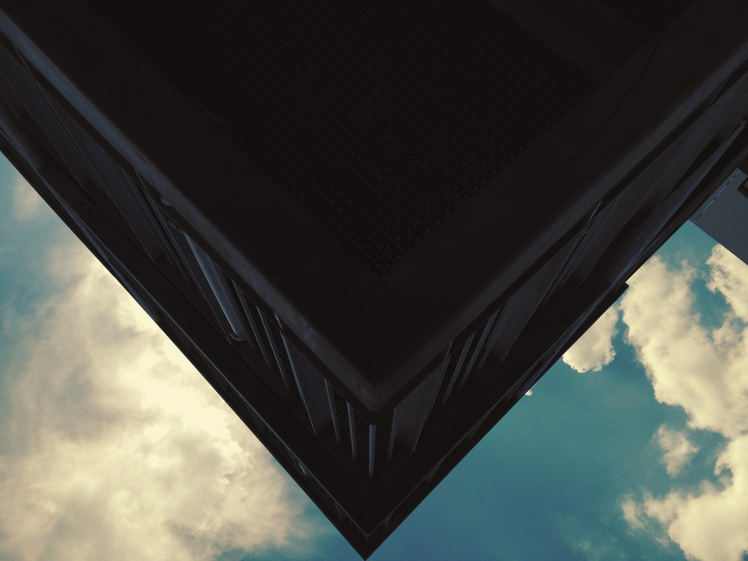
|
|
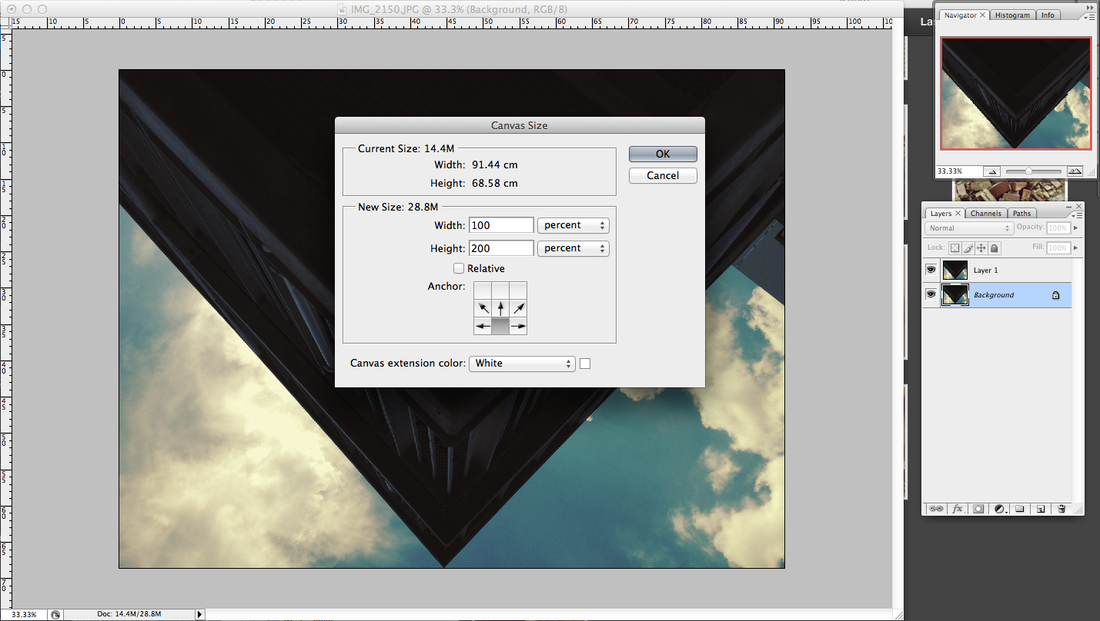
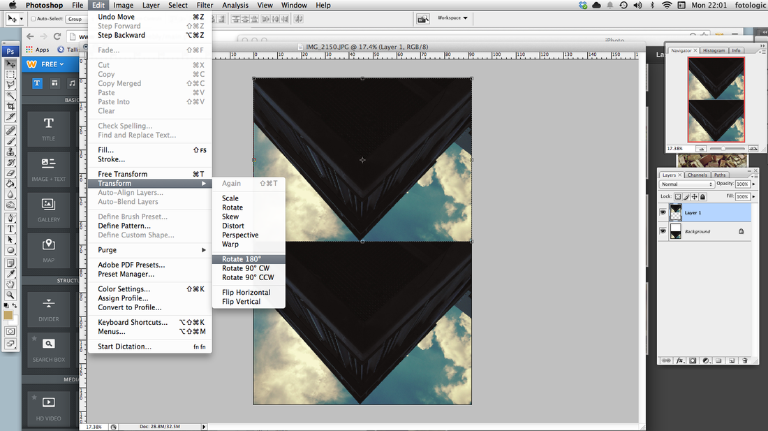
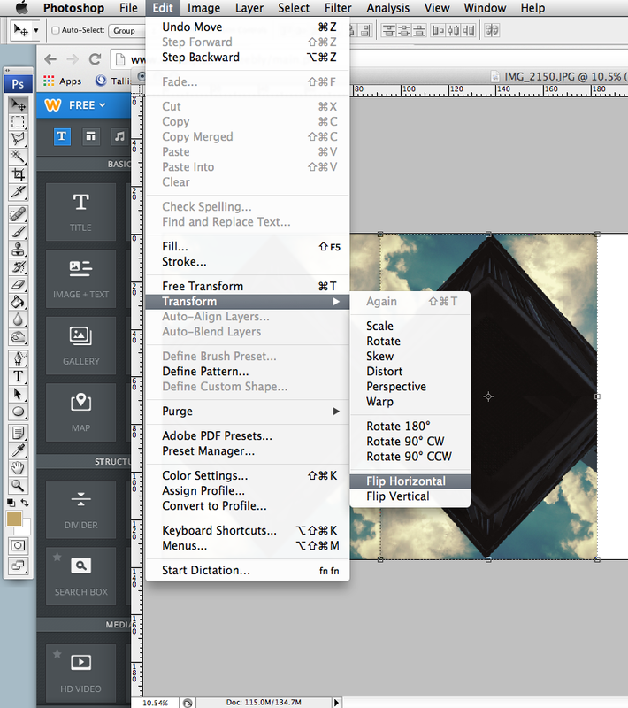
The Process
- Open image in Photoshop
- Duplicate layer (cmd j)
- Image > Canvas Size: increase height by 200% (make sure you click the down arrow to keep the background layer at the bottom)
- Move second image layer up the canvas
- Edit > Transform > Rotate 180 degrees
NOTE: You may need to decrease the size of the image as you go if it gets too big. Image > Image Size > Change width in pixels (approx. 3000 px) |
|
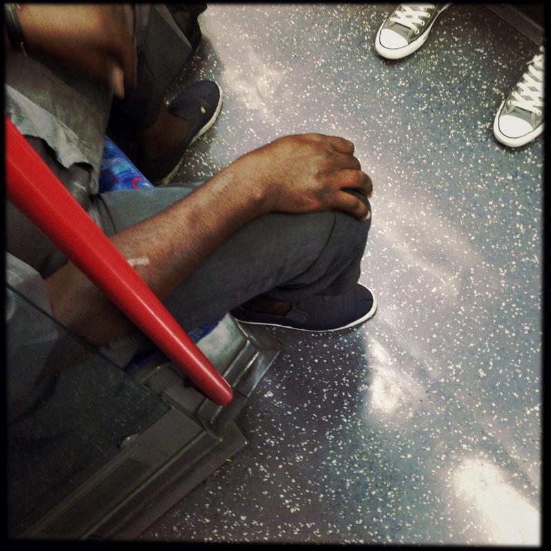
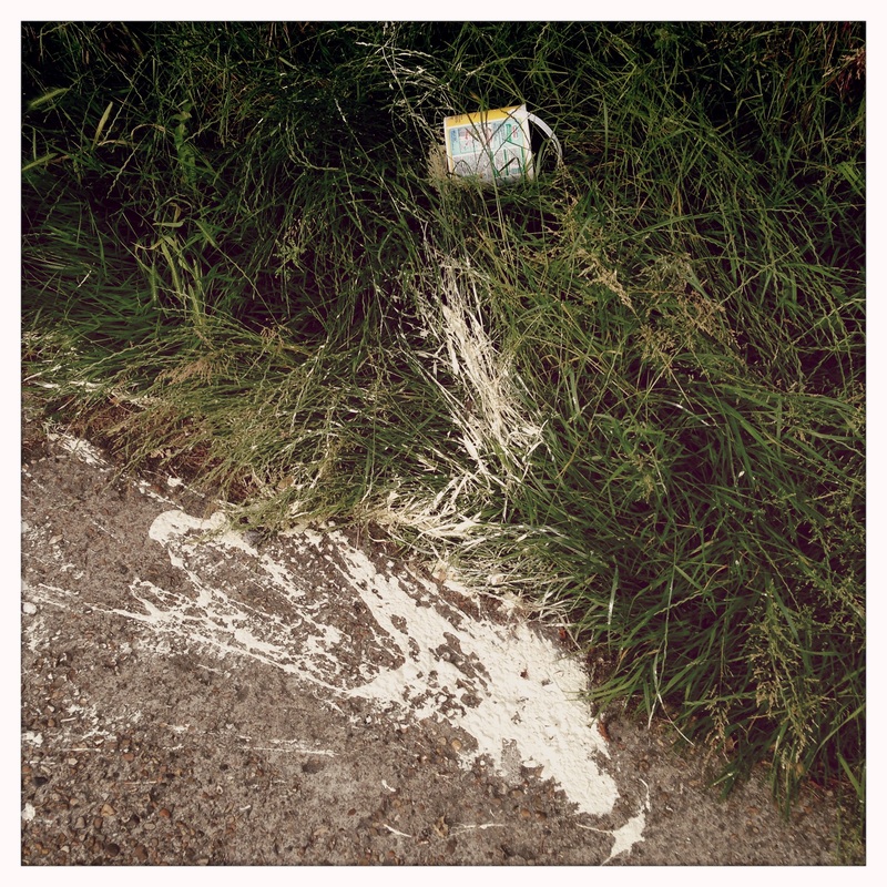
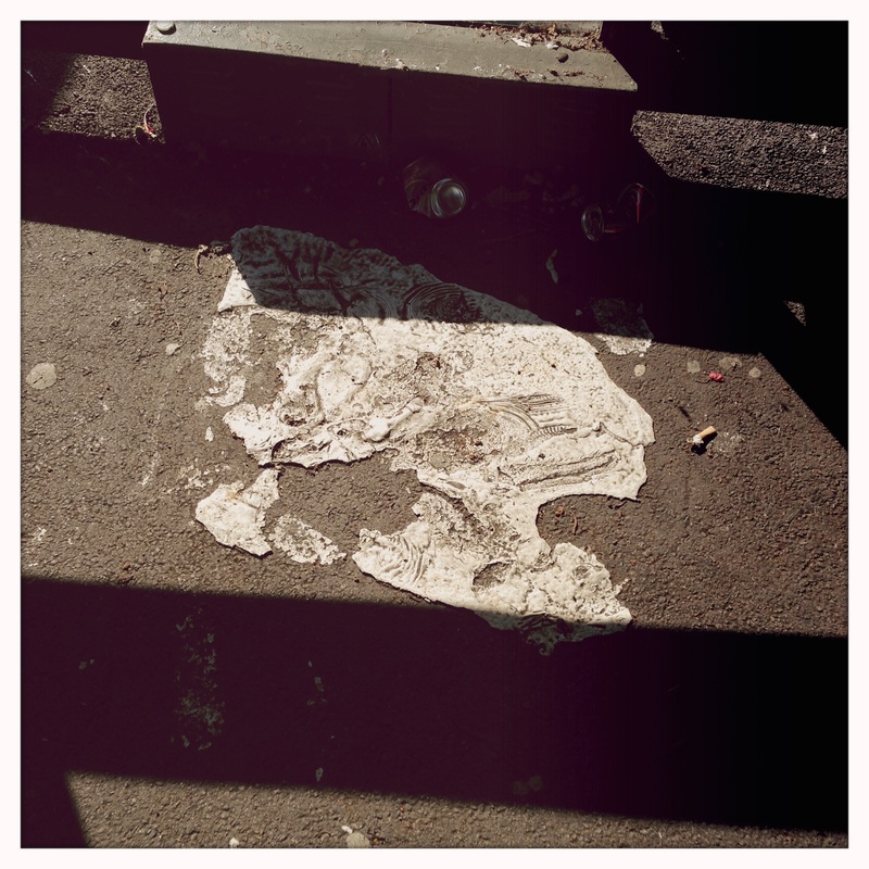
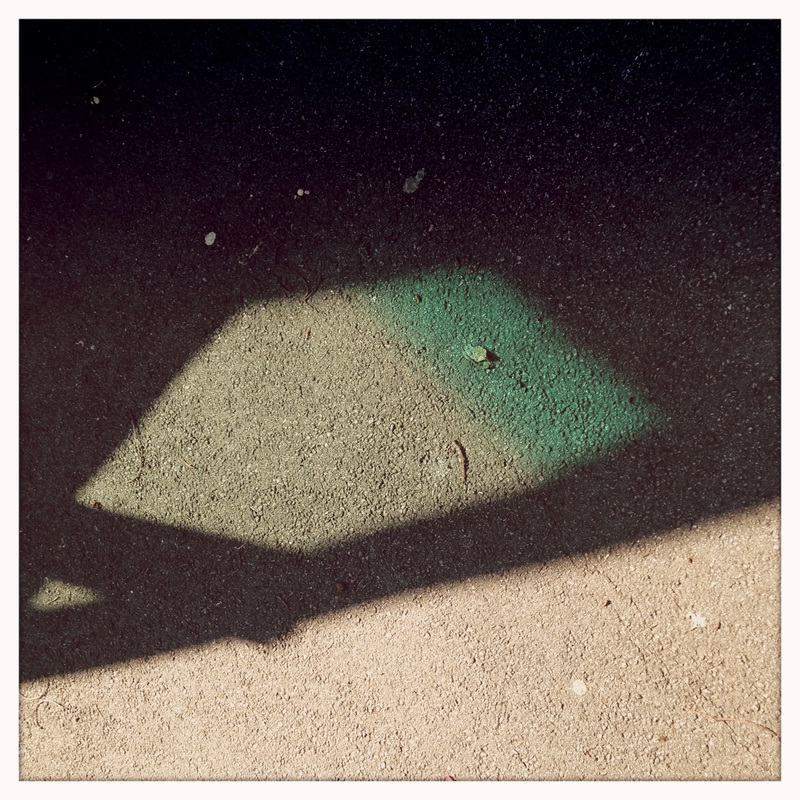
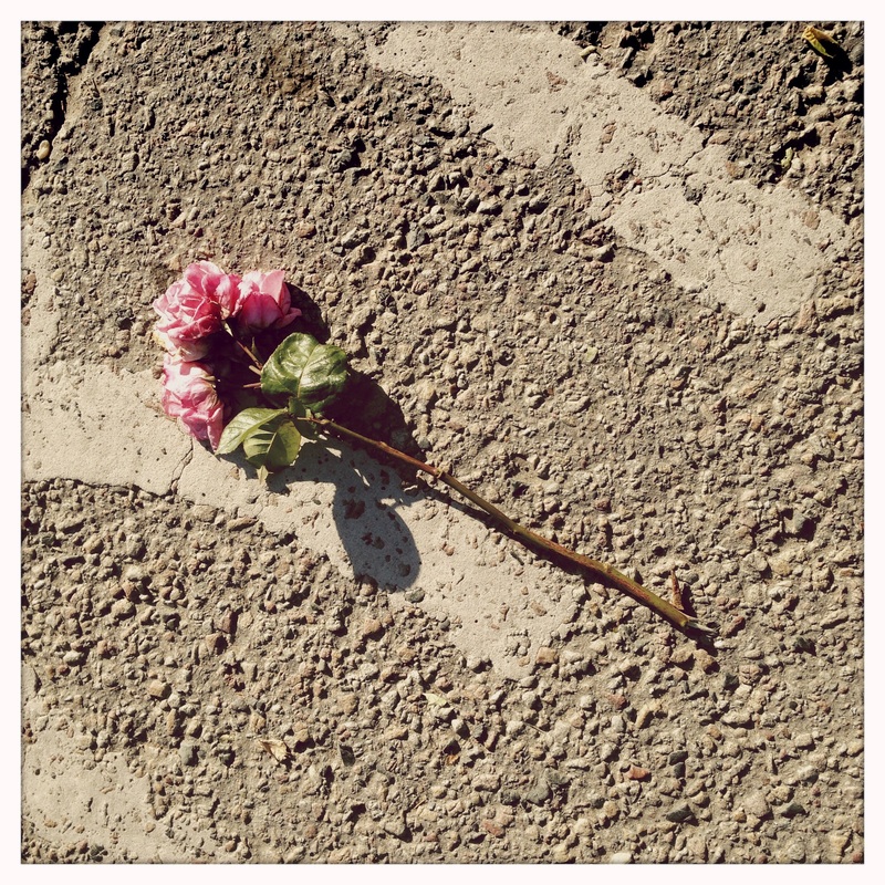
Looking Down
Each day I walk the same way to and from work. I always have my iPhone with me and, occasionally, I notice something unusual lying in the gutter. The following pictures document these objects. They were taken with the standard camera app on the phone and have not been edited.
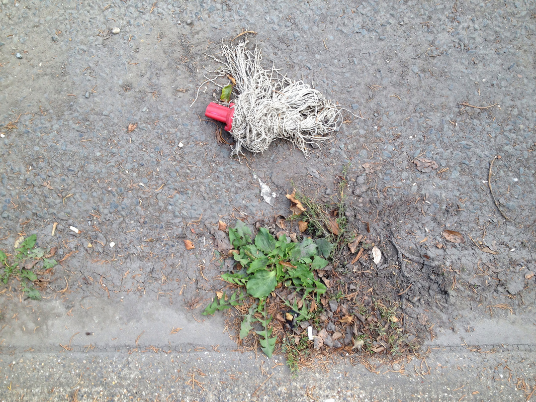

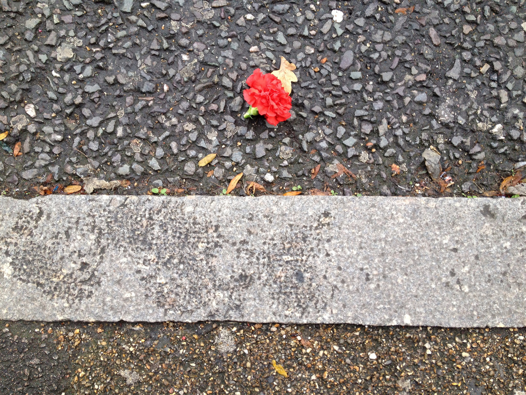

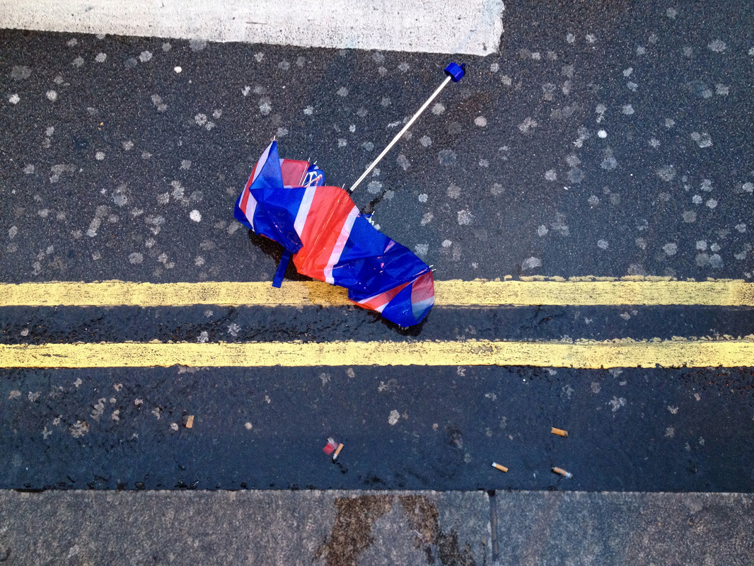


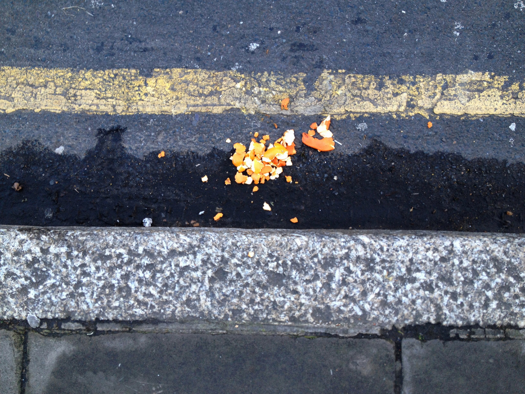

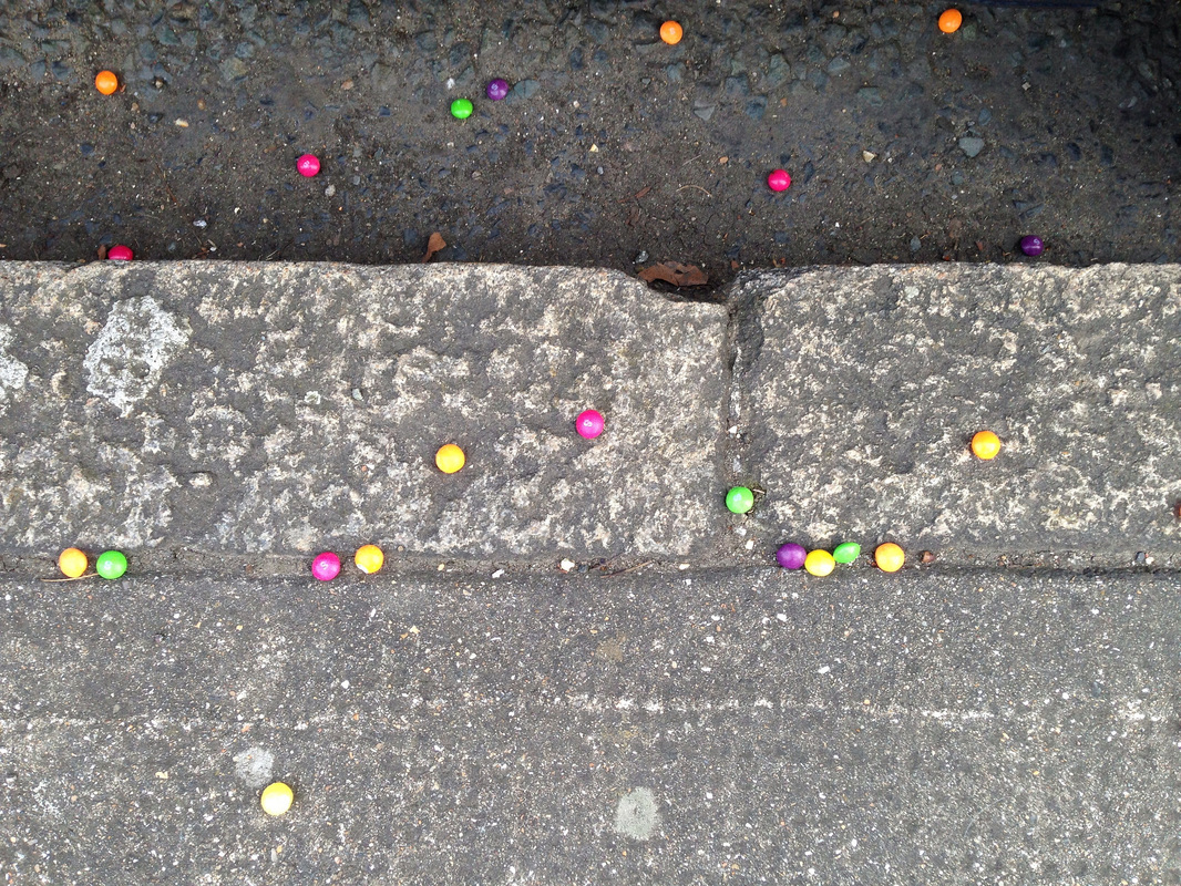
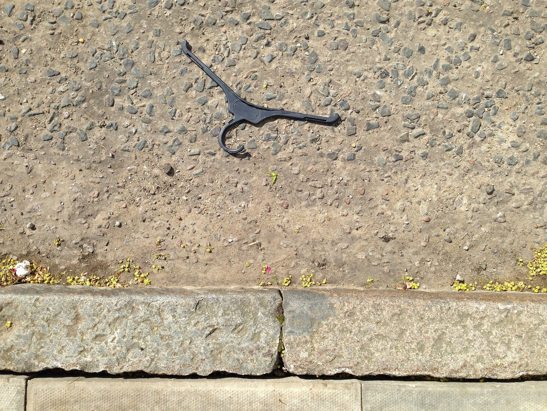
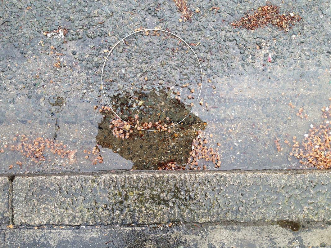

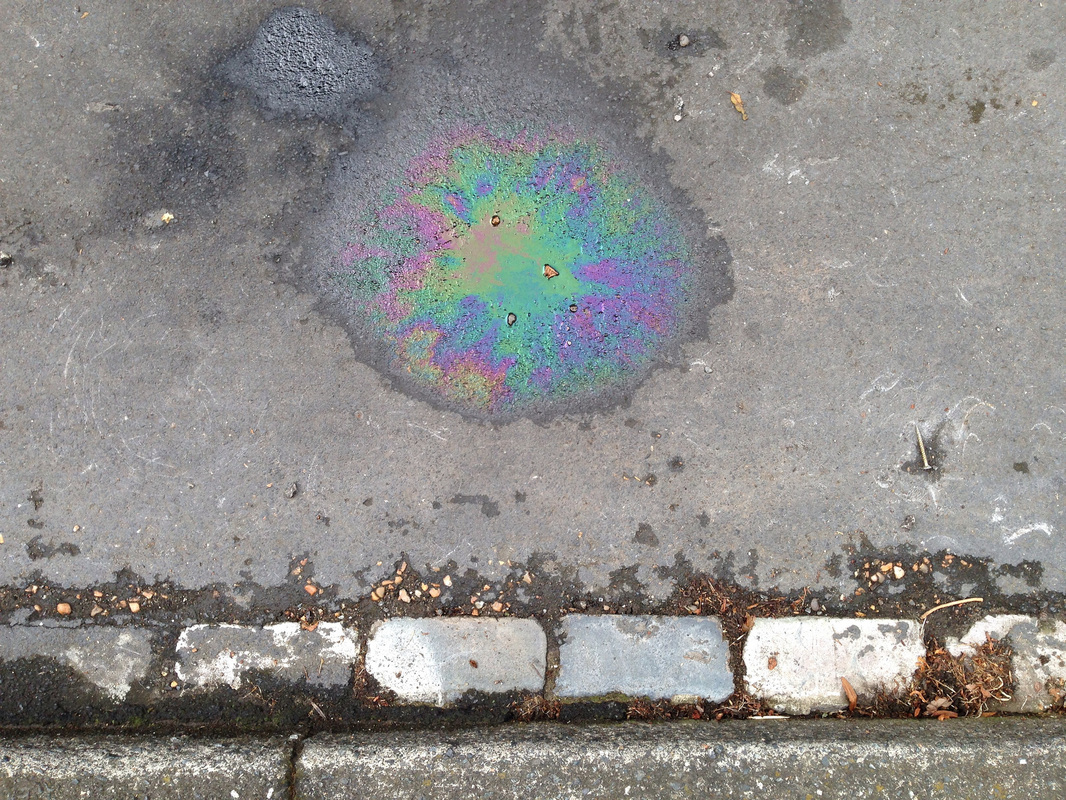
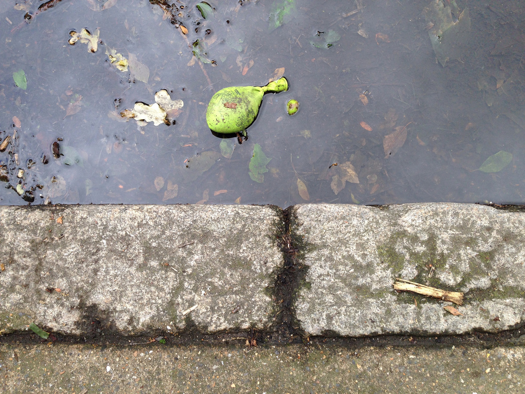

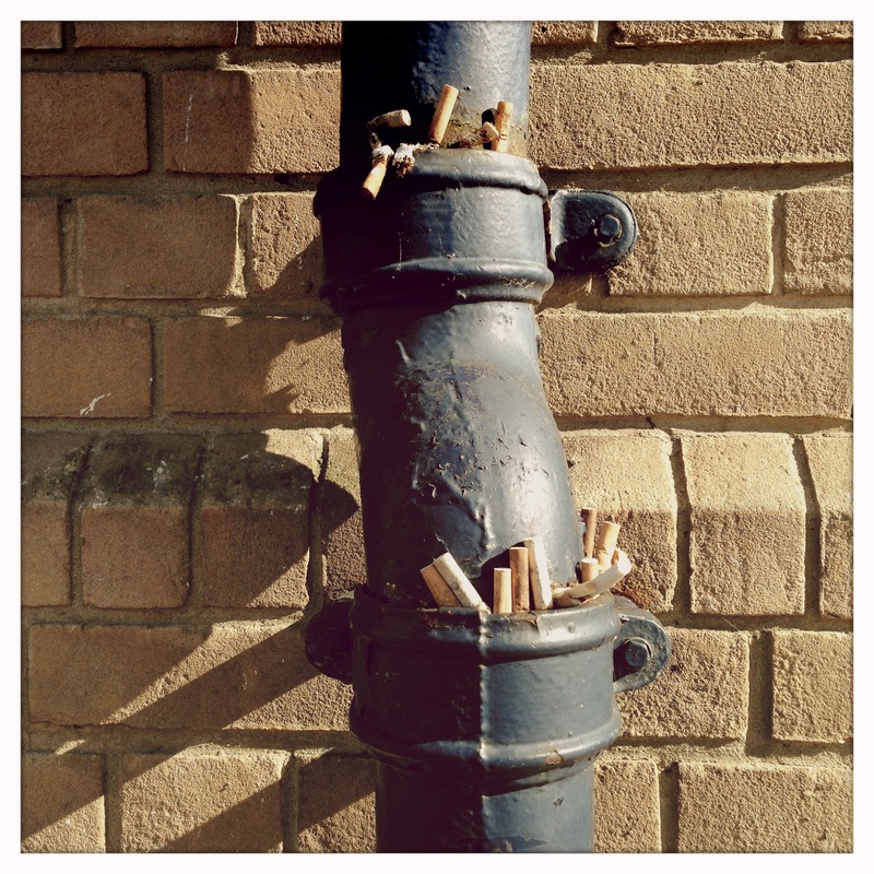
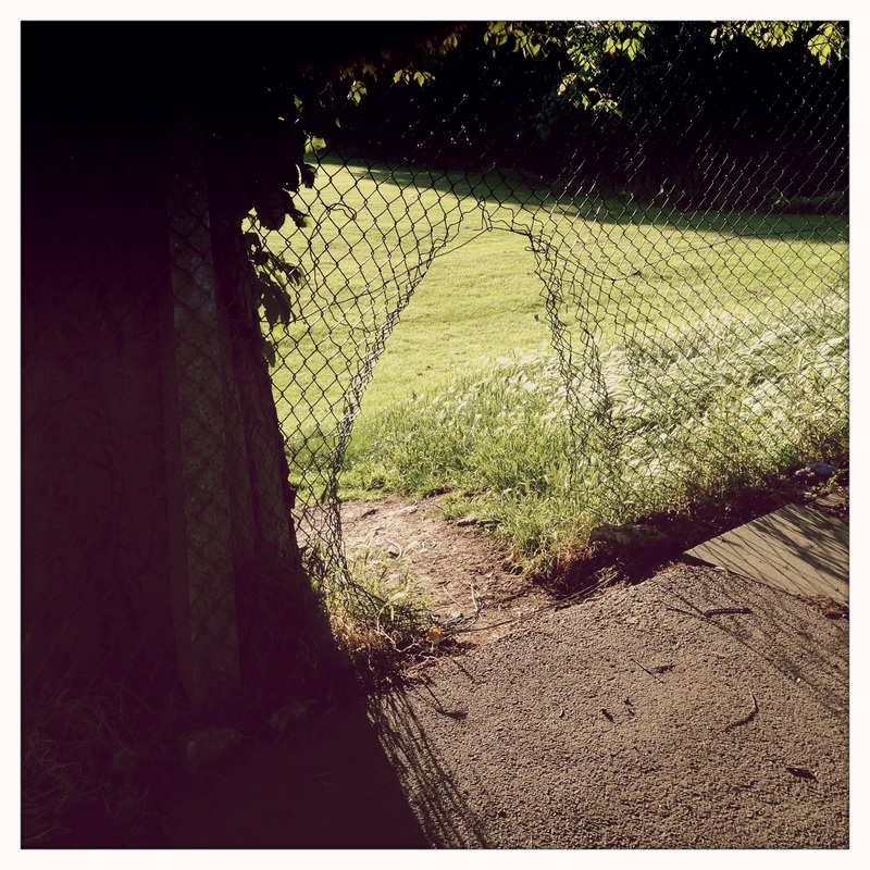
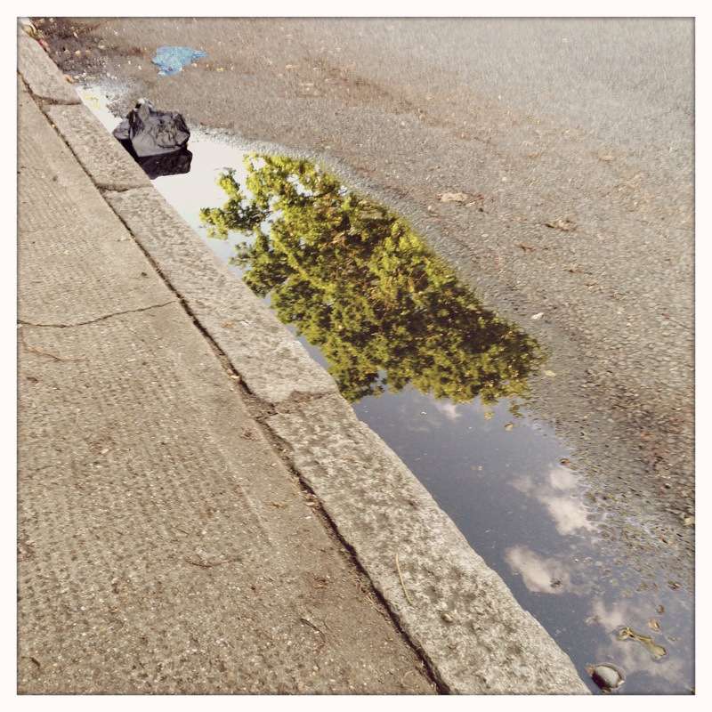
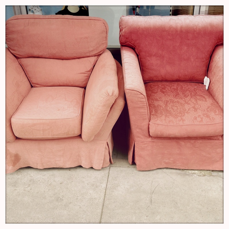
WWWThese images are a way of describing the edge of the pavement. I tried to keep a similar position in each one, looking straight down at whatever object caught my eye and keeping the kerb parallel to the edge of the photograph. I like the way that the pictures document my journey to school and the things I noticed along the way. They were taken over a period of several days so they also show the way the light changes and hint at the weather. The gutter is where objects end up once they've been abandoned so I suppose the pictures are quite sad.
|
EBIUsing the basic camera app on my phone meant that I didn't have much control over the exposures. I could edit them to improve the colour balance but I have decided not to.
|
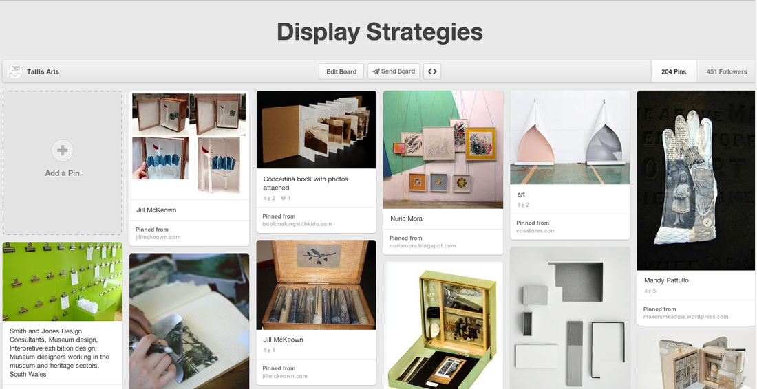
Research: Display Strategies
I have created a Pinterest Board to help me think about suitable ways of displaying my pictures.
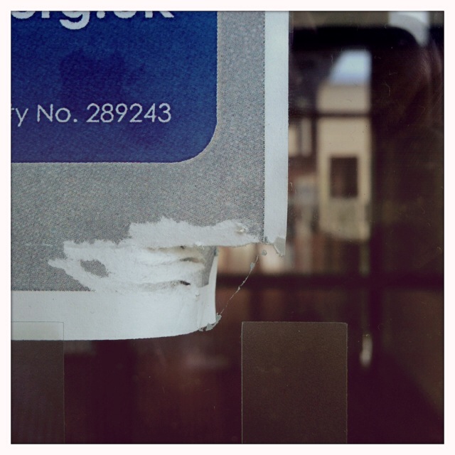
A trip to The Photographers' Gallery
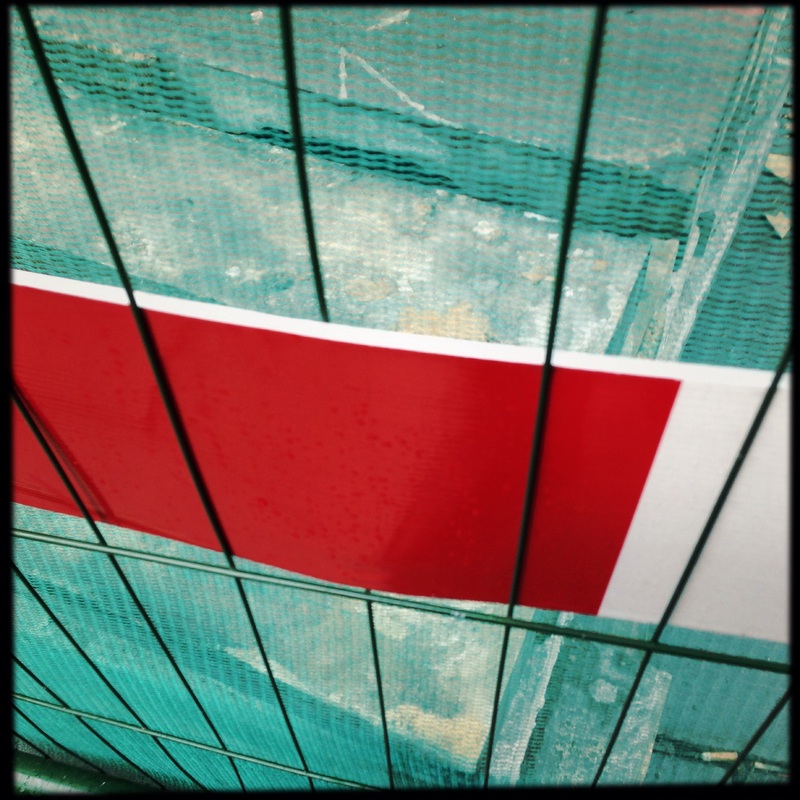
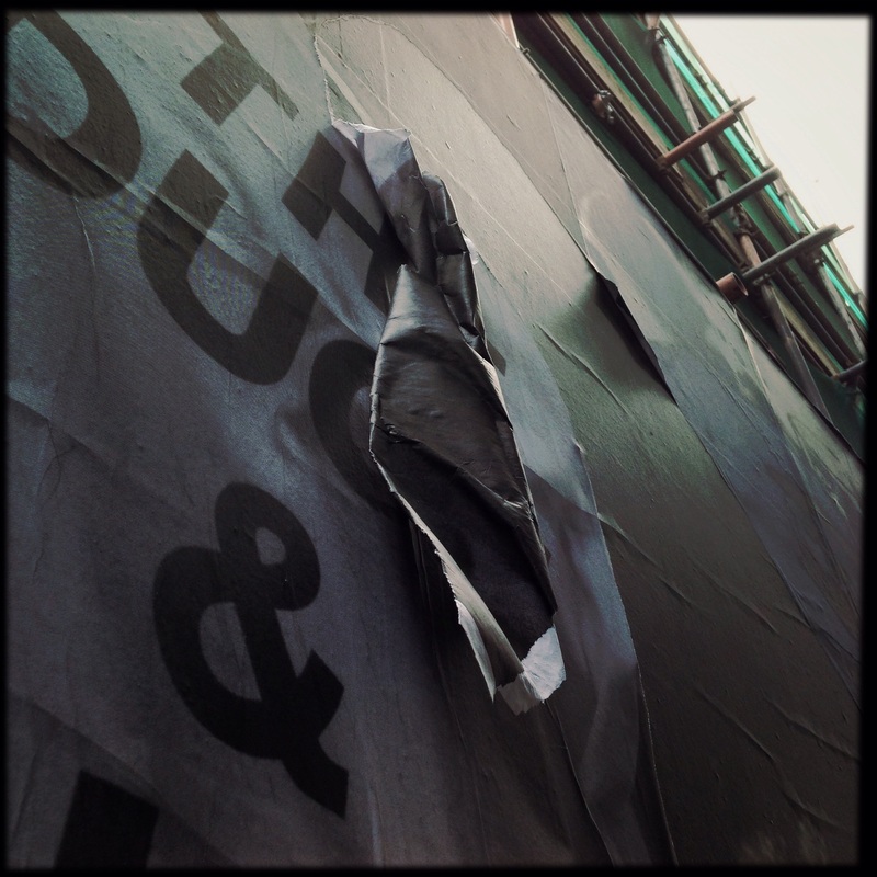
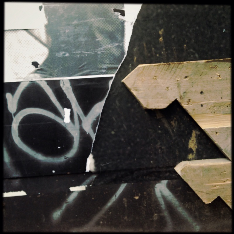
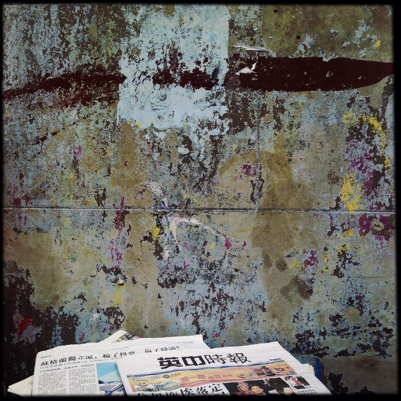
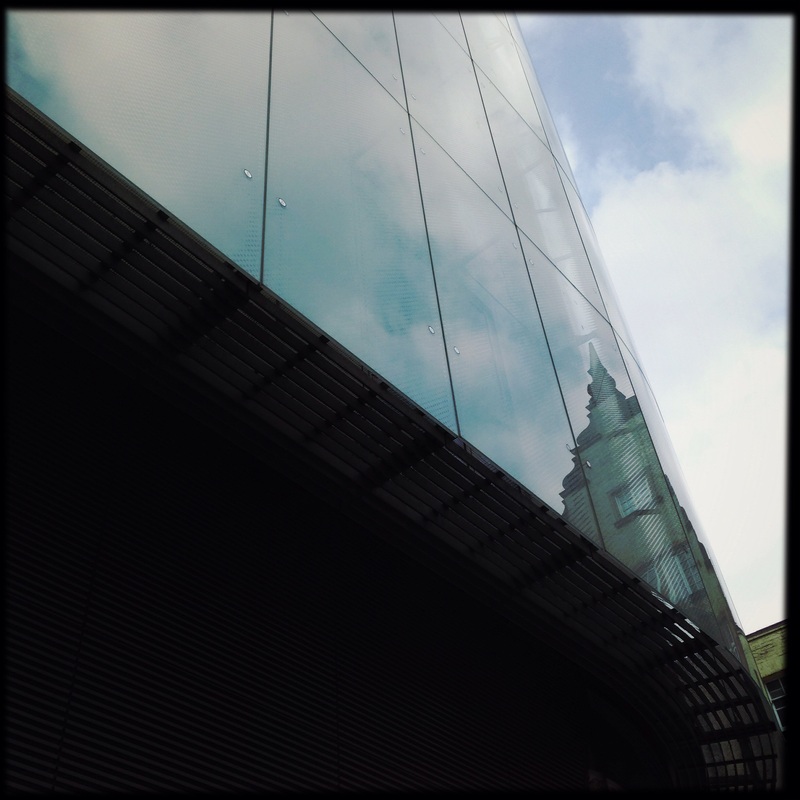
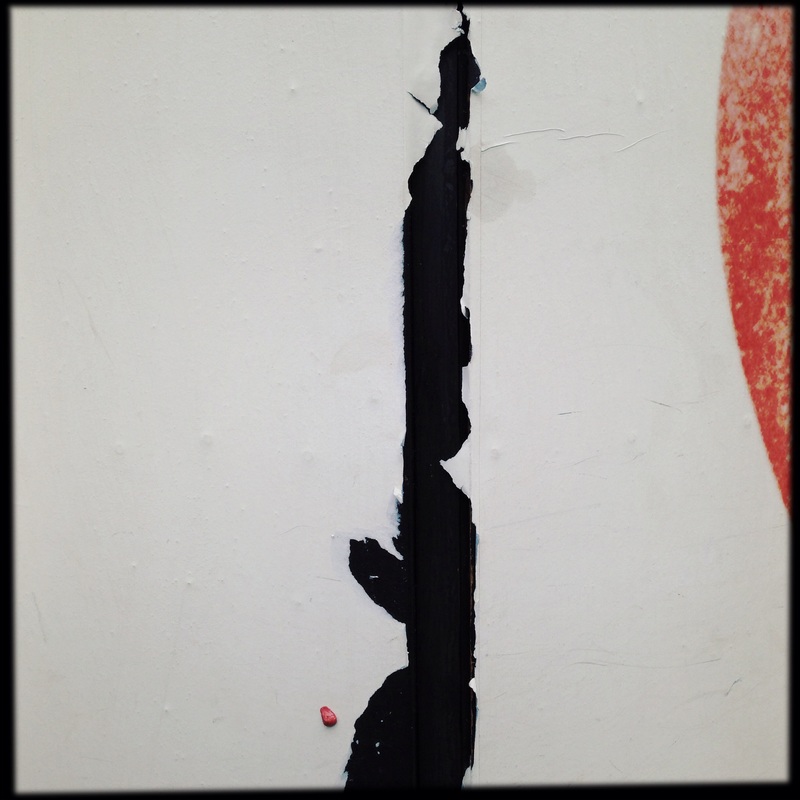
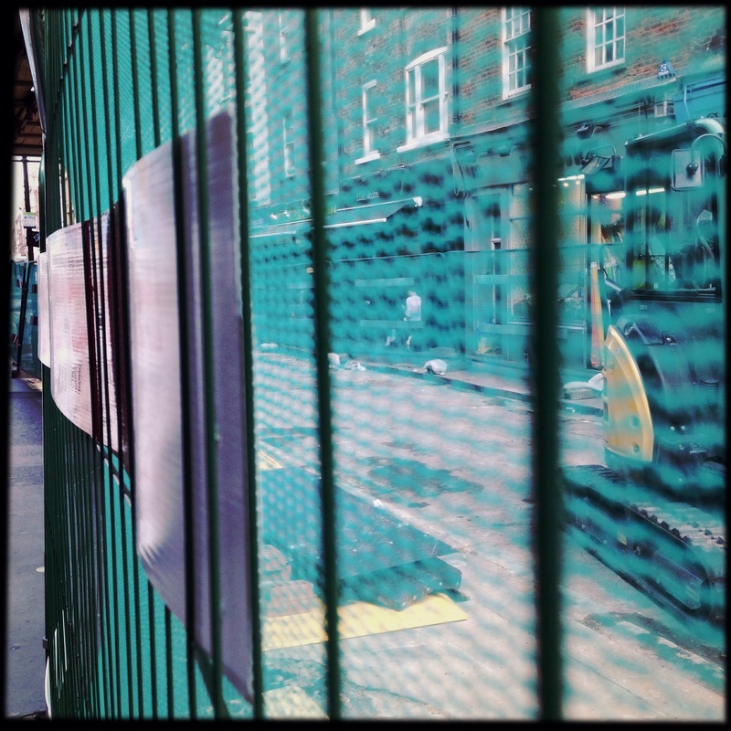
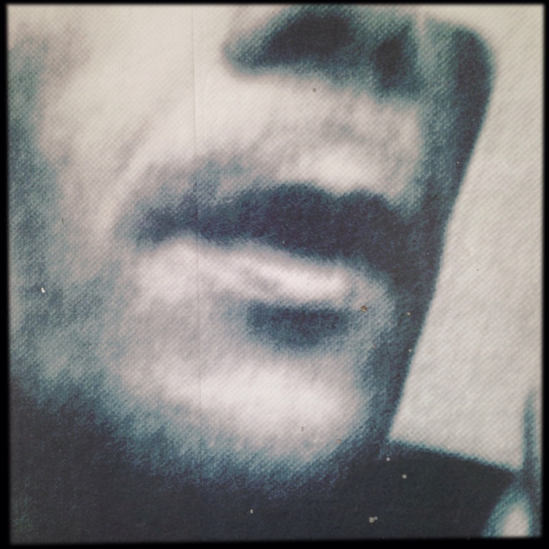
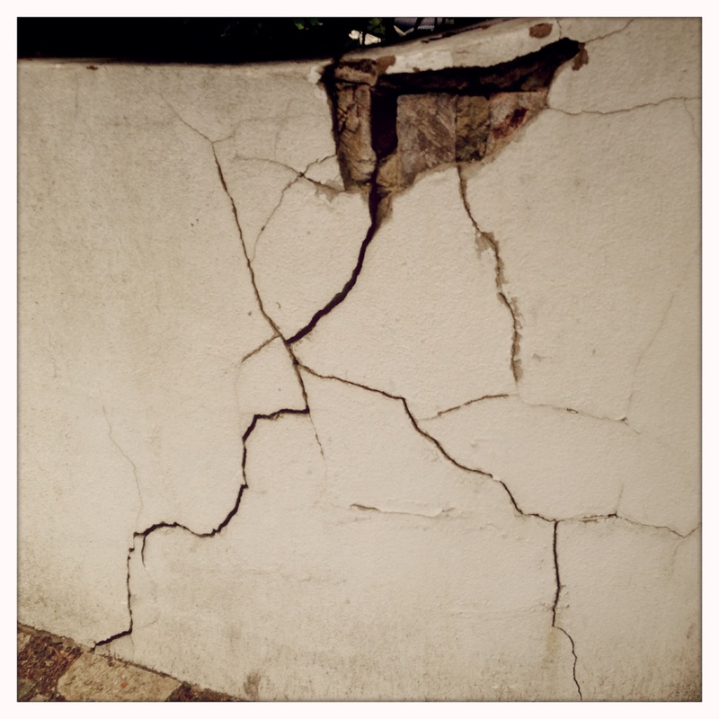
I decided to visit The Photographers' Gallery. On my walk there and back I tried to concentrate on the edges of the urban environment. I stood close to the subjects and framed the image tightly so that there was very little context. Although it was a wet and grey day, I tried to pick out interesting colours and textures, photographing from unusual angles to increase the drama in the image. You can see this in the picture of the metal fence with green plastic meshing and red and white hazard tape (looking down) and in the torn poster (looking up). My favourite image is the distressed wall I saw in Chinatown with a few newspapers lying underneath.