This personal project explores photographs of the absurd.
Activity #1: An absurd photograph
Choose a photograph that you think helps to explain the meaning of the word 'absurd'. Explain why...
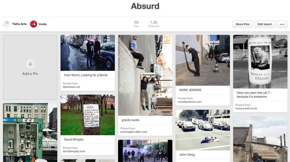
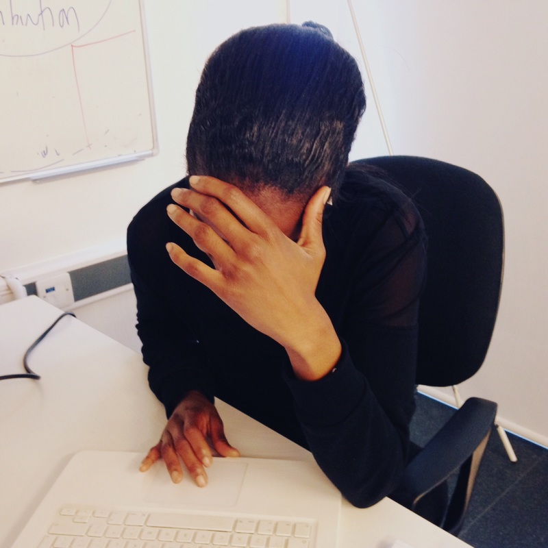
The following image sums up how I feel about the word 'absurd':
The following image sums up how I feel about the word 'absurd':
|
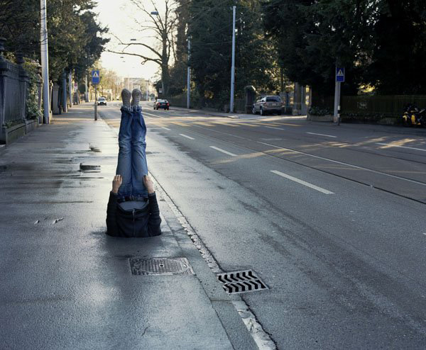
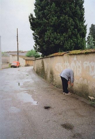
The photograph (by the artist Erwin Wurm) is of an ordinary road in an ordinary town and could be anywhere in the world (although it looks like somewhere in Europe). A person is sticking up out of the pavement. We can't see his or her shoulders or head. We assume that there is a large hole (a manhole possibly) into which the person has inserted themselves. What makes the picture even more absurd for me is thinking about how the person got into this position. Did they have help? Whose idea was it to make a photograph? How long did the person remain in this position? How did they eventually escape? I also love the fact that the body is perfectly upright, as if they have fallen straight down from the sky and ended up wedged in the pavement. Are they alive or dead? The empty road also makes the image interesting, as though we are the only ones who have noticed. Are we the photographer? Are we going to offer some help to this poor person or just stand back and laugh at them? |
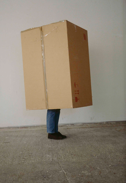
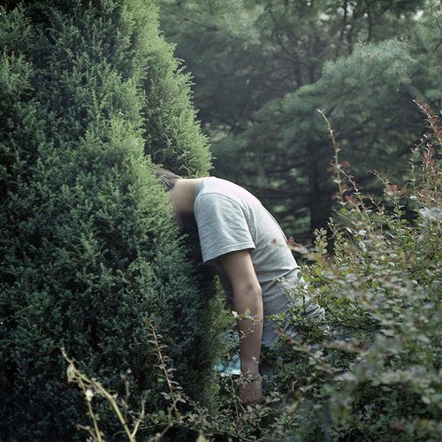
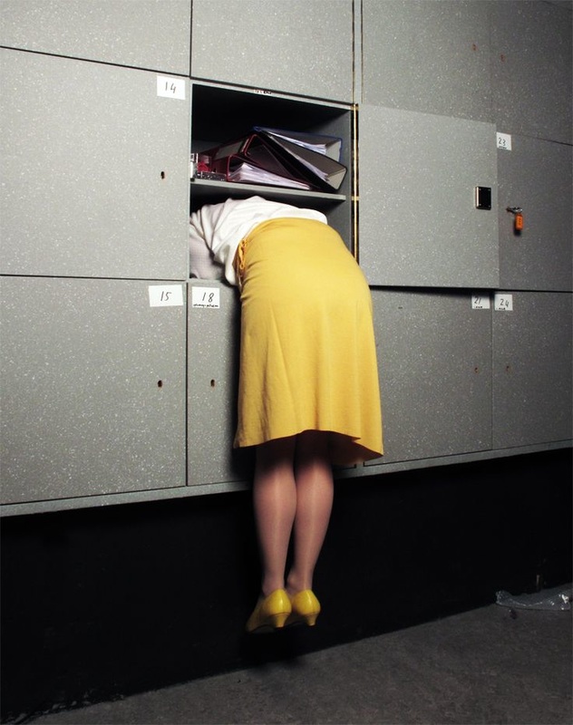
Activity #2: Hide
Working with a classmate, and using an iPod, take a series of absurd images using the instruction 'Hide'. Create a Gallery of your images and write a brief evaluation.
Here are some images to help you generate ideas:
Here are some images to help you generate ideas:

Make sure that you have:
- Created at least two sets of photographs exploring different ways of capturing the notion of hiding.
- Evaluated your photo shoots in detail:
- What were you trying to do? Where did you get inspiration for your photo shoot?
- What equipment and props did you choose and why?
- Which images worked well and why?
- Which images didn't work so well and why?
- What do other people say about your pictures? What advice have they given you?
- If you were to do another photo shoot using the same theme/idea what would you do differently to get a better result?
- What other ideas have you had related to the overall theme for this project 'Absurd'?
Set #1:
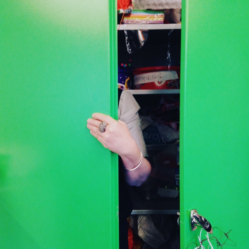
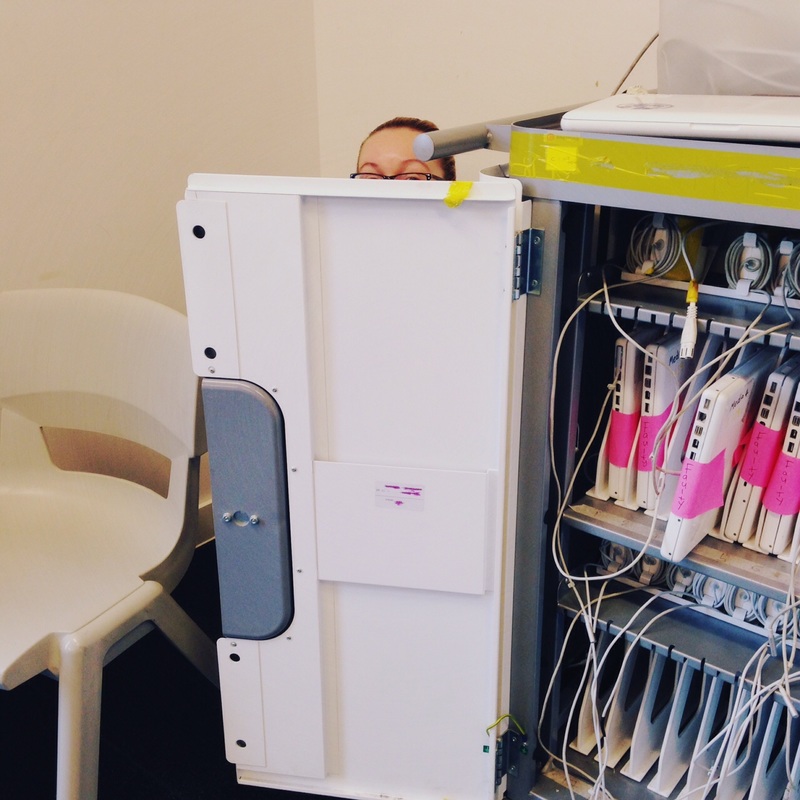
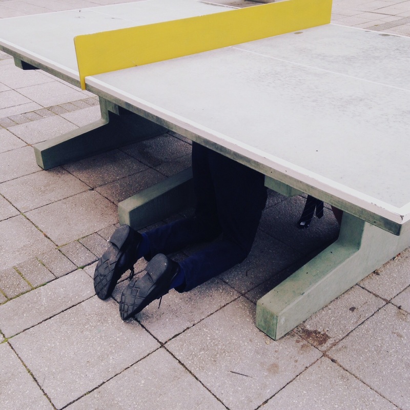


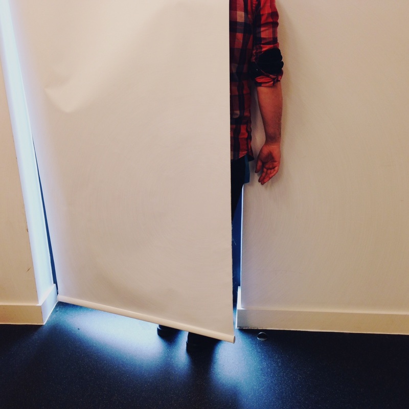
My first idea was to take photos of teachers hiding in the classrooms where they were teaching. Each person was simply asked to "Hide" and I took a photograph which showed them not quite succeeding. This seemed funnier to me than if I couldn't see them at all. In effect, they were hiding badly. For example, you can see bits of bodies - arms, heads, legs - poking out from the hiding place. It reminded me of playing hide and seek as a child when, really, you want to be found eventually. The photograph I like best is the one of a teacher hiding under a table tennis table because you can see his tie dangling on the floor. This makes the image seem more absurd to me. I also like the one of the teacher hiding in a green cupboard. The pictures work best when the composition is quite simple and there is one strong colour - the yellow and green in these pictures. I used my phone to take the pictures because I knew I needed to be quick (because I was disturbing their lessons). I used the Hipstamatic app so the images are square and slightly desaturated.
|
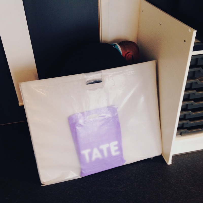
I tried one image with more than person hiding. I don't think this works as well although it is absurd to see the school police office hiding under a desk. You can see other people attempting to hide but the composition is too cluttered and the joke doesn't work so well.
Next time I plan to make a similar set of images of students hiding in various places. I have decided to only have one person in each picture and to allow them to choose the hiding place and method. Again, I don't want them to hide too well so I will photograph them so that they can be partly seen. I also want to experiment with using a variety of props, perhaps taking a series of portraits in which the face is obscured by another object. I could also try putting something in front of the camera lens so that a blurred shape obscures the subject. These need not be pictures of people. There are some great trees on the school grounds so I might try obscuring them. In this case, I will be hiding the subject and not the other way round. |
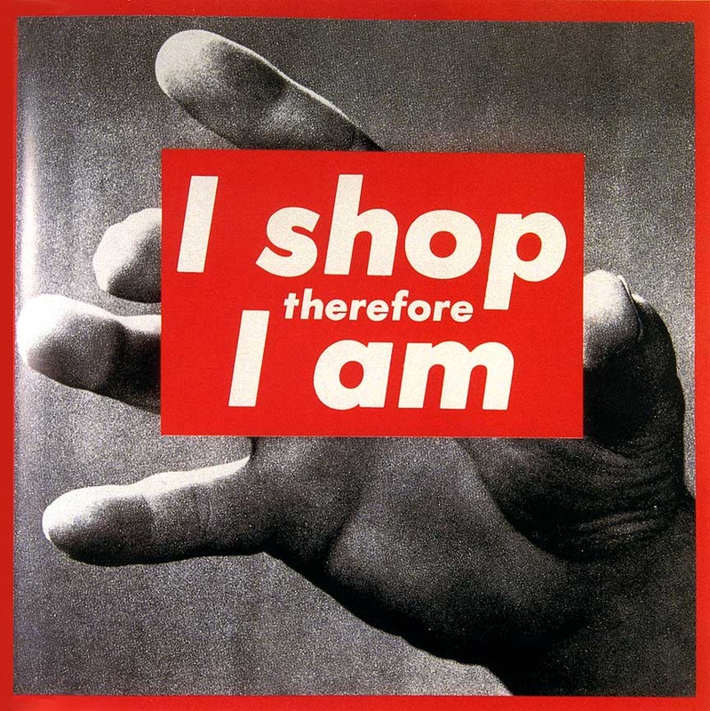
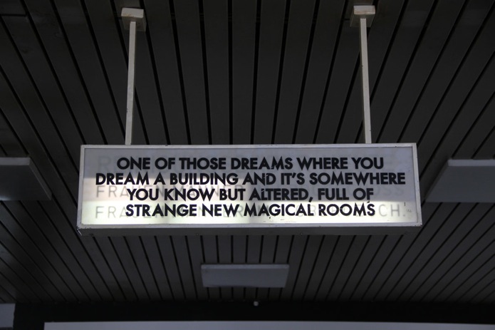
Activity #3: Absurd Signs
Signs are meant to help us. They can warn us, instruct us, direct us, support us, inform us. What happens when signs do the opposite of these things? Some photographers and artists have played with the conventions of signs, the accepted ways in which we expect signs to work. This often results in absurd images. Here are some examples by the artist David Shrigley:
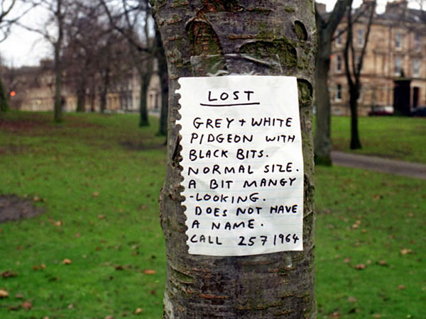

- Try to explain what makes these photographs absurd?
- What do you think when you look at these signs? Are they helpful?
- Why do you think the artist has placed the signs in public places? Who are the signs for?
- Why was it important to take a photograph of the signs?
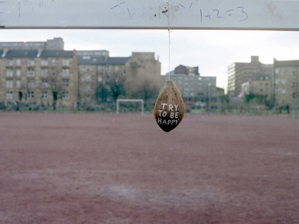
Here are some more examples by other artists. This blog has lots of great examples:

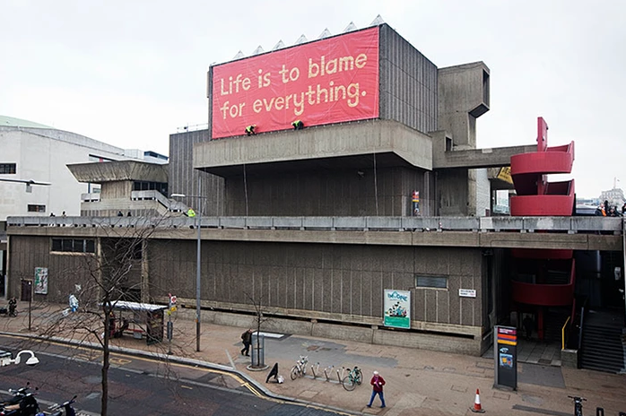
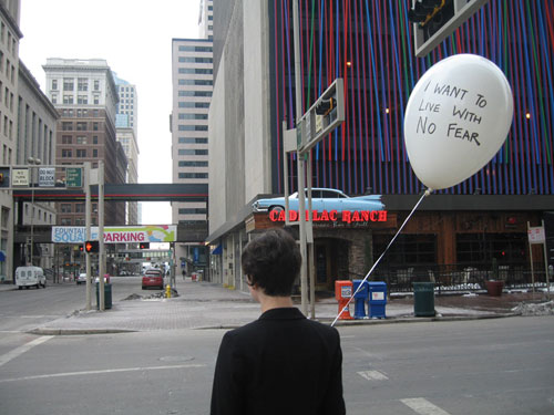
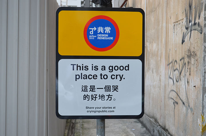
|
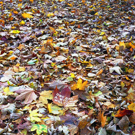
And here's a whole website with work that might inspire you to create your own absurd signs:
Your task:
|
|
Some ideas to get you started:
- Adding signs to things that don't need signs e.g. pencil, classroom, window etc.
- Adding the wrong sign to things that have an already obvious function e.g. adding the phrase 'Gateway to secret parallel universe' to a toilet door.
- Writing poetic messages on Post It notes and leaving them in unlikely places
- Creating official looking signs that don't make sense (Tip: these need to look believable)
- Giving people bizarre and/or impossible instructions e.g. Don't look at this sign
- Making signs from odd song lyrics e.g. “What about elephants? Have we lost their trust?” (Michael Jackson)
Set #2:
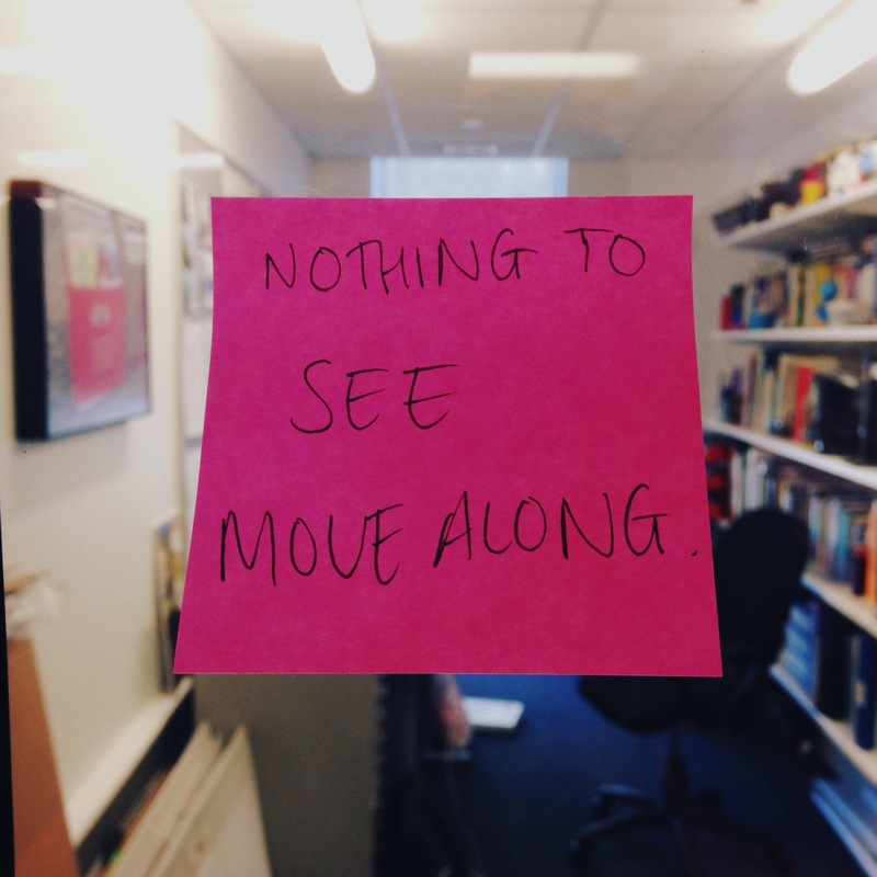


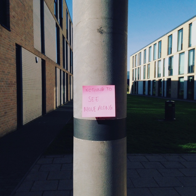
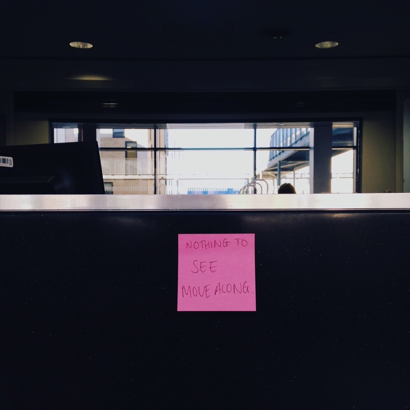
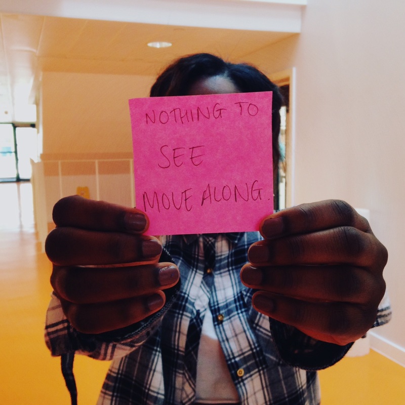

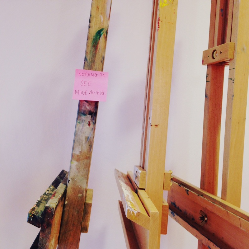

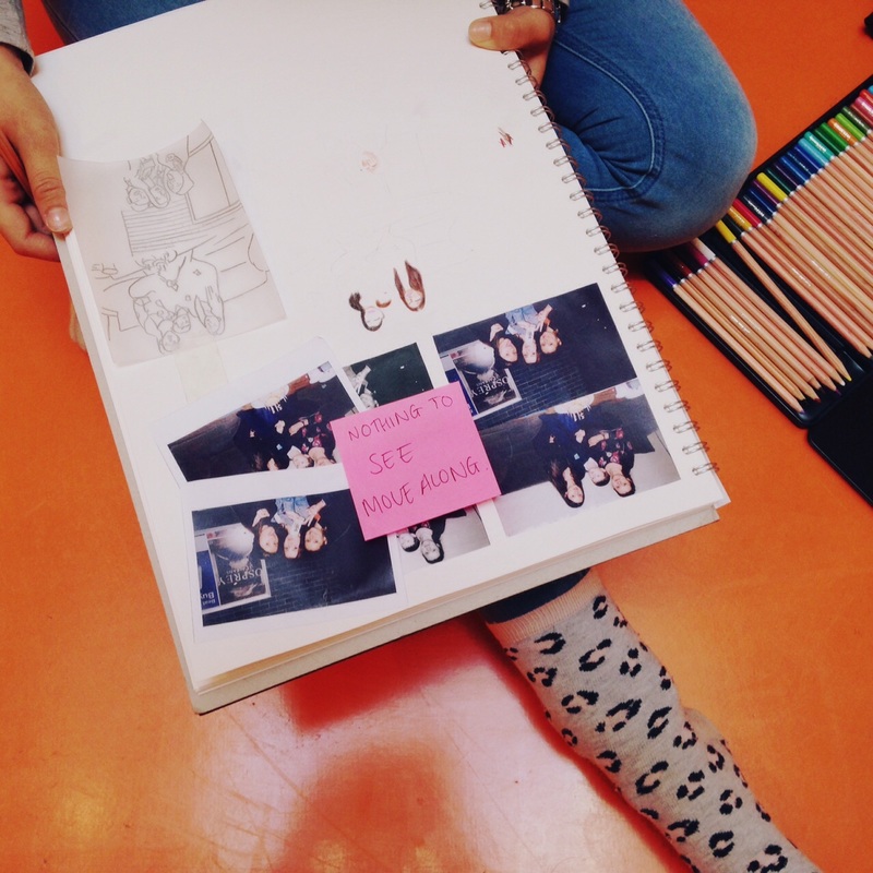
My first set of images was based on the simple idea of writing an instruction on a Post It note and placing this in a variety of locations. I wanted the sign to be frustrating to the reader. "Nothing to see. Move along." I thought that this sign would do the opposite and make people more interested in looking at the thing the sign was attached to. We tend to walk past interesting things every day without really seeing them. Ironically, asking people not to look at something probably makes them take greater notice of it. I thought this produced some interesting and absurd images. If I did this again, I would try to produce more official looking signs that almost look like the signs you find on walls in public places telling you to do something.
Set #3:
My second idea was to subvert existing signs with new text and re-name objects in my classroom with poetic titles. I'm generally pleased with the way these turned out. I like the fact that they are quite subtle and could go unnoticed. This makes the surprise element greater once the sign has been read and recognised. Signs like these are absurd (how could a hand towel dispenser deliver dreams?) but they are also potentially lovely things to encounter in your daily life. I would like to continue to experiment with this idea. I need to make sure that I spend time making really convincing looking signs and that I take really good quality photographs of them once they are installed.
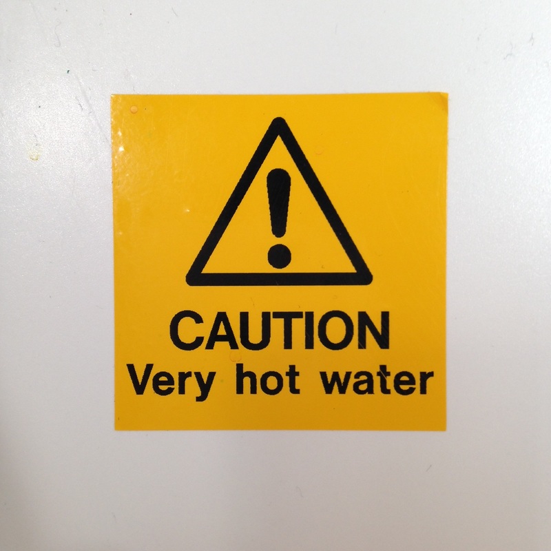
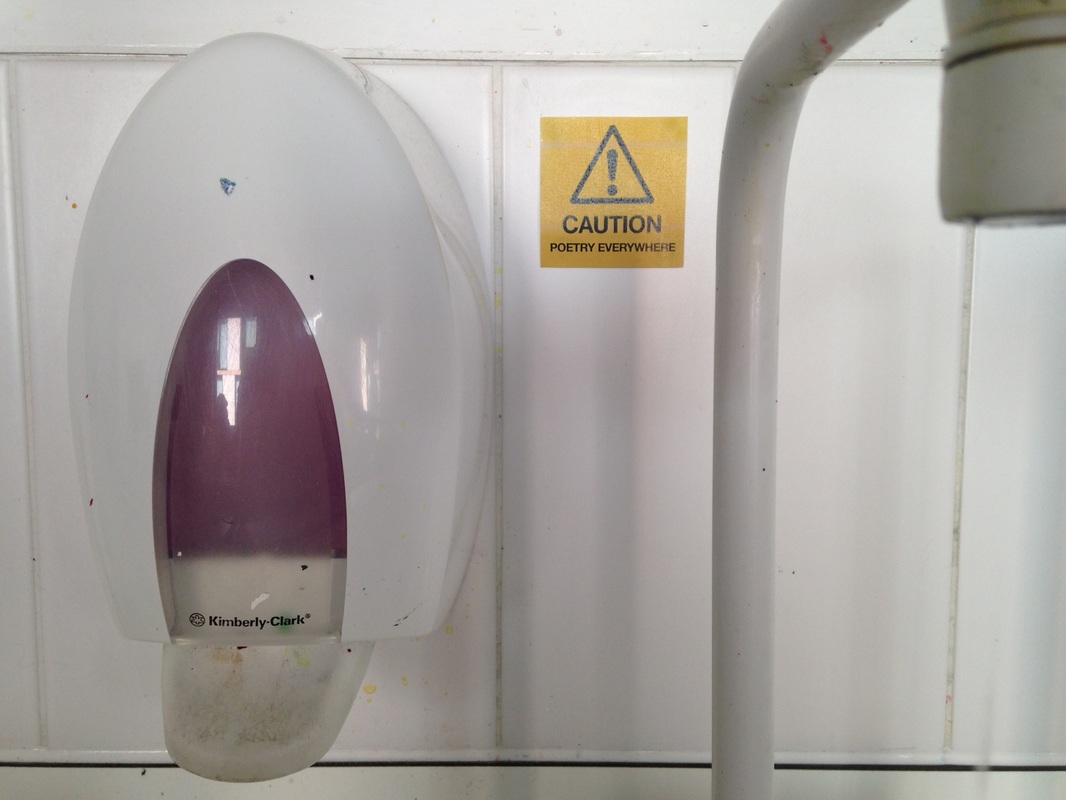
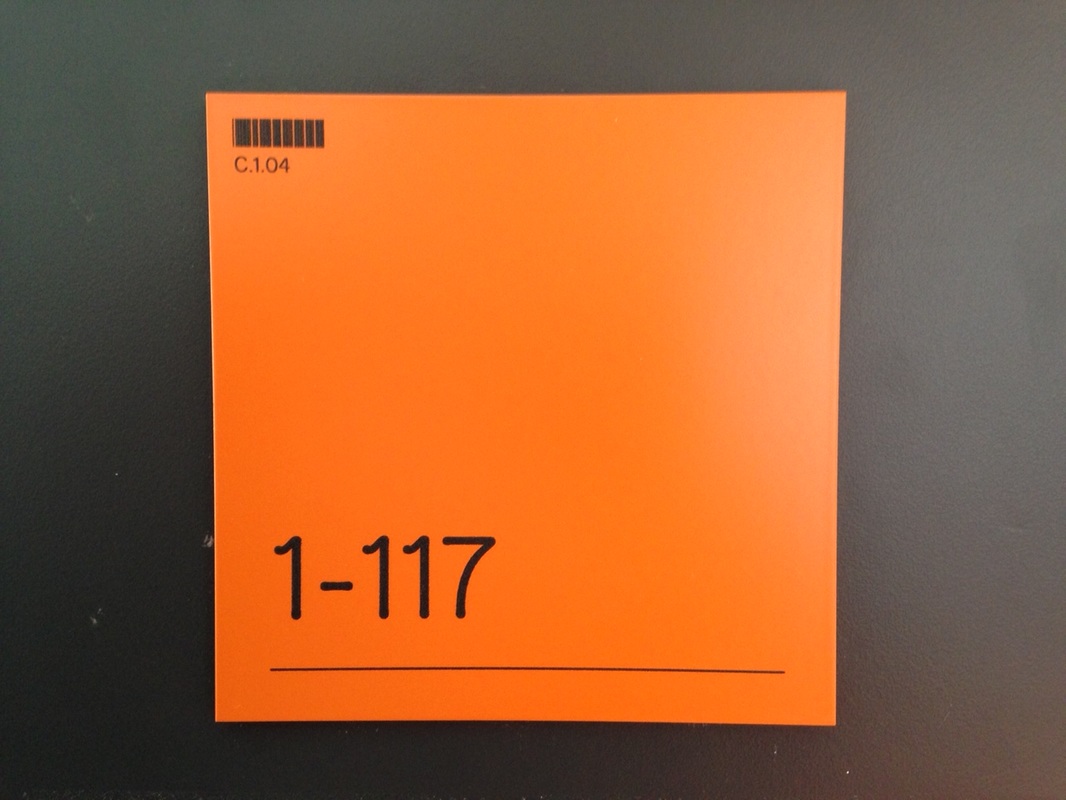
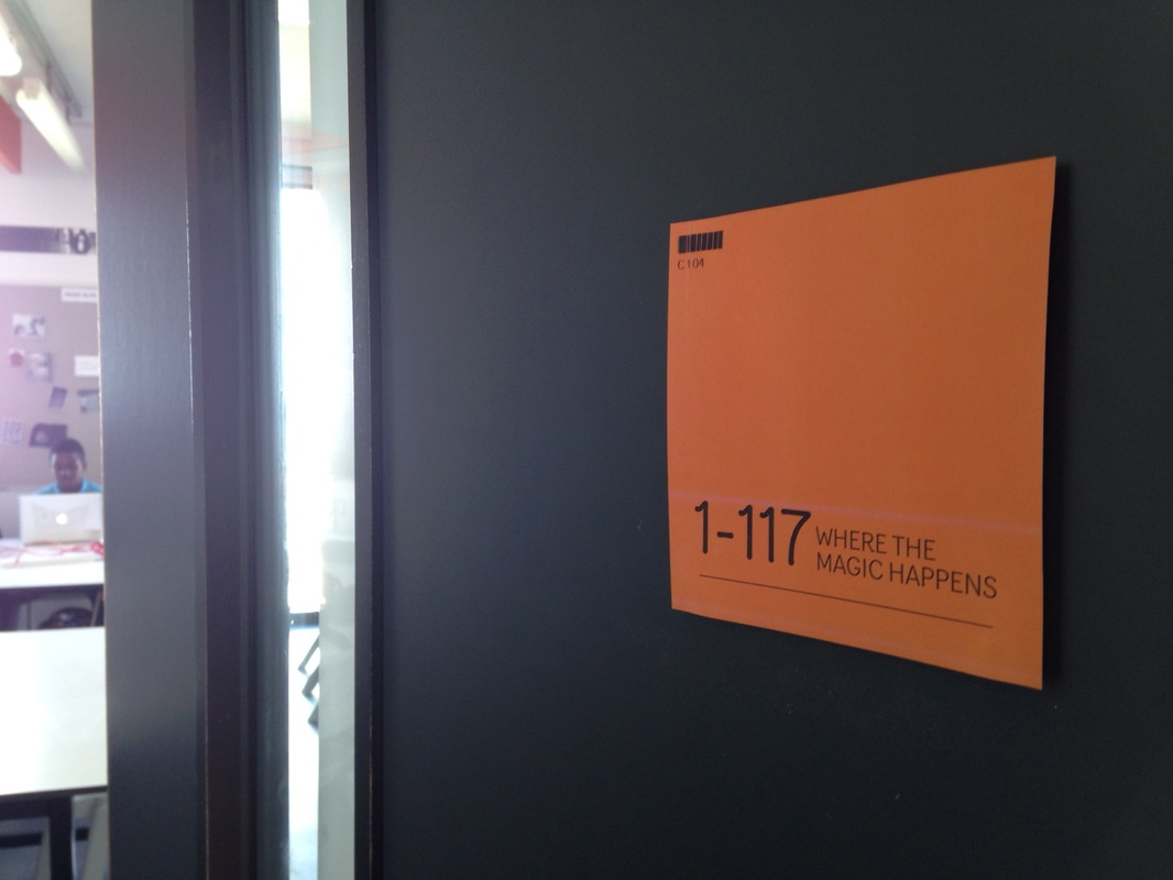
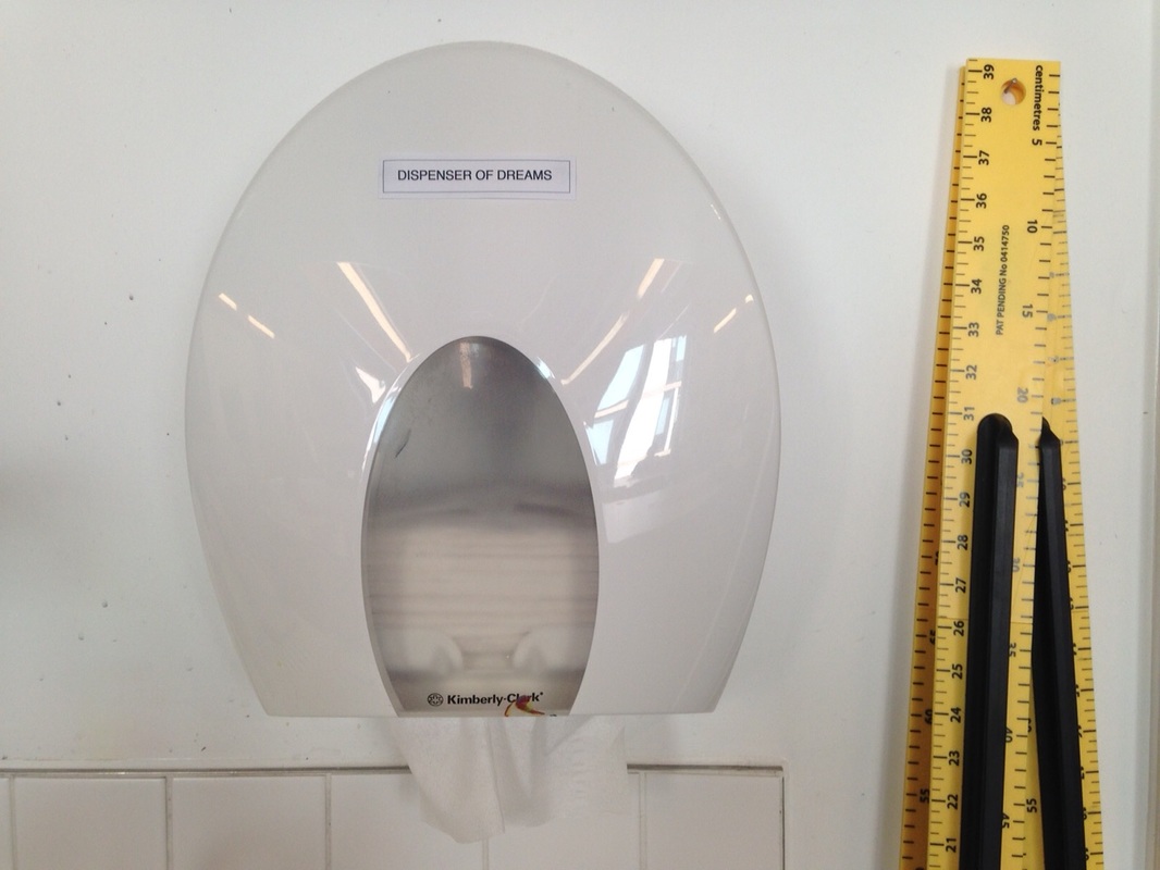
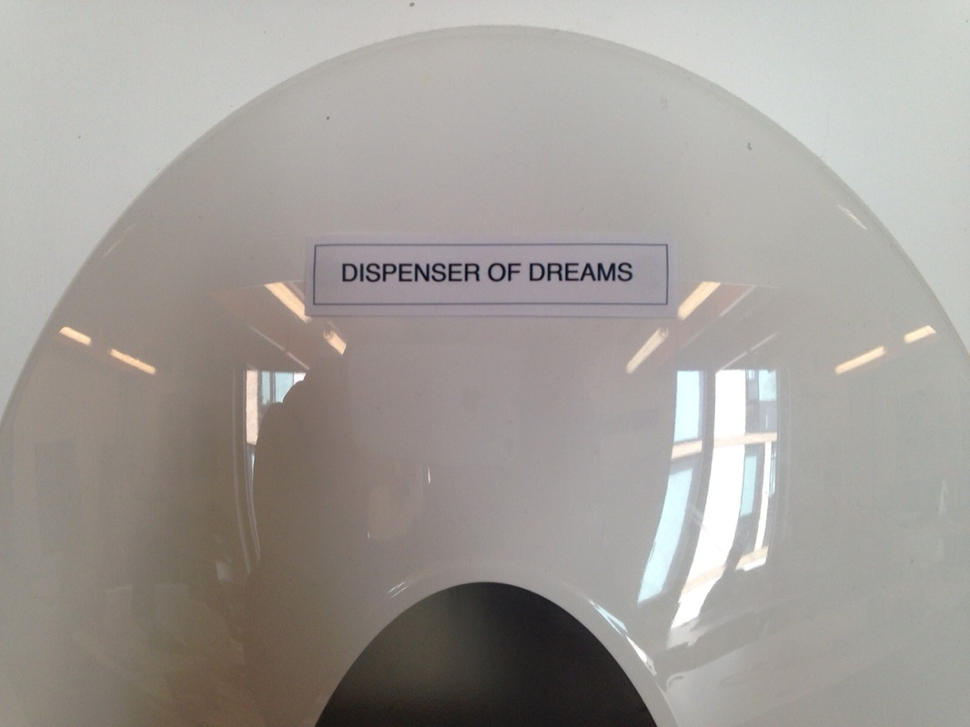
These experiments are about adapting the signs that already exist in school and giving existing objects absurd titles. The "Caution Very hot water" sign is above the sink in my classroom. I changed the warning so that it read "Caution POETRY EVERYWHERE". I liked the idea that poetry could be seen as potentially dangerous and that it was indeed everywhere if you could see it. I tried to make the sign look exactly like the original one. I photographed it and replaced the text in Photoshop. It looks pretty convincing. The second experiment was with the sign on my classroom door. Using the same technique I added the phrase "WHERE THE MAGIC HAPPENS" next to the door number. I matched the typeface exactly. This has been really successful since very few people notice it but when they do, it's a nice surprise. Finally, I decided to pick the ugliest object in the room - the paper towel dispenser (which is also the most useless since it hardly every contains any paper towels) - and give it a grandiose title. I chose the phrase "DISPENSER OF DREAMS". There is nothing at all dream-like or wonderful about the object. The absurdity here lies in the contradiction between the object and its new name.
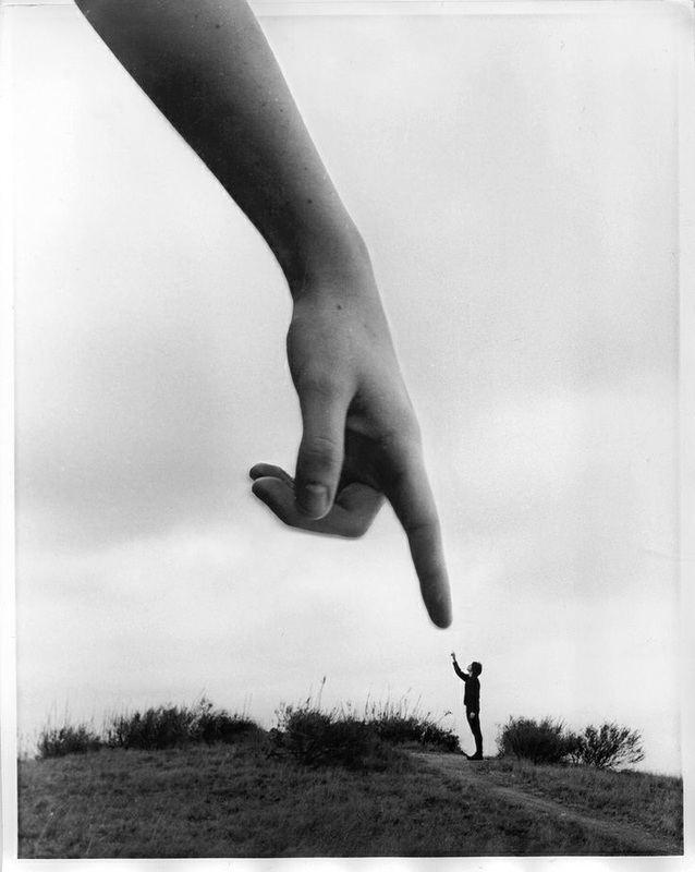
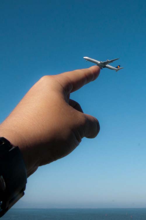
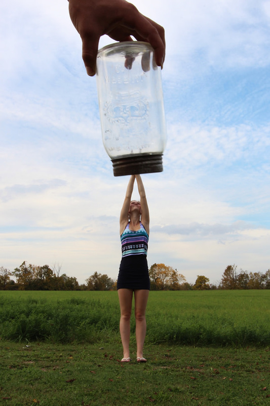
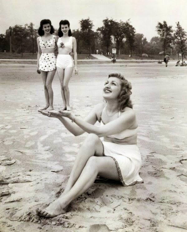
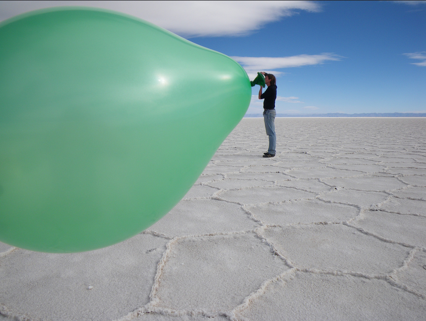
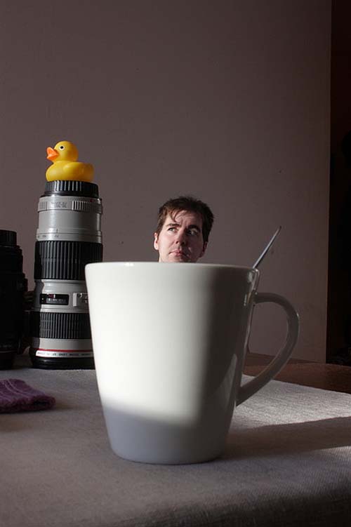
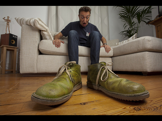
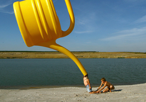
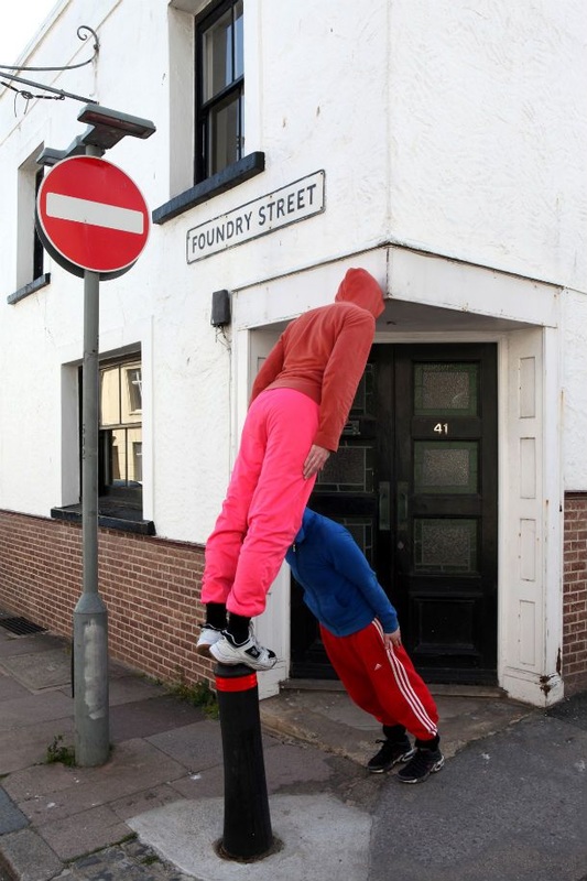
Activity #4: Forced Perspective
|
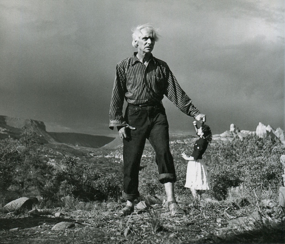
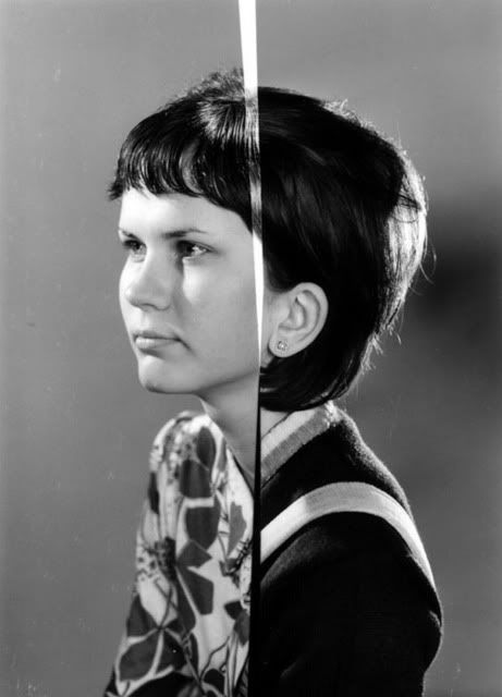
One of the strangest things about photographs is that they flatten space. Objects that can be distant in reality can appear to be right next to each other in a photograph. This is sometimes referred to as Forced Perspective - the photographer is altering our normal sense of space (foreground, middle ground and background) by forcing objects that don't belong together to be directly in relation to one another. The photograph on the left is a famous image of artists Max Ernst and Dorothea Tanning taken by the equally famous photographer Lee Miller. It's a joke about the relative reputations of male and female artists. Tanning is standing in the background, Ernst in the foreground, but it looks as if he is holding her down. This kind of optical illusion is a consequence of the way that photographs can alter our sense of space and perspective. They flatten the world into two dimensions. |
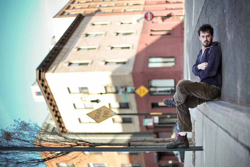
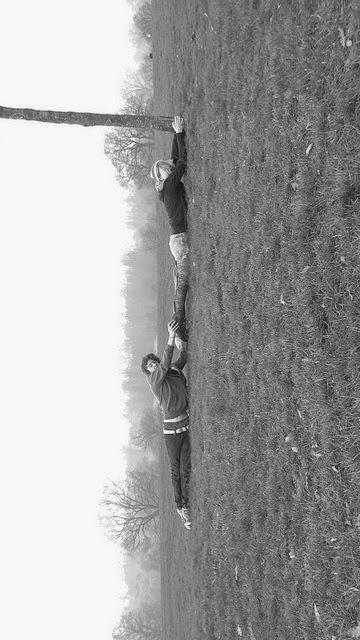
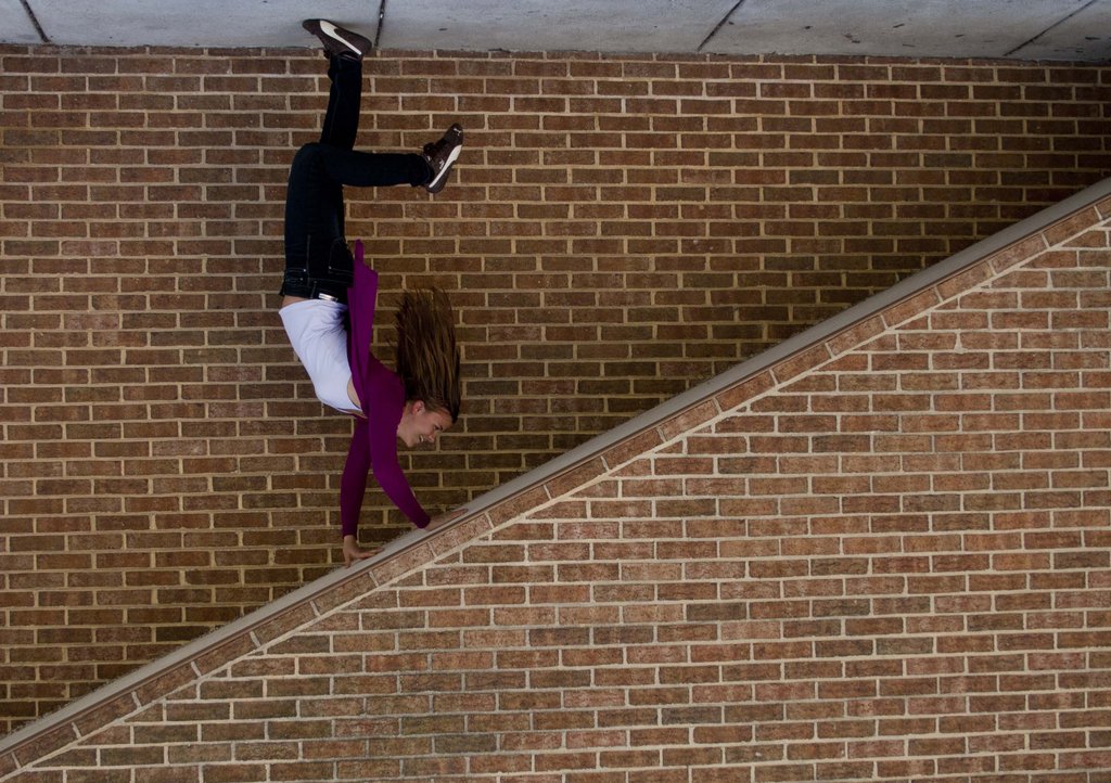
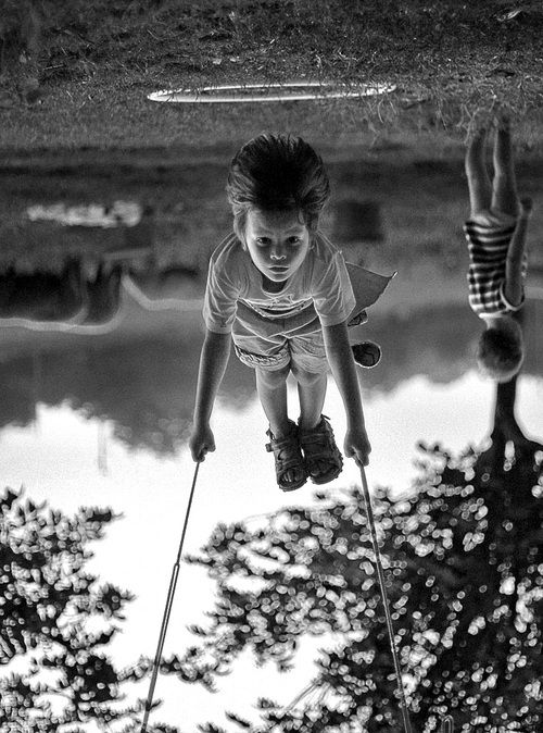
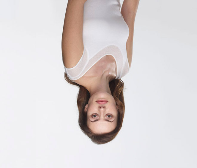
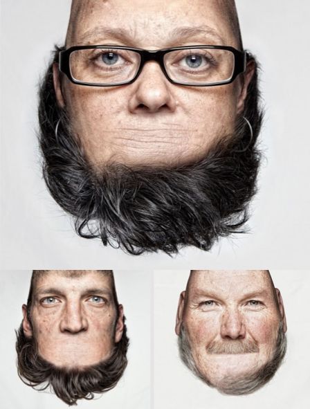
Michael Hughes creates this kind of optical illusion in his photographs which feature small objects (souvenirs of his travels) that stand in for much larger, famous objects and landmarks. Photographers also play with rotating their photographs, changing our sense of proper orientation. Our expectations of up and down can be radically altered so that people lying on the floor can appear to be sitting, flying or stopping themselves from falling. Such images are absurd because our eyes and brain try to make sense of something we know can't be true.
Here are some other examples:
Here are some other examples:

- Research your own favourite examples of forced perspective photography and make a gallery on your page.
- Experiment with making your own forced perspective photographs. Attempt different kinds of forced perspective like the ones above. Remember, you'll probably need to collaborate with someone else in the class for some images.
- Upload ALL your attempts, including the ones that don't work very well. Evaluate your work, explaining which techniques and images worked well and why. Also explain why you think some images didn't work so well.
- Refine your techniques. Make more images and explain how your work has developed.
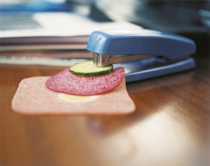
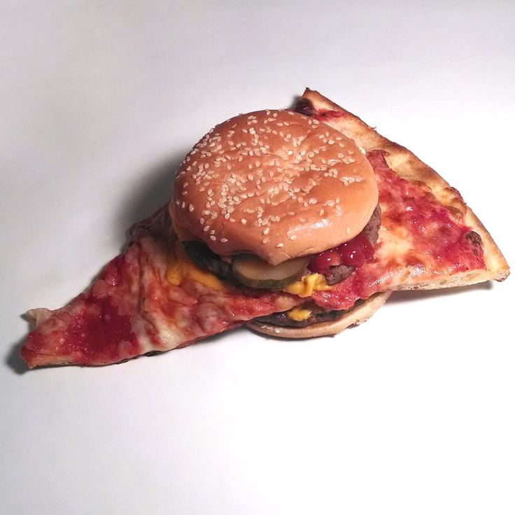
Some other ideas to get you thinking:
It's time for you to start developing a strong idea for a resolved outcome. You will have several weeks to do some detailed research, make several sets of photographs, refine and develop your images and create a final outcome which is personal and meaningful. Here are just some idea to get you started. However, it's important to add your own value to these starting points and not simply copy someone else's idea. Remember to think about why these images and your own ideas might lead to absurd photographs. What makes a photograph absurd?
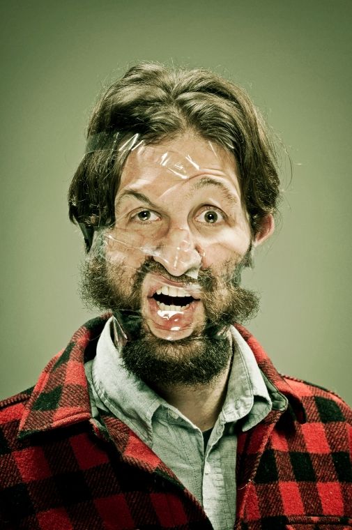
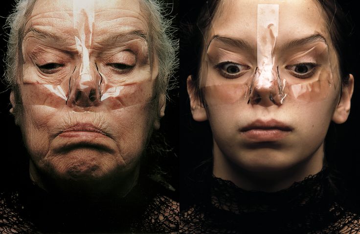
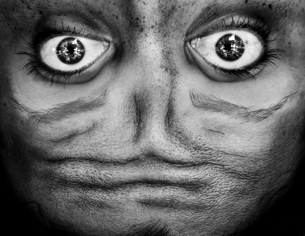
Wes Naman
|
Inge Grognard
|
|
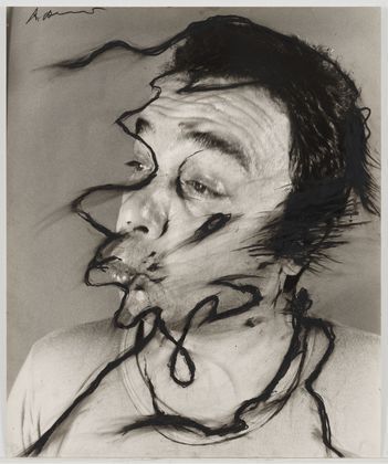
Arnulf Rainer
|
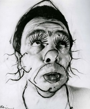
Arnulf Rainer
|
|
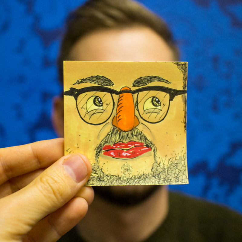
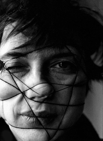
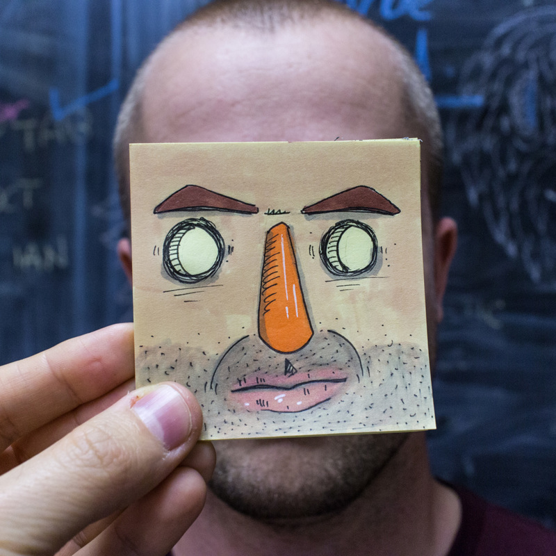
from the StickyHeadz blog
|
from the StickyHeadz blog
|
|
William Farges
|
Jane Wynn
|
|
|
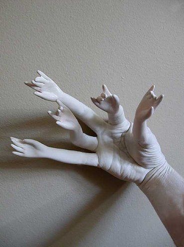
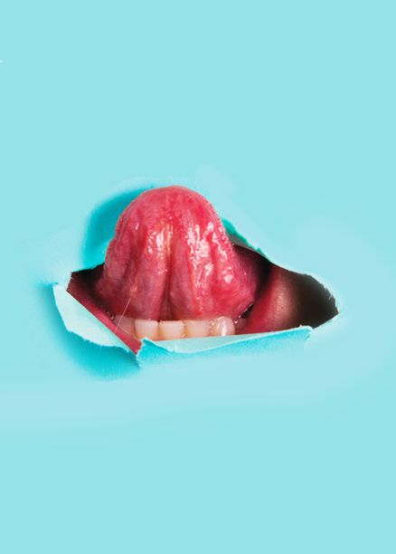
Bizarre bodies |
Ellis Aveta
|
|
Anelia Loubser
|
Anuschka Blommers & Niels Schumm
|
Thorsten Schmidtkord
|
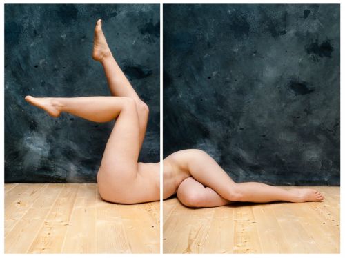
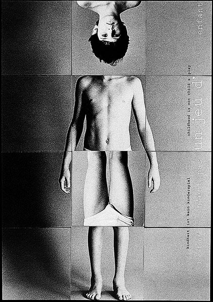
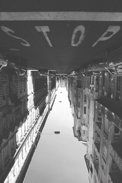
Upside down |
Joachim Schmid
|
John Stezaker
|
|
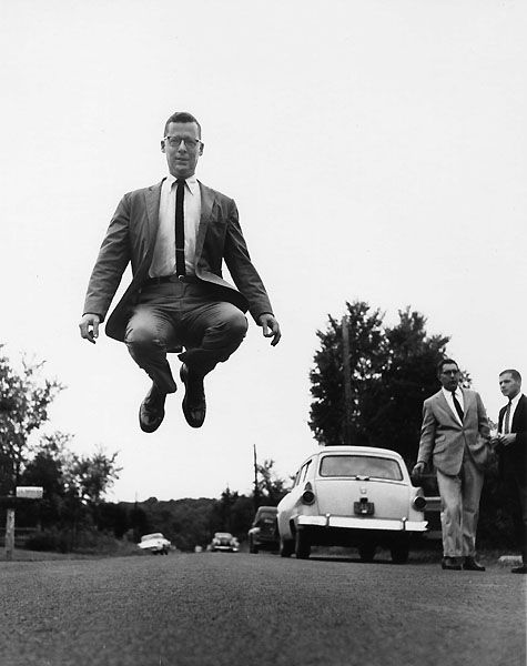
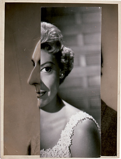
Phillippe Halsman
|
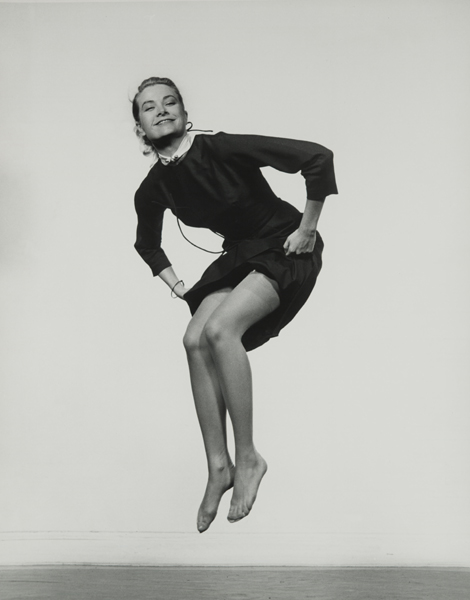
Phillippe Halsman
|
Phillippe Halsman
|
|
|
|
|
|
|
|
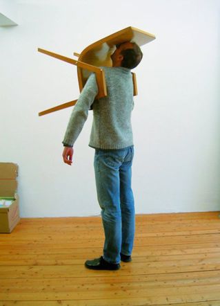
Erwin Wurm
|
|
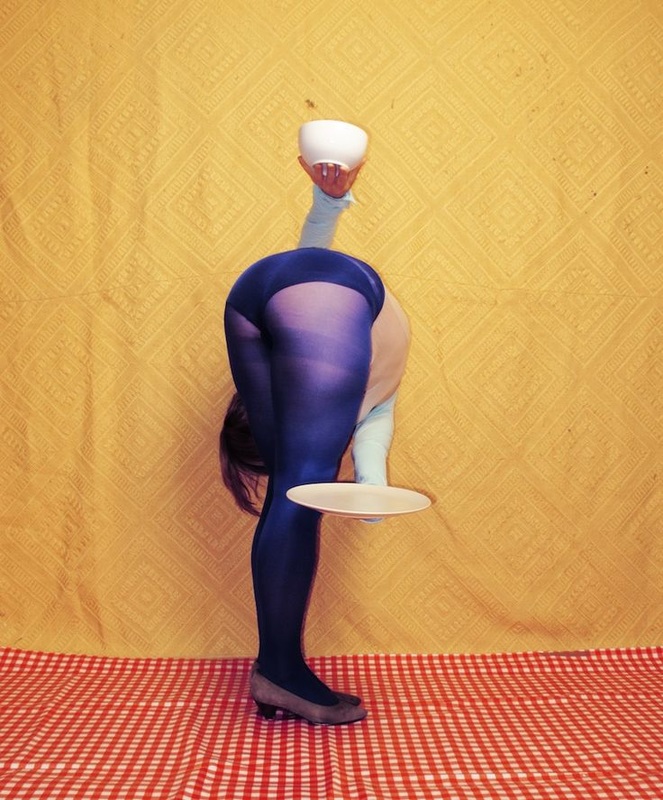
Isabelle Wenzel
|
|
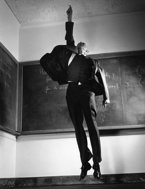
Bruce Nauman
|
Willi Dorner
|
