Personal Project: Abstraction
IntroductionSome people argue that all works of art are abstractions because they are representations of life rather than real life. Most people would agree that abstraction is a kind of sliding scale with naturalism on the one end and total non-representation at the other.
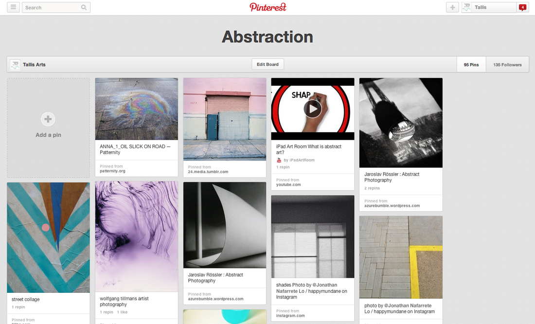
This project is about how the camera can draw attention to the formal elements of art in order to create images in which the subject isn't the most interesting element. Why not begin by having a look at the Abstraction Pinterest board for some ideas about how other photographers have approached this theme. |
|
|
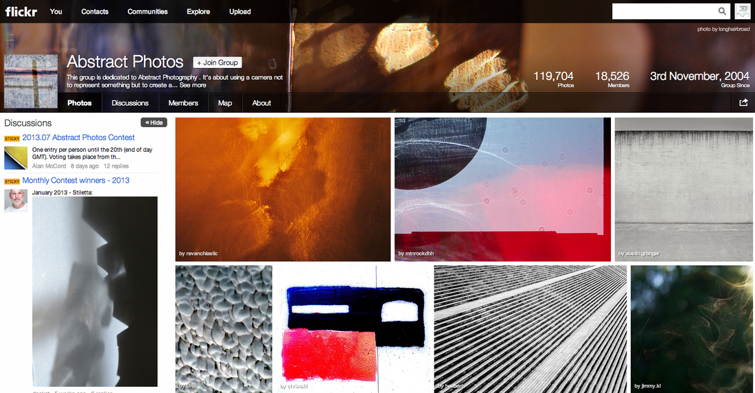
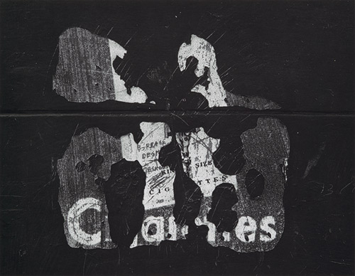
Flickr is another great place to look for inspiration. There are several groups dedicated to promoting abstract photography like this one opposite. Here are some others: |
Task 1: |
|
The Formal Elements
Photographers are usually aware of the ways in which they can create interest in their images beyond the simple fact of the subject. This is what separates good pictures and bad pictures of the same thing. The following list describes some of the abstract elements in any photograph. Below the list is an example of how you can analyse a photograph looking for these things specifically and how this helps to give the image meaning:
|
Focus:
Light: Line: Repetition: Shape: Space: Texture: Value/Tone: |
Which areas appear clearest or sharpest in the photograph? Which do not?
Which areas of the photograph are brightest? Are there any shadows? Does the photograph allow you to guess the time of day? Is the light natural or artificial? Harsh or soft? Reflected or direct? Are there objects in the photograph that act as lines? Are they straight, curvy, thin, thick? Do the lines create direction in the photograph? Do they outline? Do the lines show movement or energy? Are there any objects, shapes or lines which repeat and create a pattern? Do you see geometric (straight edged) or organic (curvy) shapes? Which are they? Is there depth to the photograph or does it seem shallow? What creates this appearance? Are there important negative (empty) spaces in addition to positive (solid) spaces? Is there depth created by spatial illusions i.e. perspective? If you could touch the surface of the photograph how would it feel? How do the objects in the picture look like they would feel? Is there a range of tones from dark to light? Where is the darkest value? Where is the lightest? |
| Paul Strand handout.pdf |
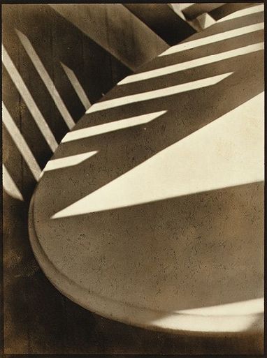
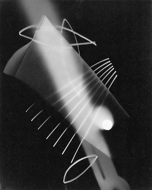
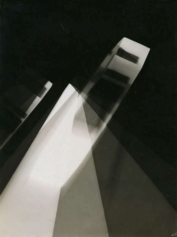
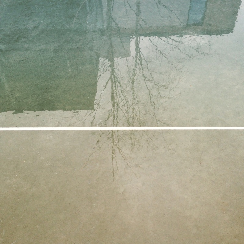
This image is by Paul Strand. It is entitled 'Abstraction, Twin Lakes, Connecticut' and was made in 1916. You can read more about the image here. The photographer created an abstract image deliberately, drawing attention to the Formal Elements.
|
Focus: The whole subject is in focus. However, there is a slight softening of the focus towards the bottom of what appears to be the edge of a table top.
Light: A triangular slash of bright sunlight appears in the middle of the image. This is accompanied by bands of light running diagonally across the upper portion of the image. These appear to be gaps in another object out of shot, a fence perhaps. Line & Shape: There are number of strong lines, mostly straight, although these are complemented by the sweeping curve of the main object which runs from the top right of the image to the bottom right. All of the lines have the geometric quality of man made objects. Repetition: The shafts of sunlight running across two surfaces create a dramatic rhythm. A number if straight parallel lines are repeated in the composition, like repeated notes or beats in a piece of music. Space: The space in the image appears quite shallow, tightly constrained by the cropping. We don't the whole of any of the objects and the photographer appears to have been quite close to the subject. Texture: All of the objects in the image appear smooth. The drama comes from the jagged bursts of light across their surfaces. Value/Tone: The image contains a range of tones from very dark to very light. There are deep shadows but also mid tones. The photograph is monochrome but has a brownish tint, perhaps caused by the paper the artist has used. |
Task 2: |
Here are some famous examples of abstract photography to help you get started:
|
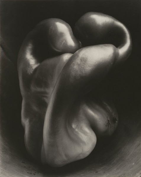
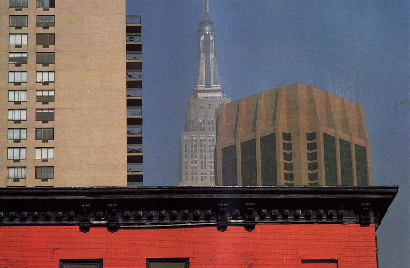
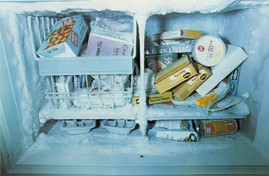
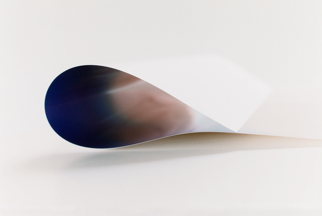
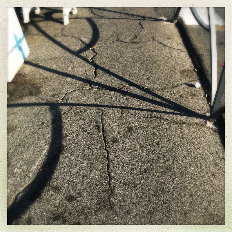
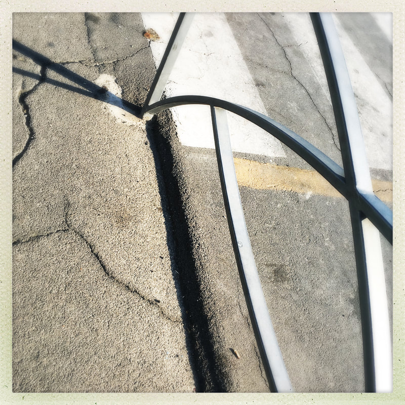
Some examples of abstract photographs
These photographs are focused on the formal elements and are some examples of abstraction. The photos simply focus on line, shadows, light, shape colour and some are also a mixture of several elements. For example, some of them focus on colour, blurred, out of focus images and images that are taken from odd angles. All of them were taken outside where I looked around me for the formal elements. You will see that some of the images are recognisable objects and some are abstractions of objects as the focus is on the element rather than the object. If you look carefully you will start to see the world around you in terms of lines, shapes, colours and textures-don't be afraid to capture the formal elements and take some really interesting photographs.
Sub Themes
When you are getting started on a big project like this it's a good idea to break the main theme down into a number of sub themes. This means you can do some practical research on one of these sub themes to begin with without feeling overwhelmed by all the options available to you. Here's a mindmap of possible sub themes associated with the main theme of Abstraction:
Task 3: |
|
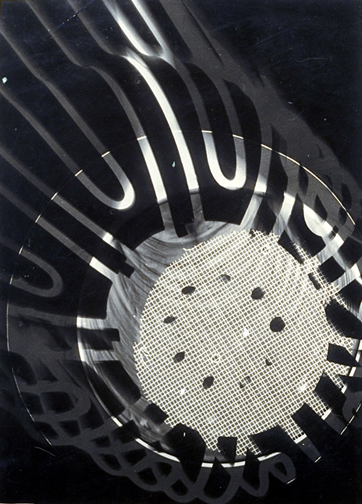
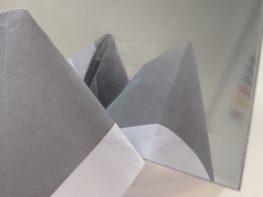
Experiment: Photograms
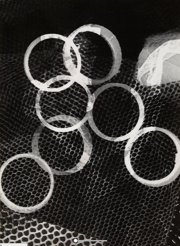
Take a look at these photograms. They are examples of abstract photographic images. Think about how they might have been made. What materials might have been used by the photographer? How were they arranged on the photographic paper? What can you learn from these images about how to make really effective, abstract photograms?

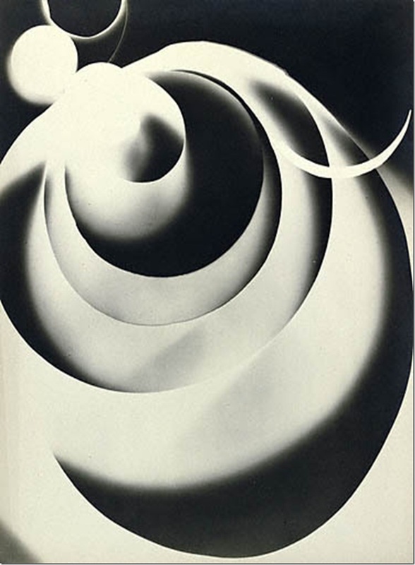


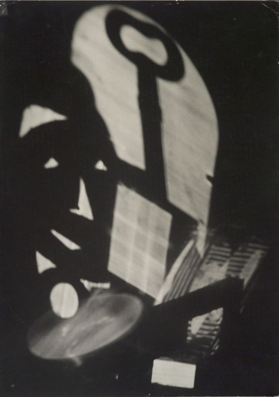
My favourite photogram
|
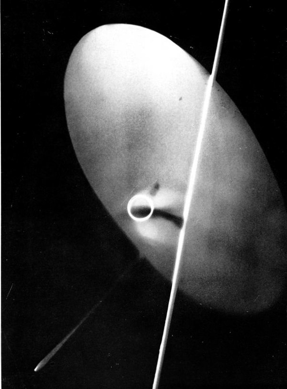
This photogram is by Laszlo Moholy-Nagy and was made between 1939-41. I like this image because it appears completely abstract - it's not possible to tell what any of the objects used to make the photogram actually are. They have been transformed in the process of making the picture. Unlike lots of other examples, the artist has chosen to leave a lot of the background blank. These are the dark areas are where no objects were placed during the exposure. The artist seems to have used several objects which he has overlapped. Some were clearly touching the photographic paper (the brightest areas) whereas others may have been floating just above it. Some light has managed to get underneath these creating mid tone areas of light grey. The objects are placed diagonally (top left to bottom right). This makes the composition a little more dramatic. The objects create a strong, graphic shape which is a combination of a cross and circle. There is a dramatic tonal contrast between these shapes and the black background. Although totally abstract, the picture suggests a mechanical object moving through space at speed - an aeroplane perhaps.
|
Your photograms
On your Abstraction web page, write a brief introduction about photograms. Research carefully online and write the technique in your own words. Add a gallery of your favourite examples but choose those that seem the most abstract. Choose one photogram that you really admire. Write a detailed analysis of it using the language of the Formal Elements to help you (see my example above).
When you have created some examples of your own in the darkroom, scan them and add to your web page in a gallery. Evaluate your work using the following prompts to help you:
When you have created some examples of your own in the darkroom, scan them and add to your web page in a gallery. Evaluate your work using the following prompts to help you:
- What decisions did you make before you created your first photogram - what materials did you choose? How did you arrange them on the paper?
- Did you keep the objects still or move them during the exposure? Were they all touching the paper or not? What effects have you managed to create e.g. shadows, tones, translucency, overlapping forms etc.
- Which of your photograms worked well? Explain why.
- Which of your photograms worked less well. Explain why?
- If you had more time in the darkroom, what you do differently and why?
3 ideas:
Once you have completed your evaluation of your first set of photograms, think of three things you could do to refine and develop your next set:
- Idea #1
- Idea #2
- Idea #3
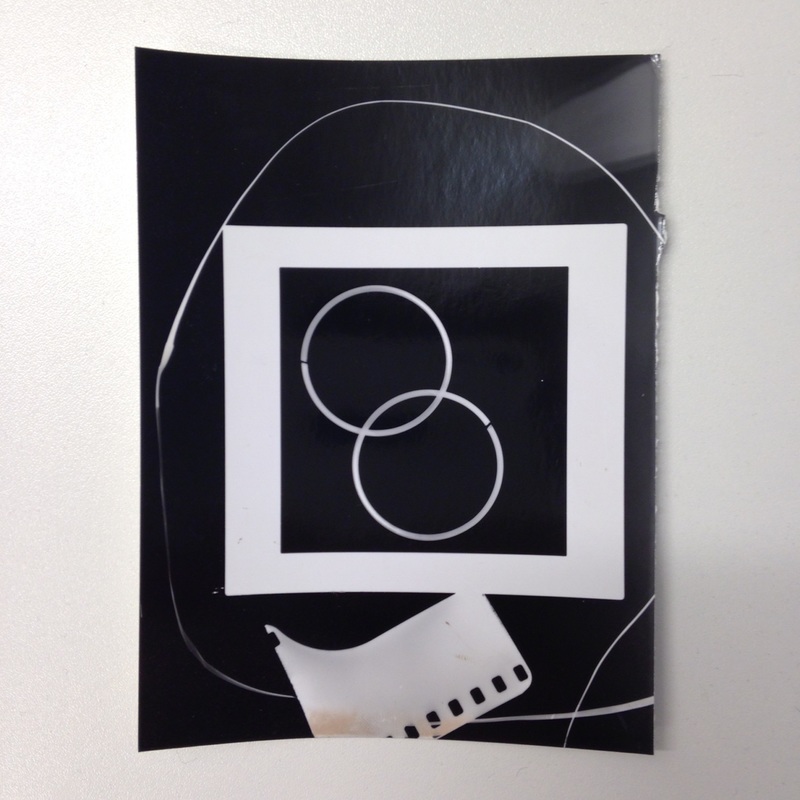
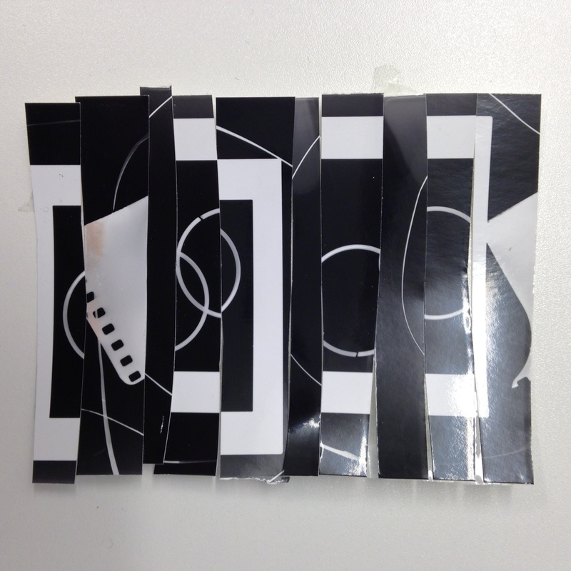
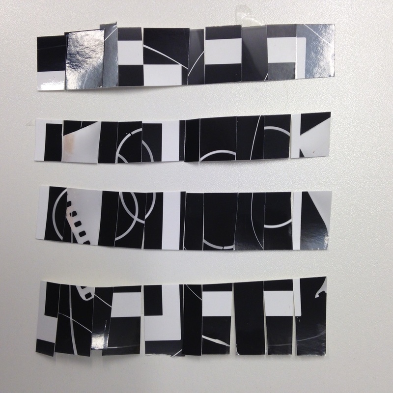
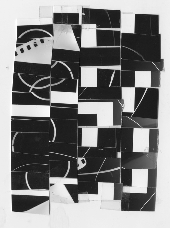
Photogram Cut-Up

|
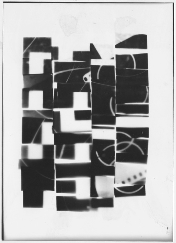
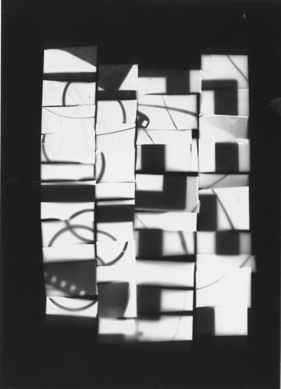
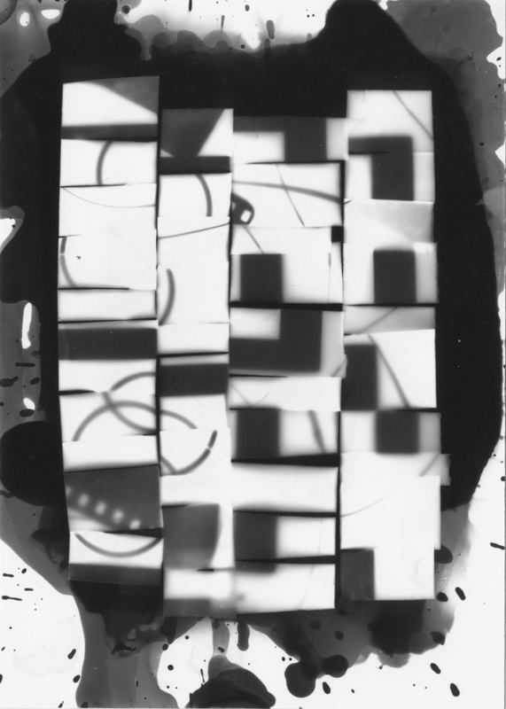
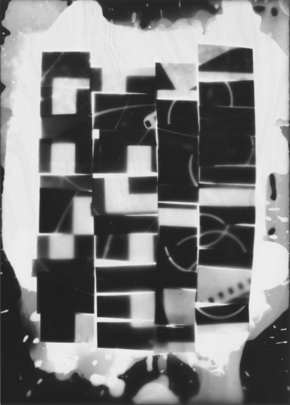
I decided to adapt one of my photograms, cutting it up and re-arranging the pieces to create a more abstract composition. I intended to take this back into the darkroom to create other photograms using this as a paper negative. I cut the image into strips in two directions, using clear tape to hold the strips together. In the darkroom I created a positive from the negative, submerging the print in the developer to create a black border. I then used this positive as the source of the next exposure. This time I decided to paint the developer onto the paper using a sponge. I then used this image to create one final negative version of the photogram. I'm really pleased with the results and I would like to continue to experiment with making more images like this.
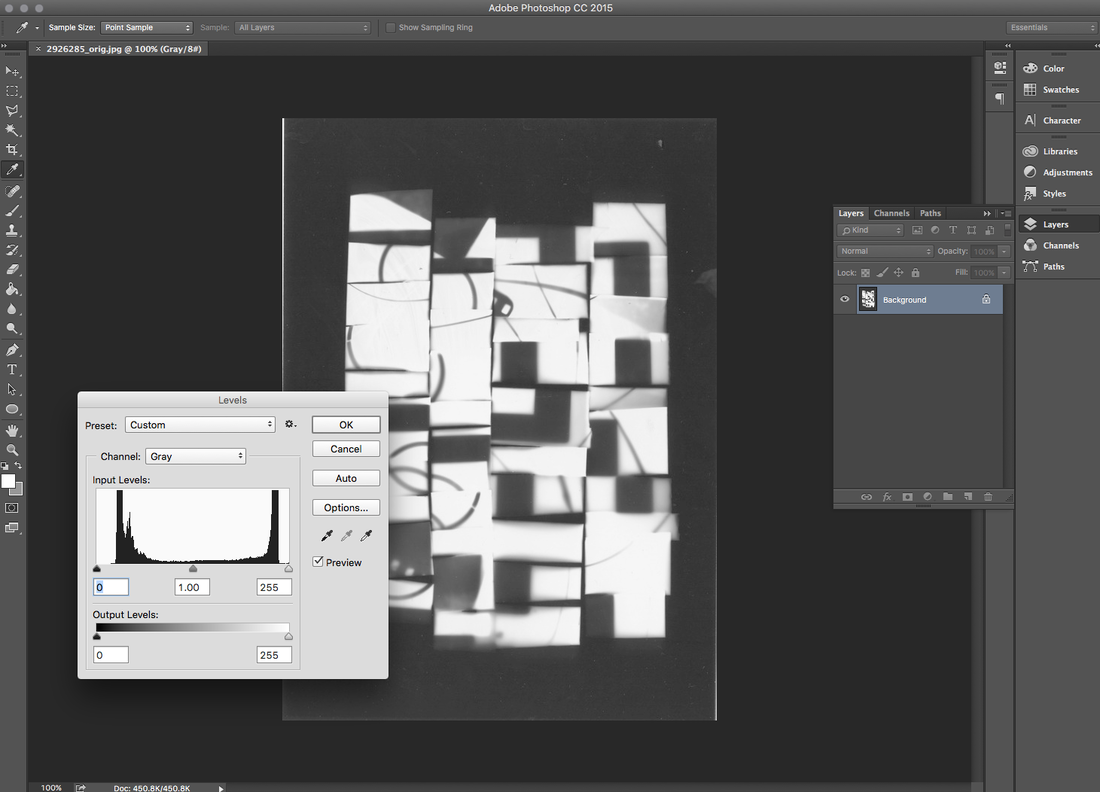
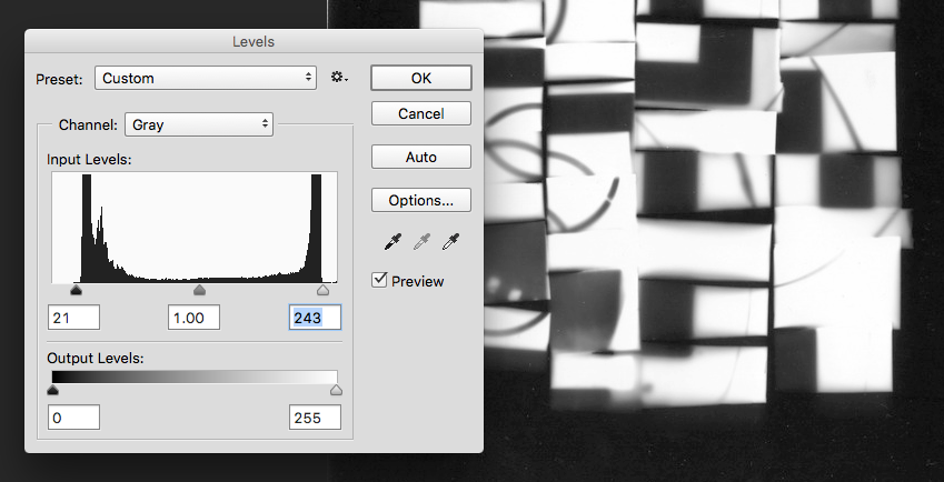
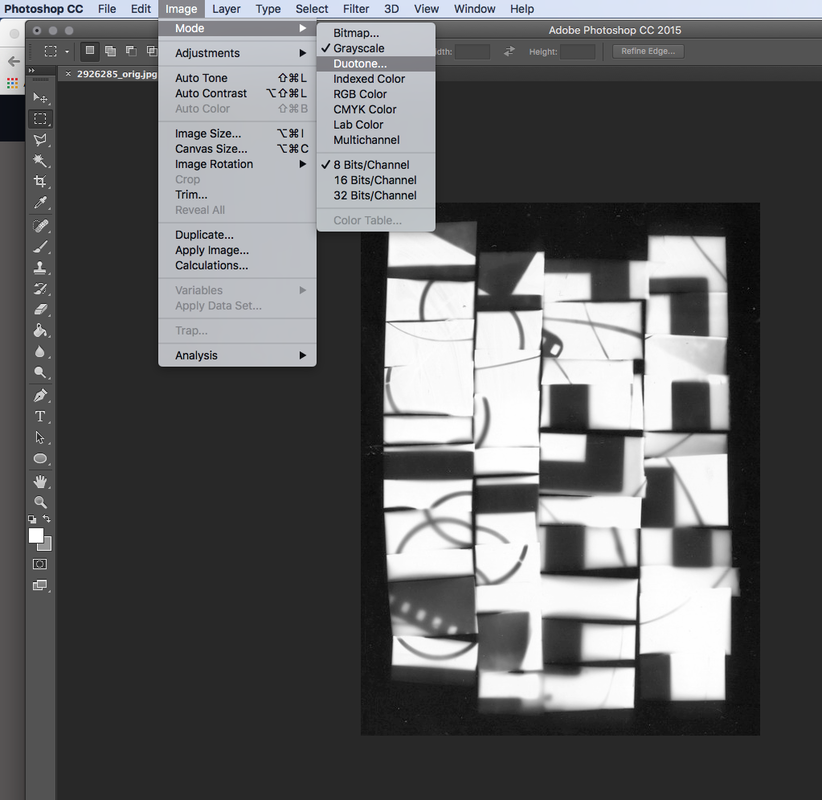
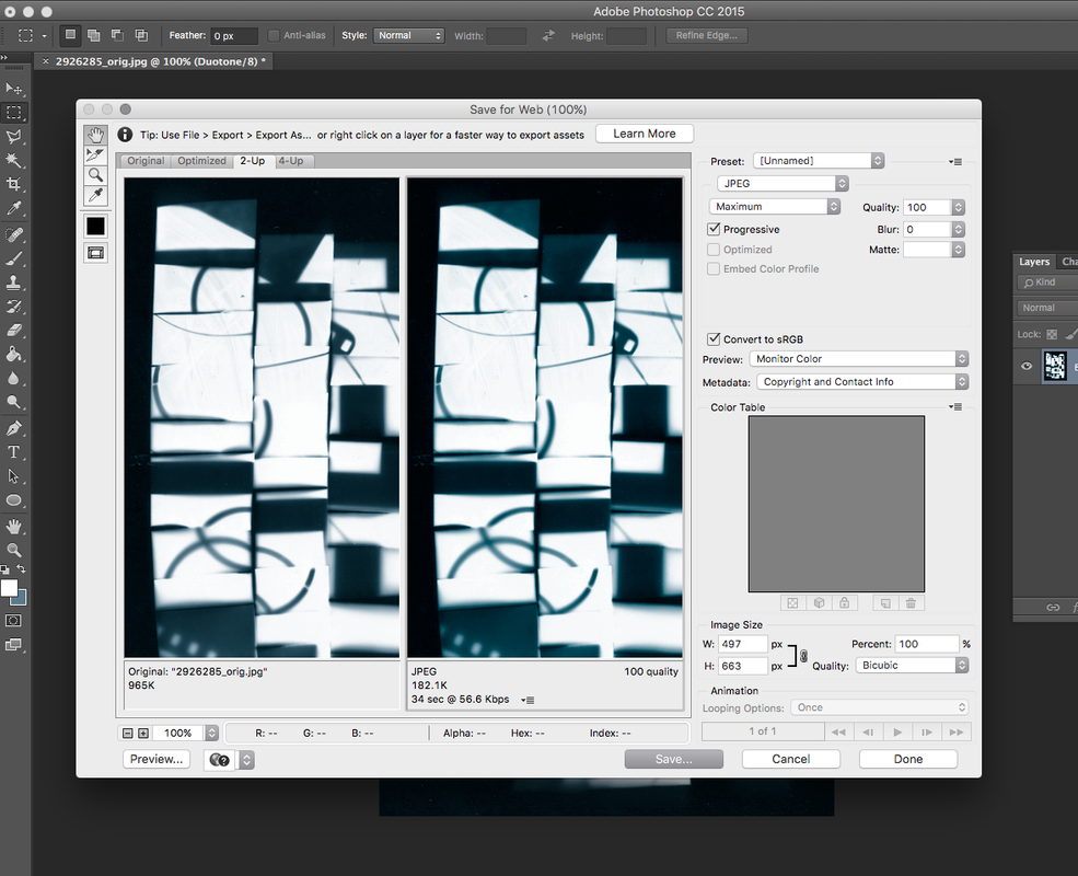
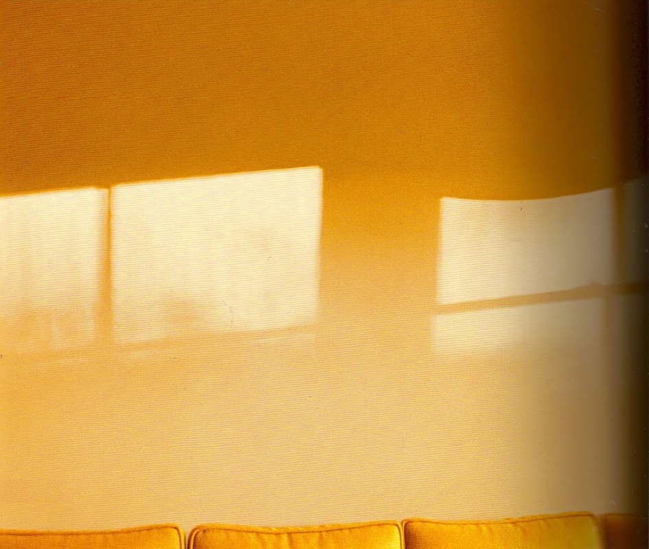
Photoshop DuotoneI decided to continue to experiment with a scanned version of the image on the left in Photoshop. I wanted to add a layer of colour to the image so I learned how to make a duotone. This is an old printing technique in which an image is made using contrasting half tones (usually black combined with another colour). This process can now be achieved in digital editing software like Photoshop. Below you can see screen grabs of the process. I cropped the image and increased the contrast using Levels. I then applied the Duotone to the Greyscale image. I chose a red and a blue colour. I think the finished blue image works really and is more subtle than the original black and white. You can see both below.
|


|
|
Assessment Checklist:
Your work on photograms will be assessed using the criteria from the exam board to give you an idea of how you have progressed in photography since the start of Year 10. Here's a quick checklist of evidence you need on your website:
- AO1: Research and ideas. Make sure that you have explained what a photogram is and provided some examples of important photograms from the past. You should have selected one to write about in some detail, referring to the Formal Elements.
- AO2: Experimentation, refining and developing. Make sure that you have included examples of your experiments in the darkroom and with your photogram cut-ups. Explain what decisions you made and why. Demonstrate how you have taken some creative risks and improved the quality and consistency of your work over time.
- AO3: Documenting your learning. Make sure that your website is clear and well-organised. Think carefully about the layout of text and images. Ensure that your spelling, punctuation and grammar is accurate.
- AO4: Final outcomes and evaluation. Make sure that you display your final outcomes properly. You should have examples of photograms, your photogram cut-up(s), the prints you made from the cut-ups and at least one final duotone print made in Photoshop mounted on a board. You could include a photograph of you holding your display board on your website. The evaluation of this work should be detailed and thoughtful - WWW/EBI.
Research:
In order to do well in photography you need to demonstrate that you are able to do strategic research. Good ideas come from good quality research. This is a way of finding out more about a particular photographer, theme or subject or technique so that you learn something new and can begin to experiment with your own responses.
Take a close look at the work of the following photographers. They approach the idea of abstraction in different ways. Choose 2 or 3 photographers who particularly interest you. Find out about them. Select some examples of their work that you think explore the theme of abstraction (NB. try to find examples in addition to those I've selected here). In your own words, write about why you think they are interesting.
Try to use some of the language of the Formal Elements (Focus, Light, Line, Repetition, Shape, Space, Texture, Tone) and other subject specific vocabulary.
Also, try to explain what you have learned from looking at them and how they might influence your own abstract photography.
Jaromir Funke


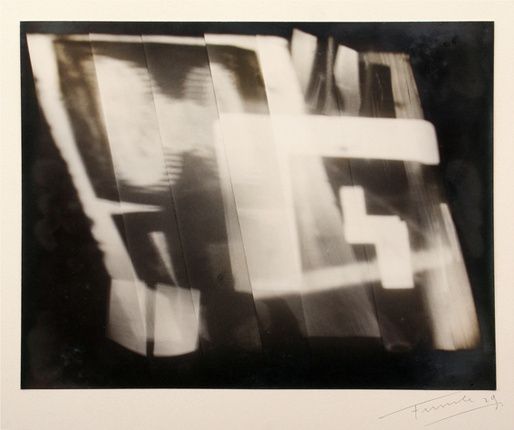

Funke's images interest me because he seems very experimental in his approach. He is fascinated by the patterns of shadows caused by the play of light on a variety of objects. This results in abstract compositions where the shapes of the various objects overlap and intersect. I intend to experiment with this approach which is less reliant on natural sunlight - especially now that the winter months have arrived.
Uta Barth
Barth is a contemporary photographer whose practice is about exploring light and space. She often takes images which are deliberately out of focus to draw our attention to the quality of the light rather than the objects it describes. She is also interested in colour and composition. Her images are usually low in contrast, as if the whole scene is bathed in light. There are very few dark shadow areas. I like the way she crops her images to make them even more abstract. However, it is nearly always possible to see what she is photographing despite it being abstracted. When I am able to photograph in natural light, I will use what I have learned from looking at Barth's compositions to create a series of light abstractions.
Harry Callahan


I love the way Harry Callahan is able to see patterns, textures and repetition. His images have just enough information. He knows just where to place the edges, to leave out unnecessary details, so that we are able to focus on the main idea. He has a fantastic sense of design. I am interested in creating some closely cropped photographs of natural forms so that they become more mysterious to the viewer. I will try to create images that are high contrast.
Ralph Eugene Meatyard
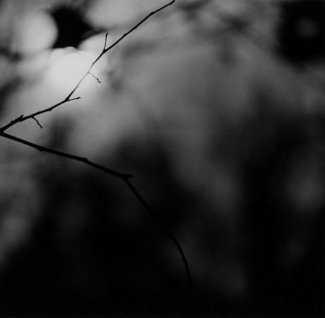
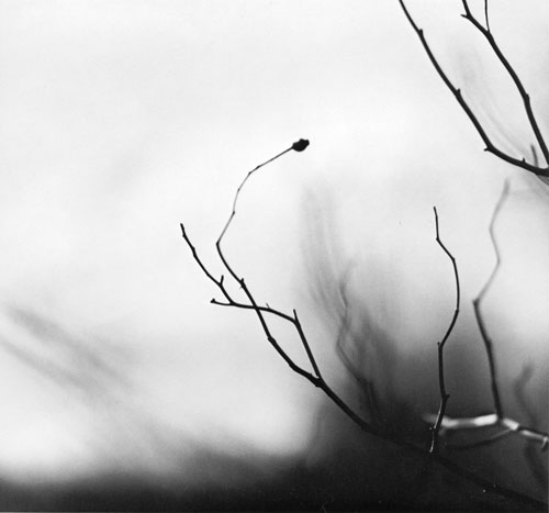
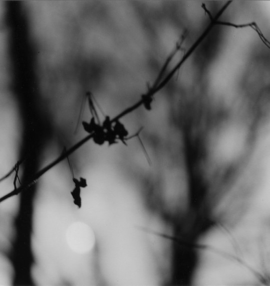
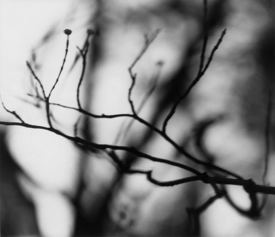

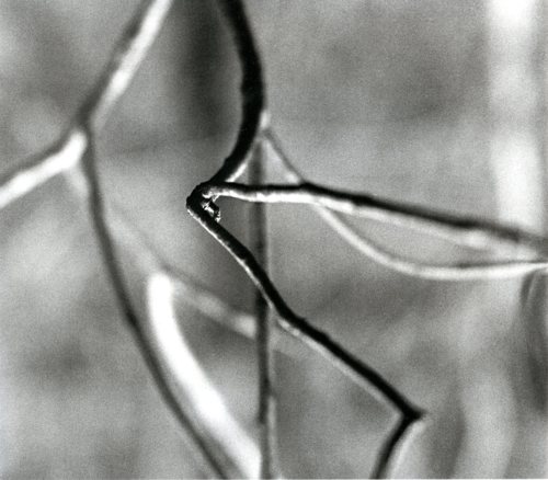
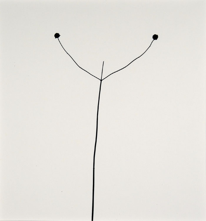
Meatyard lived in a rural part of the United States. He was an optician by trade and seems to have been fascinated by the way we perceive the world. He was also interested in Zen Buddhist philosophy. This series is called 'Zen Twigs'. He uses a very shallow depth of field to isolate individual twigs against the background. They are almost complete silhouettes. I'm very interested in creating a set of photographs of twigs and leaves shot with a telephoto lens and a wide aperture so that only a small part of the subject is in focus.
Ernst Haas

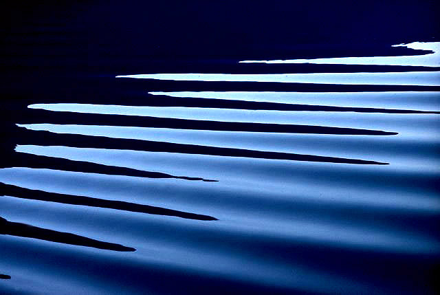
Haas pioneered colour photography and is also famous for his images of movement using long shutter speeds. He photographed water throughout his career, fascinated by its ability to reflect light and its dynamic movement. He crops the subject to increase the sense of abstraction. I would like to experiment with taking a set of pictures of moving water using a range of shutter speeds so that the subject is frozen and also blurred to suggest movement.
Aaron Siskind
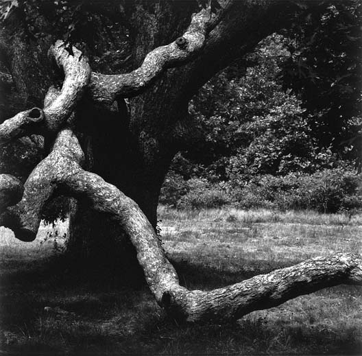
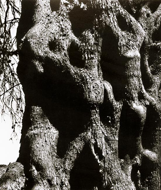
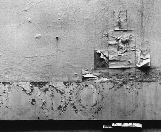

Siskind was interested in surfaces and textures, both from the natural world but also the urban environment. He gets in close to his subjects and fills the frame with detail. There is always a strong sense of design and all over interest for the viewer. I would like to try to create a set of photographs of natural and urban surfaces - tree trunks and city walls. I intend to crop the pictures so that the edges of the subject are not always visible. Hopefully this will create a greater sense of abstraction.
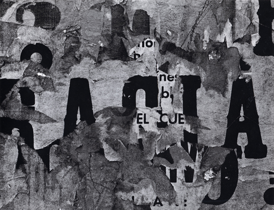
Keld Helmer Petersen
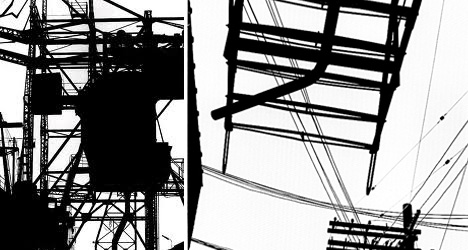
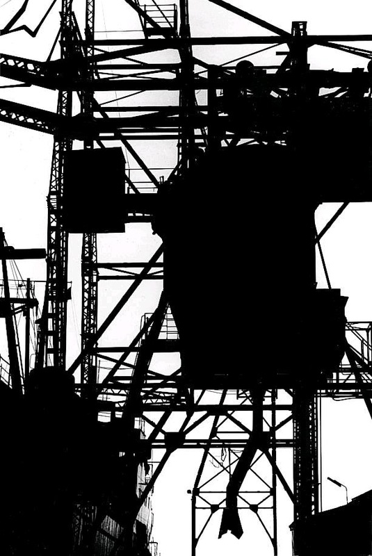
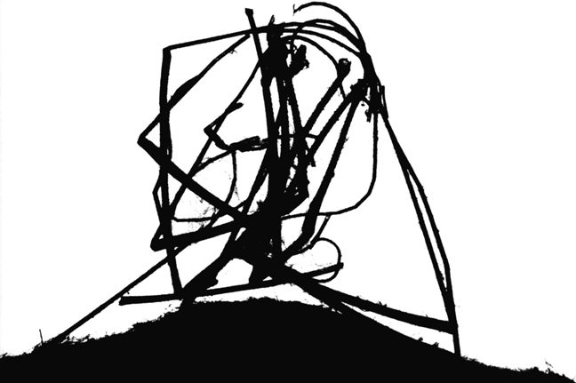
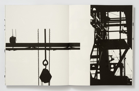
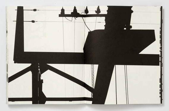

These images explore dramatic contrasts of black and white. Although they're mostly not images of the natural environment, I am interested in the way that Petersen explores negative space and the power of the silhouette to create stark, graphic images where pattern and shape are the dominant ideas. I wonder what trees, as well as scaffolding and cranes, might look like isolated against the sky, for example?
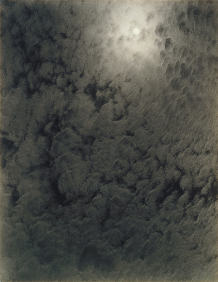
Alfred Stieglitz
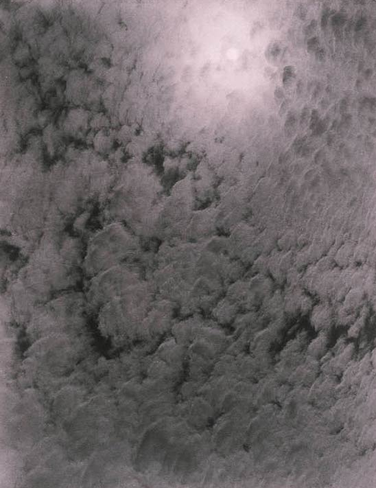
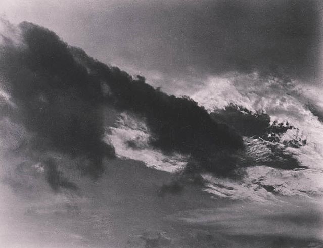

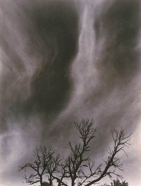
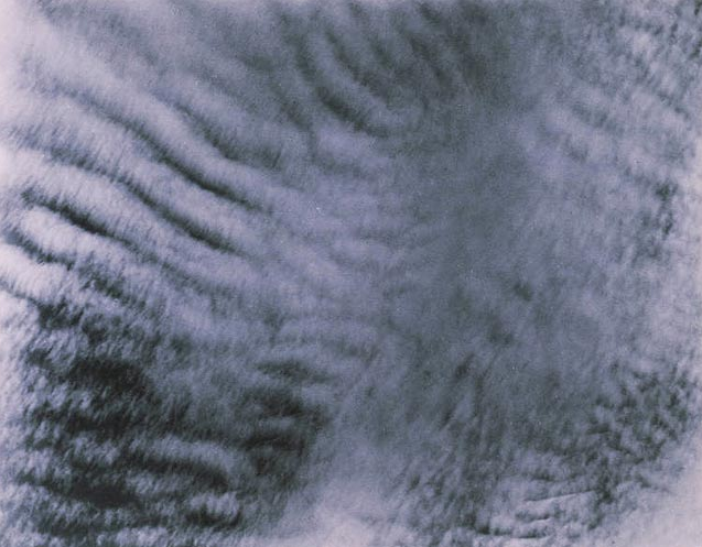
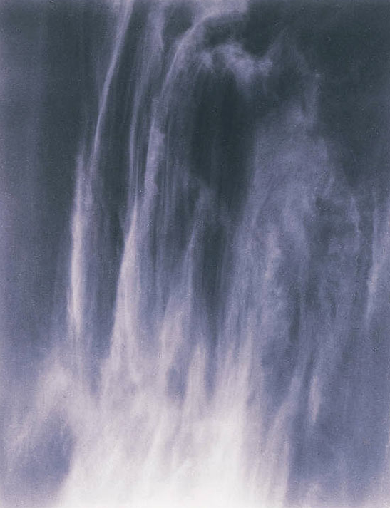
By photographing clouds, Stieglitz meant to demonstrate how "to hold a moment, how to record something so completely, that all who see [the picture of it] will relive an equivalent of what has been expressed." The 'Equivalents', as they are known, aim to create a sensation in the viewer similar to that experienced by the photographer. I wonder if this is possible. I will attempt to create my own 'Equivalent' pictures using a variety of subjects - clouds, fabric, walls etc.
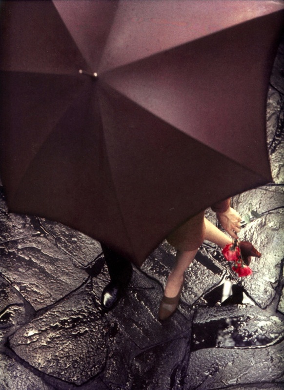
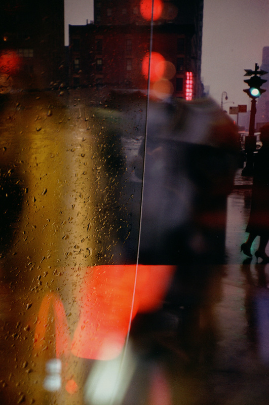
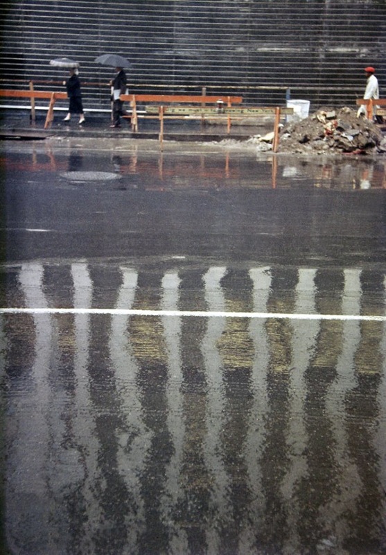
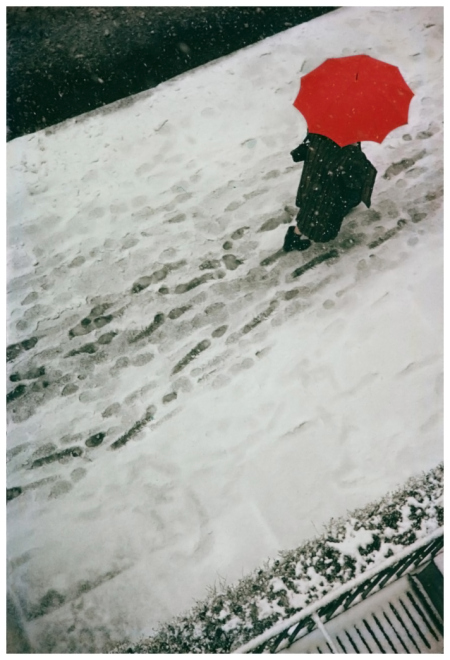
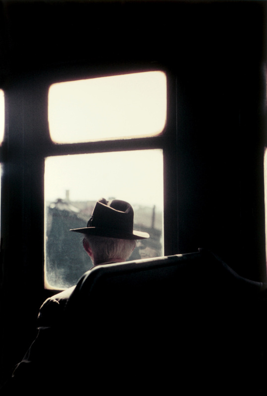
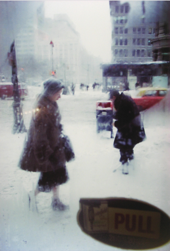
In Focus: Saul Leiter
Tale a look at these images by the American photographer (and painter) Saul Leiter:


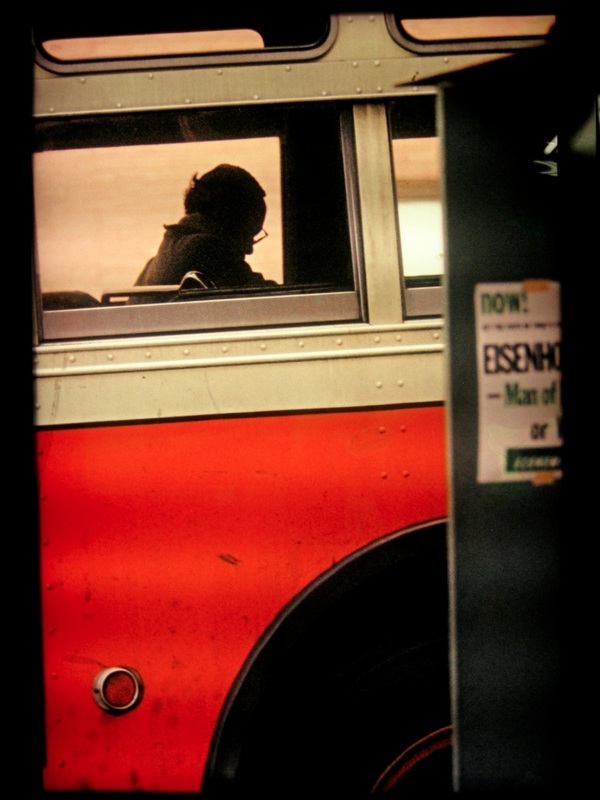
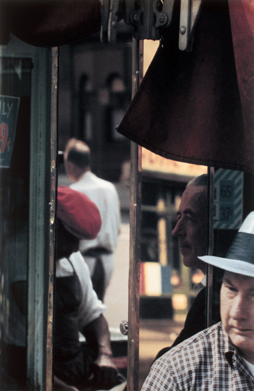


- Make a list of at least 5 characteristics (typical things) that define Leiter's photographs (Tip: think about the Formal Elements. Also, what do you see that's similar in three or more of these pictures?)
- Add a gallery of Leiter photographs to your website. You can find lots of his images online but try to select those that are at least 800 pixels wide.
- Choose your favourite photograph and place it above or next to a block of text. Write a more detailed analysis of the photograph using the following prompts to help you:
- Why did you choose this image in particular?
- What is surprising or unusual about this photograph?
- Look carefully and choose ONE of the Formal Elements that you think is important photograph in the photograph (E.g. Focus, Light, Line, Repetition, Shape, Space, Texture, Value/Tone).
- Describe why you think it is important (2 or 3 sentences)
- In what ways are Saul Leiter's photographs abstract?
Find a quotation by Saul Leiter and use the Block Quote widget to add it to your website. Explain why you chose the particular quotation and how it helps you understand the photographer's work.
Here's my favourite:
Here's my favourite:
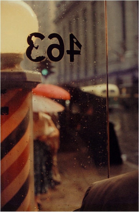
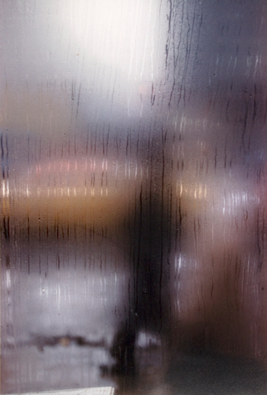
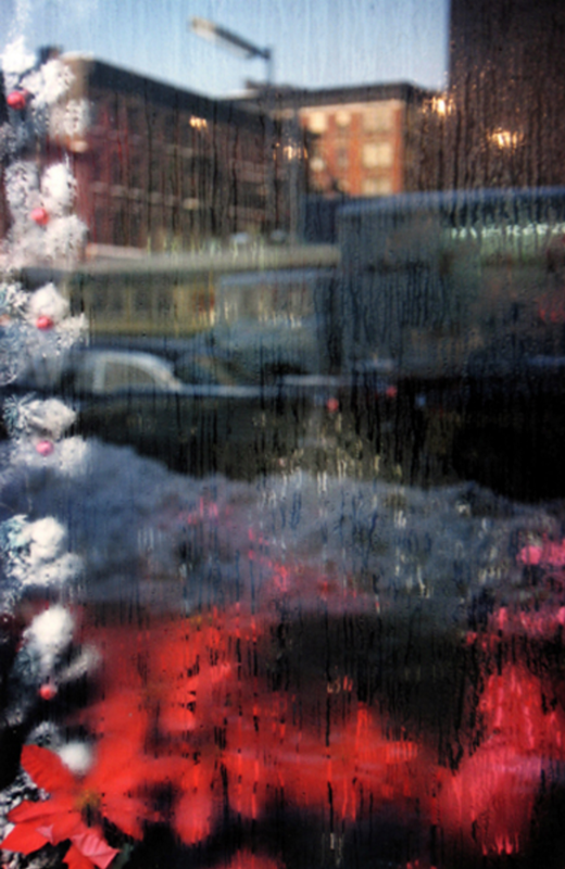
A window covered with raindrops interests me more than a photograph of a famous person.
-- Saul Leiter
I've chosen this quotation because it suggests the photographer's complete lack of interest in fame, money or celebrity. He seems much more excited by the ordinary details of everyday life, the things many of us take for granted or fail to notice. Many of his photographs feature rainy windows and he often photographs through them, focusing on the water droplets so that the scene beyond is blurry and indistinct.
I think he uses the rainy windows in a similar way to the way a painter might water down his colours, allowing them to blend and run together. You could even say that Saul Leiter paints with light.
I think he uses the rainy windows in a similar way to the way a painter might water down his colours, allowing them to blend and run together. You could even say that Saul Leiter paints with light.
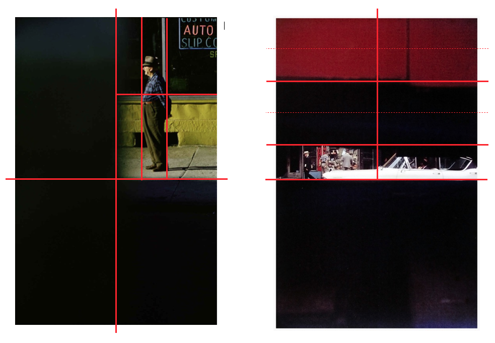
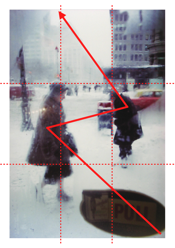
Saul Leiter's Compositions
Using either paper and pen, Post It notes or a Desktop Publishing programme (like Pages on the Mac), analyse the compositions in Saul Leiter's photographs. Draw lines on the image to indicate how he divides up the picture space. Here are a couple of examples. What do you notice? When you next make pictures influenced by Saul Leiter, think carefully about lines and shapes in the same way he does.
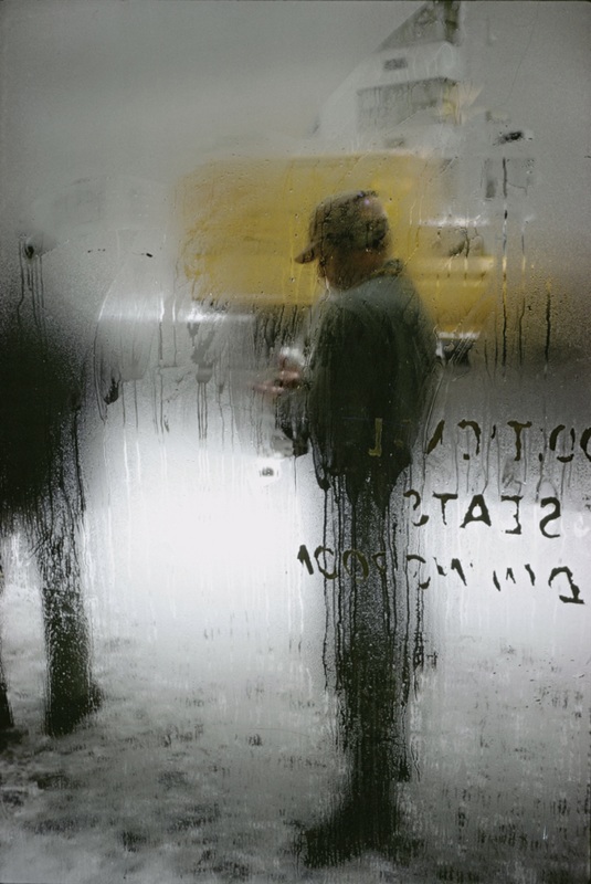
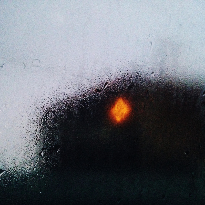
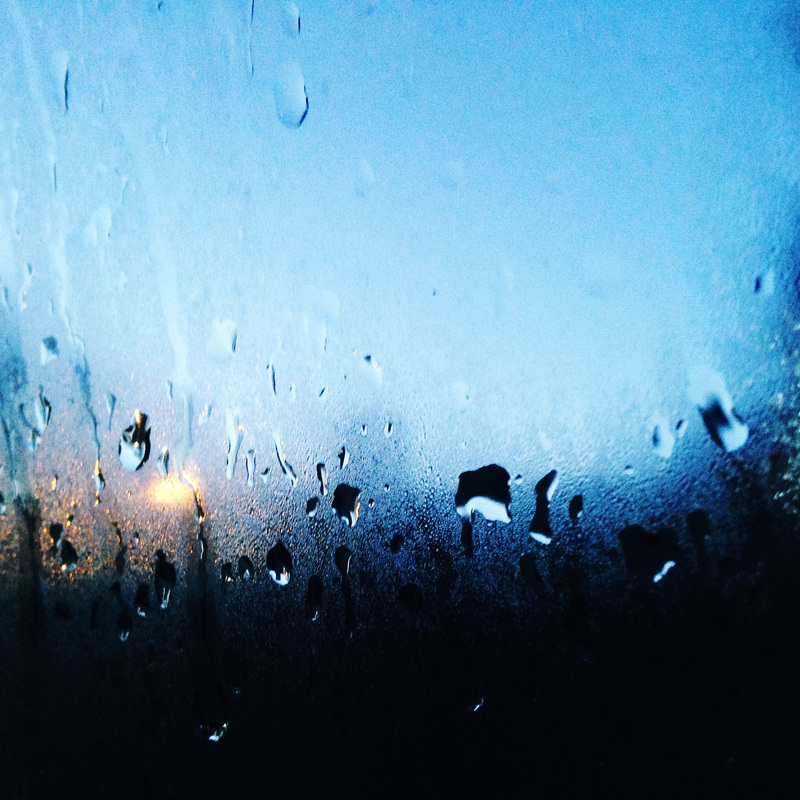
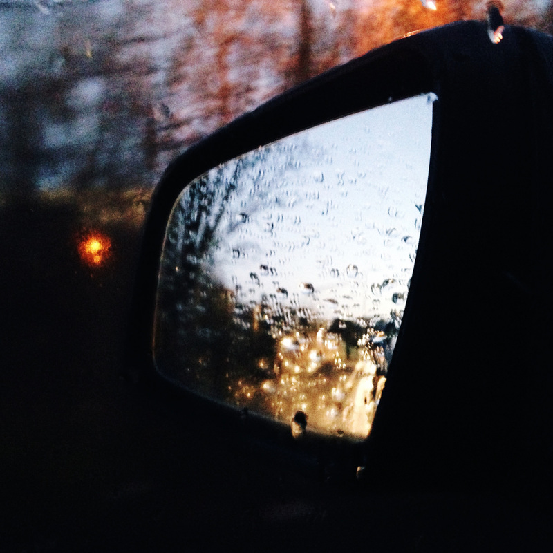
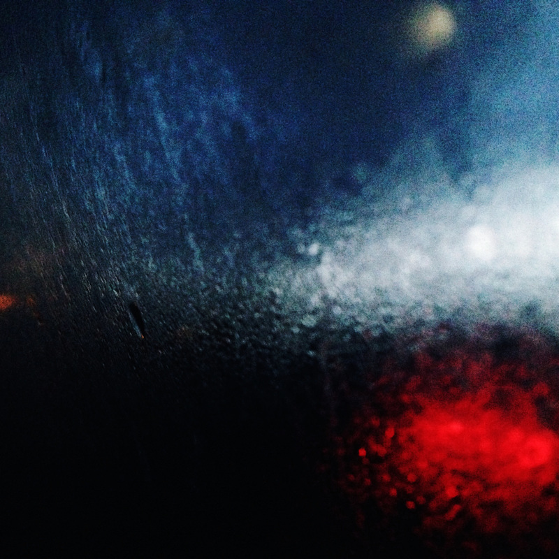
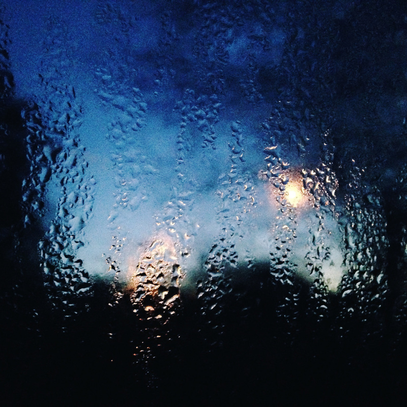
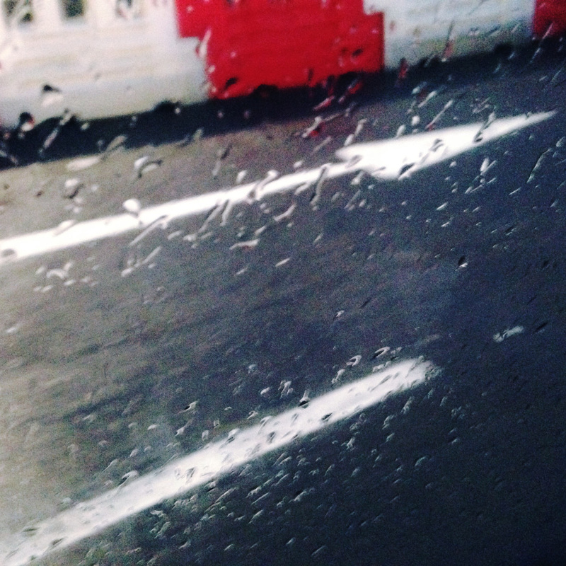
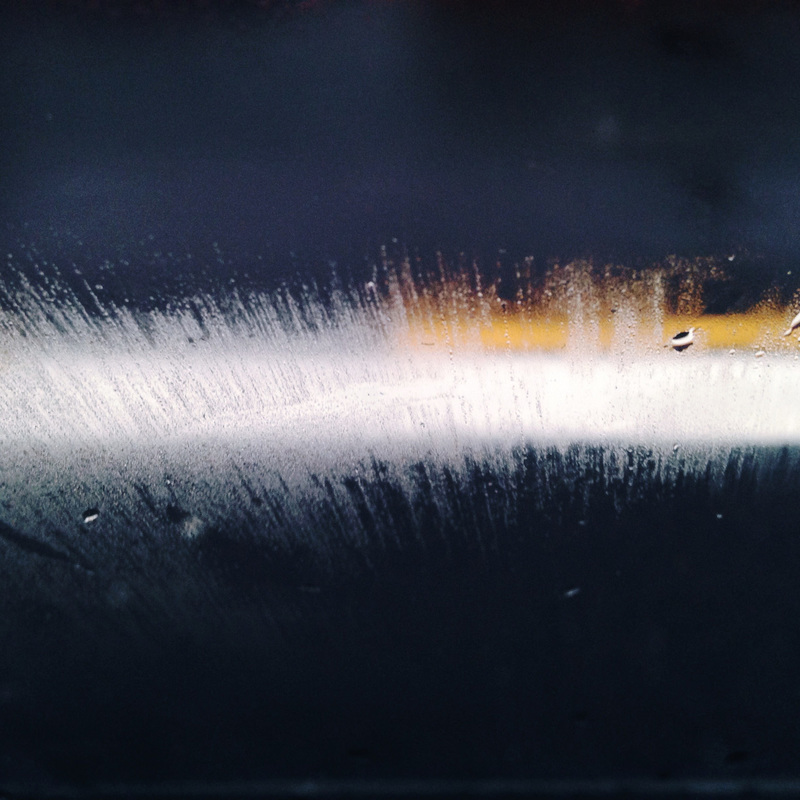
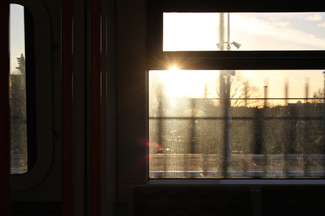
My Response #1: Through a car window
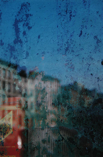
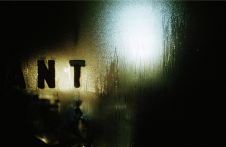
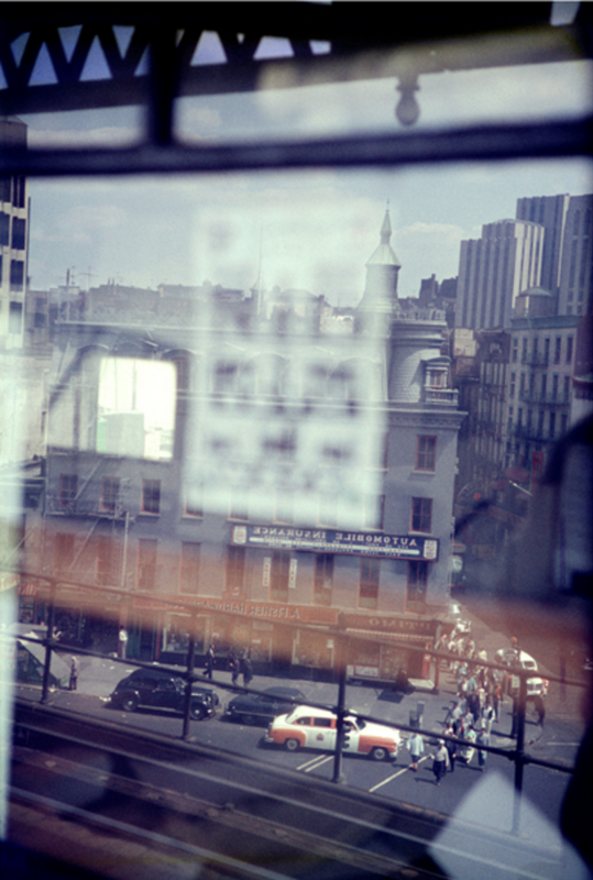
On my journey to school and at weekends recently I have been taking photographs through the car window. The condensation distorts the view and I have enjoyed playing around with focus, blur and depth of field in a similar way to Saul Leiter. These photographs were all taken with an iPhone.


My Response #2: School Leiter
I have been trying to better understand the way Saul Leiter composes his photographs. This series of images is an attempt to use my iPhone in a way that mimics Saul Leiter's approach. I used the grid display on my phone to help me line up verticals and horizontals and I was able to choose which section of the picture I wanted in or out of focus by pressing on the screen in the basic camera app. I have edited the pictures a little in Instagram, boosting the saturation and contrast or applying a colour filter.

Keywords:
blur, focus, depth of field, colour, composition, lines, shape, horizontal, vertical, grid, abstract, reflection, light, distortion, obstruction, view, arrangement, saturation
Big Ideas:
These are the BIG IDEAS or Threshold Concepts we're exploring in this project. Don't worry if they don't make immediate sense to you. Have a think about them and try to make some connections between these ideas and what you are doing when you look at other people's photographs and make your own.
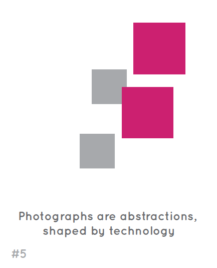
Cameras ‘see’ the world differently to the way we see the world with our eyes. The photograph (whether this is a printed image or pixels on a screen) can sometimes ‘disappear’ because photography is able to create an almost perfect illusion of reality. We tend to see only the subject of the photograph rather than the photograph itself. However, all photographs are, to some extent, abstractions. The flatness of photographs creates relationships between objects that may not have existed in reality. All photographic images are shaped by the technology the photographer chooses and by a process of selection, editing and manipulation. Each and every photographic image is therefore made or constructed, rather than being a window onto the world.
|
Photography is unlike other visual arts in that it begins with a world full of things rather than with a blank slate. Photography is more an art of selection and translation rather than of invention. However, photography is also an art of production, not just reflection. It does things to the subjects it represents.
|
Saul Leiter's influences
My work might be described as a search for certain notions of beauty. It’s an old-fashioned idea. The word ‘beauty’ is not particularly liked these days.
-- Saul Leiter, 2013
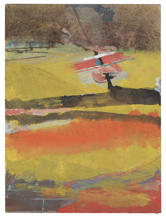
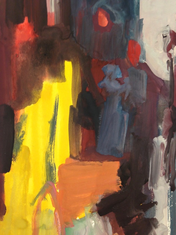
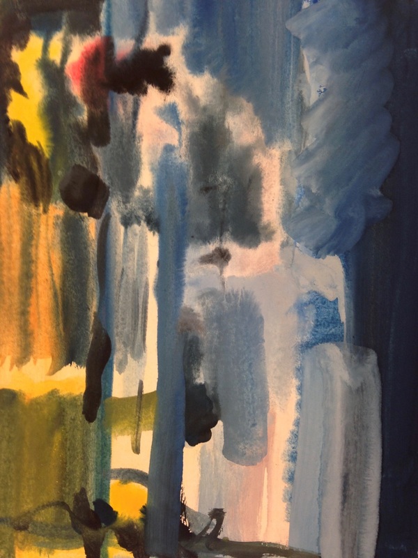
Saul Leiter loved to paint. He produced finished paintings that are in major collections but he also painted on photographs, on letters and in journals. He admired artists like Pierre Bonnard and Auguste Renoir. Here are some examples of his paintings. What similarities can you see between the paintings and the photographs?
Activity:
- Create a Gallery of Saul Leiter's paintings. Choose your favourite images.
- Now, select one of his photographs and one of his paintings that you think are similar in some way - use of colour, composition, lines, patterns etc. Place them side by side on your web page.
- Write a short paragraph or a few bullet points explaining the similarities and differences between the two images (like the example below).


|

|
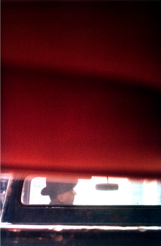
Compare & Contrast
- Both images are in portrait format. Both a relatively abstract. The painting is more abstract than the photograph. It is not possible to tell what the painting is about, whereas we can identify some of the objects in the photograph.
- These images have similar compositions. Large areas of relatively flat colour or tone fill the top and bottom of the picture drawing attention to a thin strip of lines and shapes running across the middle from side to side.
- However, they are also like negatives of one another. The painting on the left has lighter areas top and bottom and darker in the centre. The photograph on the right is the reverse of this with darker areas top and bottom and lighter tones in the centre.
- When I look at the painting, my eyes move from left to right across the centre, following the yellow, blue, green and red lines as they curve upwards. In the photograph my eyes follow the line of the car from right to left and then the man with the white hat walking towards the left hand edge of the frame.
- Both pictures seem to have areas that are 'out of focus'. The paint has been used in thin washes of colour that sometimes overlap. It looks like watercolour which has spread on the wet paper so that colours bleed into one another. Some of the lines have sharper edges. In the photograph, only the centre strip of information in the background is in sharp focus whereas objects in the foreground are blurry.
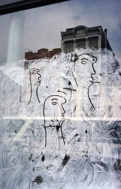
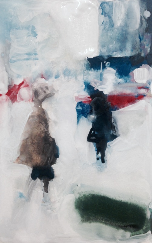
Painting Saul Leiter
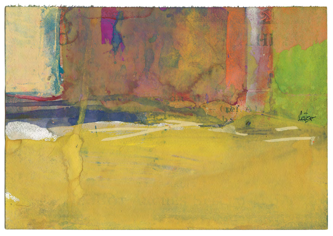
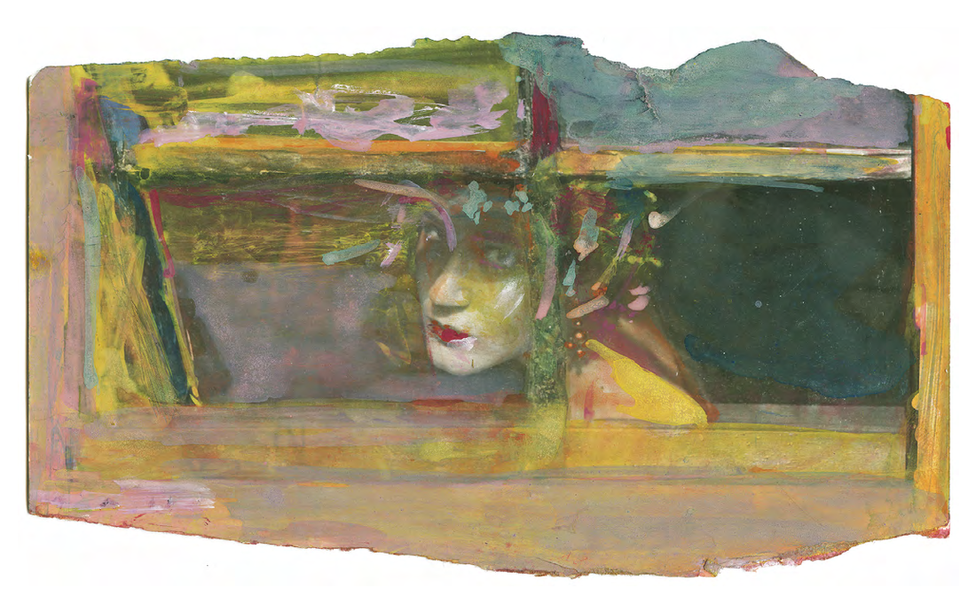
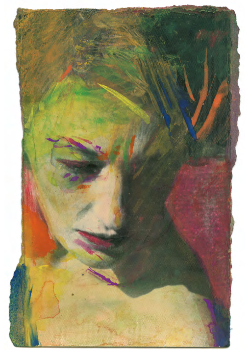
Sometimes the best way to understand how a photograph works, especially one like Saul Leiter's, is by drawing and/or painting it. Using an A5 piece of cartridge paper and watercolours, create a small painting that represents one of Saul Leiter's photographs. Once you've finished photograph or scan your painting and display them side by side on your website. You might want to try this several times. Remember, your painting will be abstract. There is no need to make it look like the photograph exactly. The idea is to look hard at the same photograph for a long period of time thinking about the Formal Elements and trying to translate colours, tones, lines, patterns etc. in paint. Underneath both images write a short paragraph about the experience of making your painting and what you may have learned about the photograph in the process.
Here's an example:
Here's an example:
|
|
|
|
I decided to try a couple more paintings, this time working more quickly and not worrying so much about making an accurate representation of the photograph. I chose the most abstract of Saul Leiter's images, those with lots of distorted reflections. I found it really challenging to translate the compositions and colours but it certainly helped me understand the photographs. The whole activity helped me look far longer at the photographs than I would have otherwise.
|

|
|

|
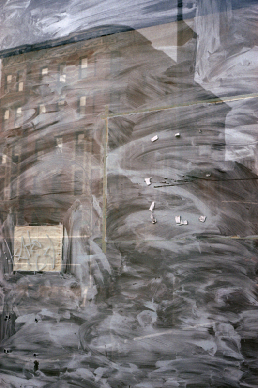
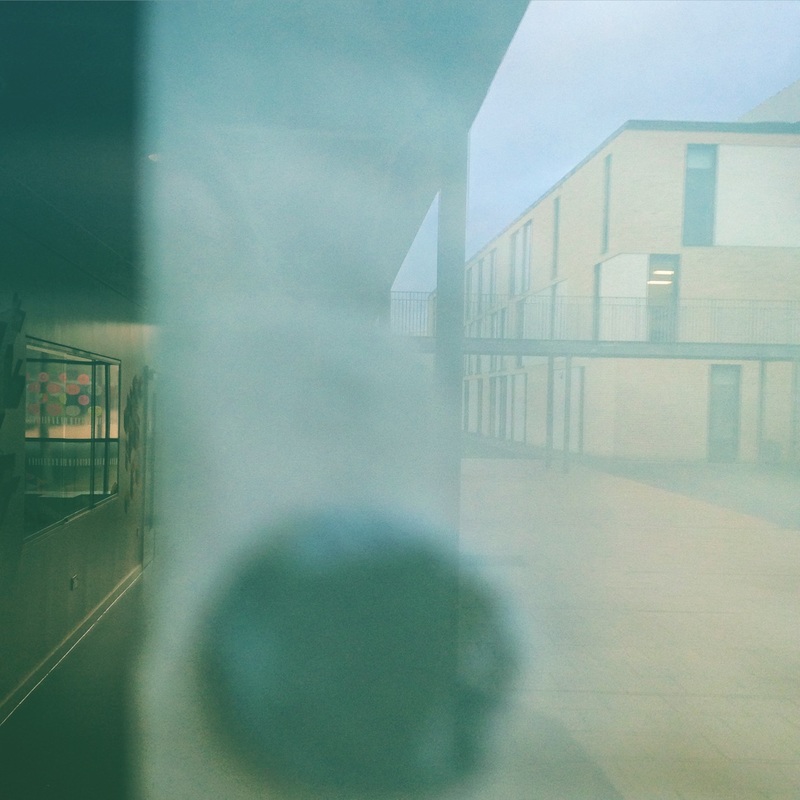
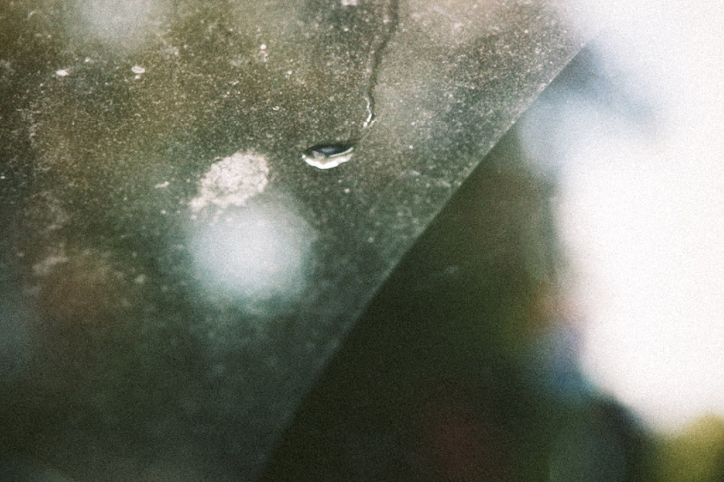
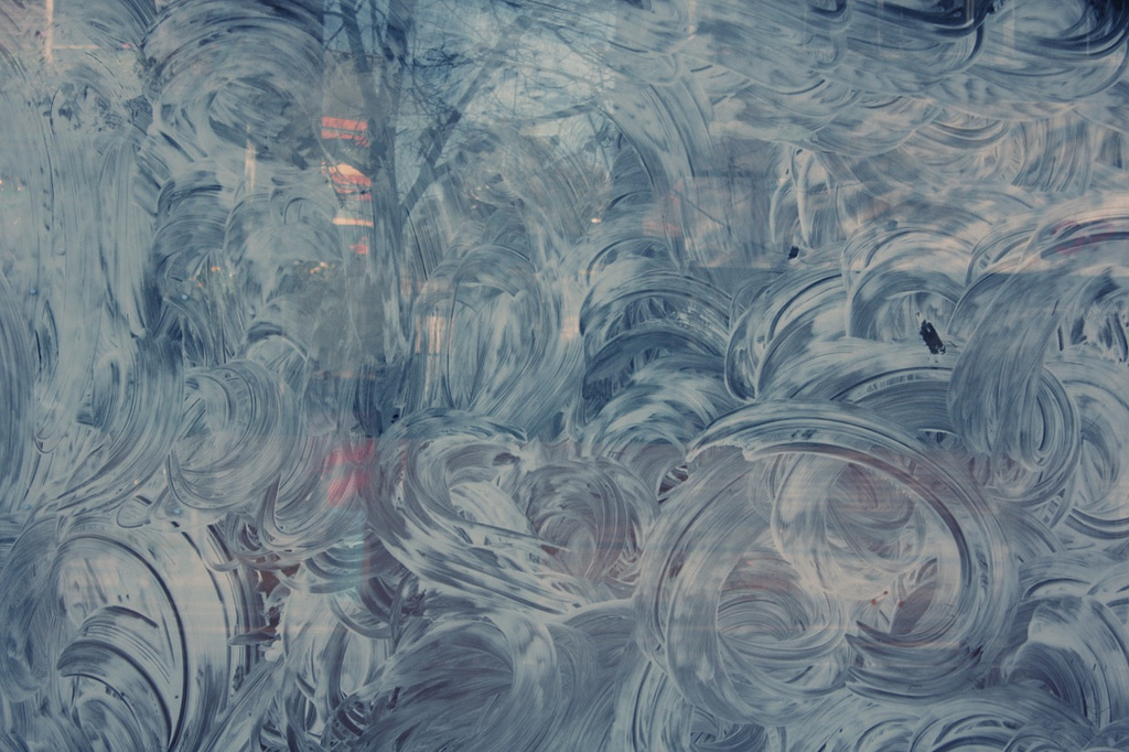
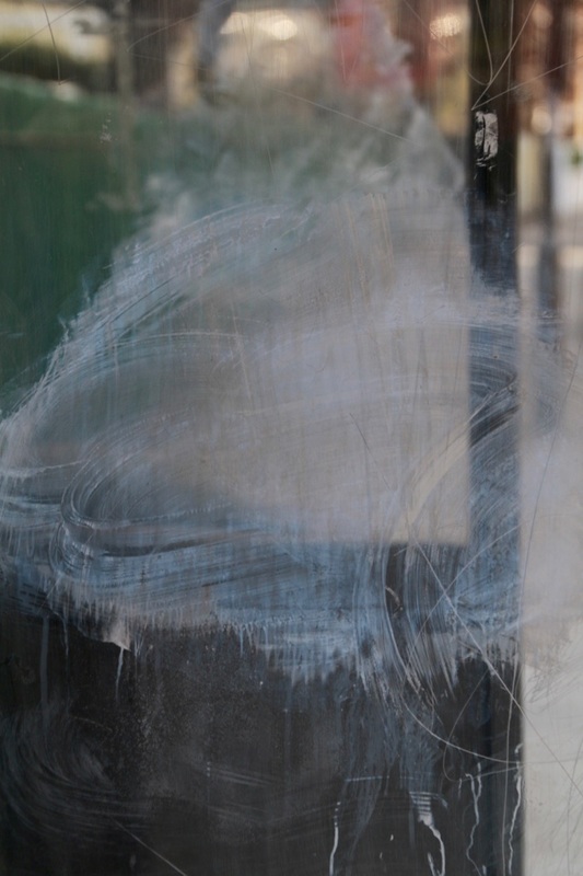
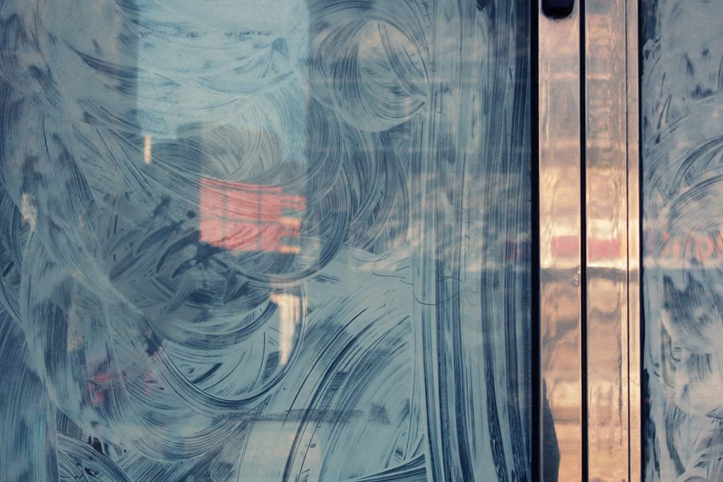
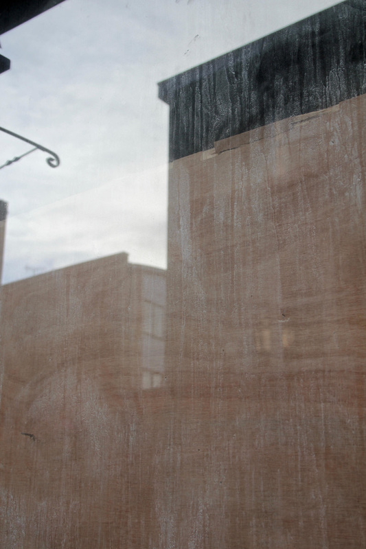
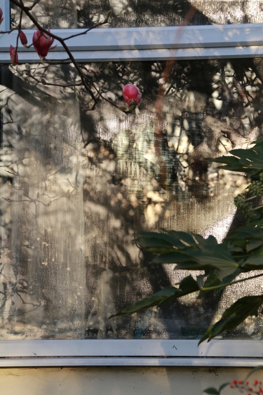
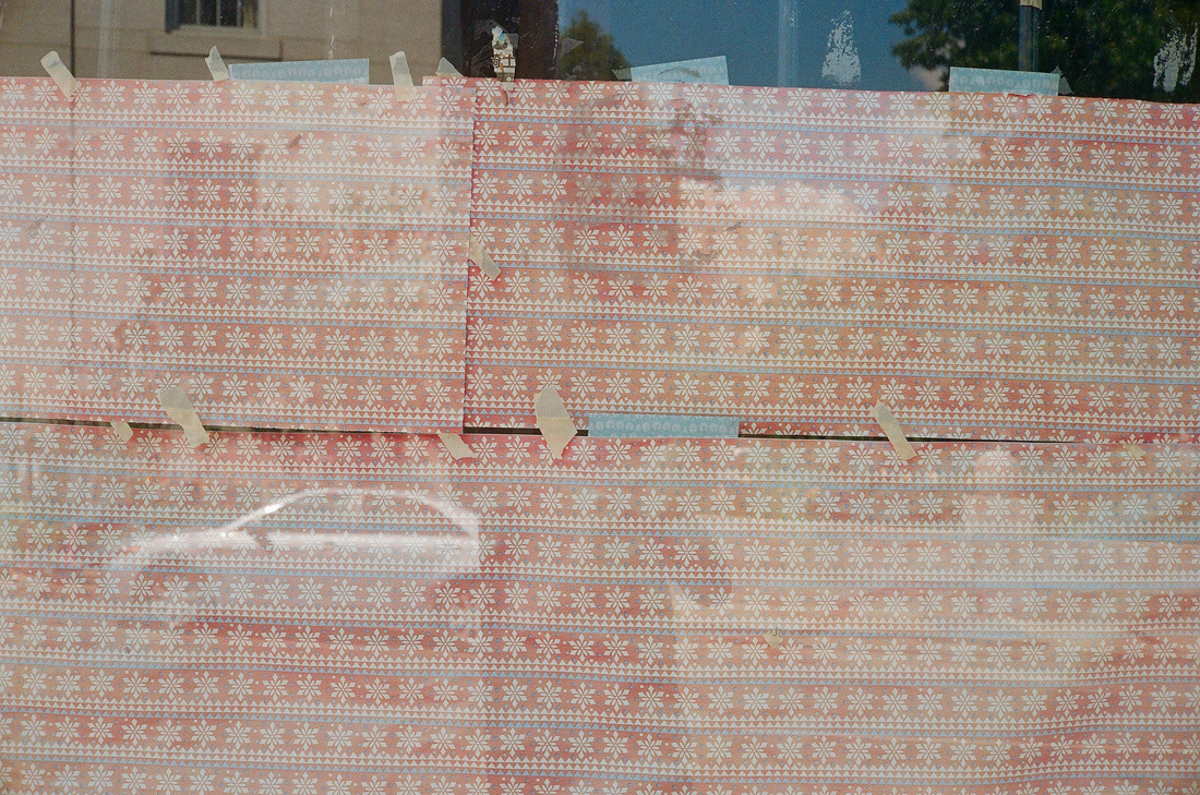
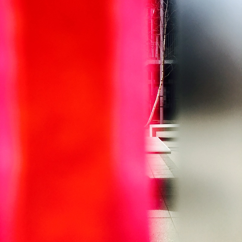
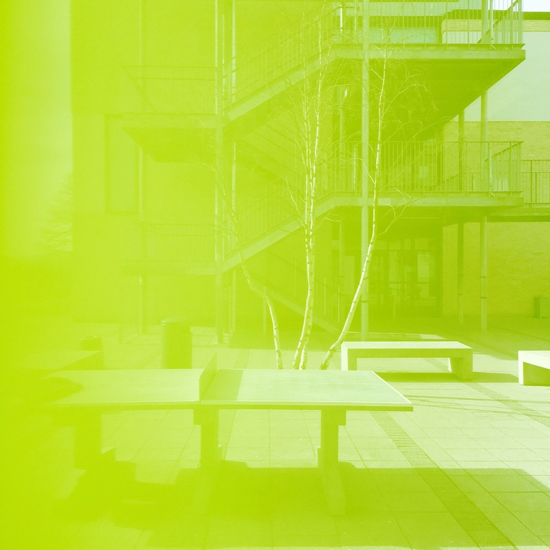
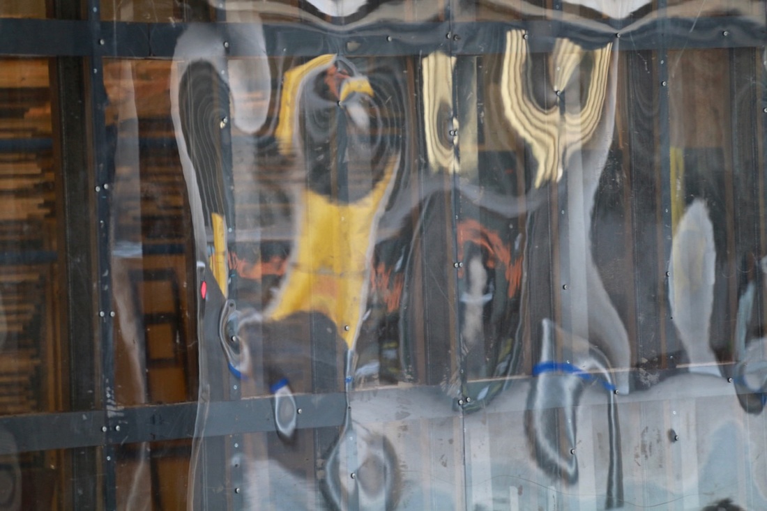
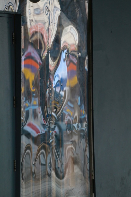
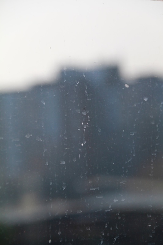
Views through glass
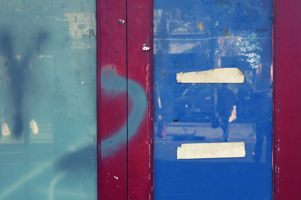
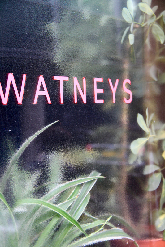
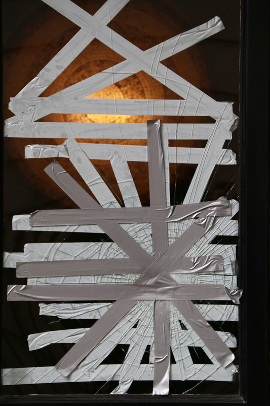
Inspired by Saul Leiter I decided to make some photographs looking through glass. I was interested in the combination of reflections, obstructions and distortions in these views. I'm generally pleased with the results. I'd like to include more colour in future and I'd also like to experiment with making pictures at dusk using longer exposures.


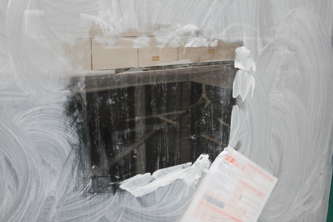


Obstructed views

|
One feature of Saul Leiter's photographs is that he often includes an obstruction through or beyond which a view appears. Using a piece of coloured card, carefully cut various shapes (apertures) into it. Hold the card up close to your camera lens so that it partially obscures your view. Experiment with focusing on either the distance or the card itself. Try various compositions. Create a new Gallery of these images and evaluate them. You may wish to compare and contrast one or more of your images with those of Saul Leiter.
|


Further research:
Research the work of other artists/photographers whose approach is similar to that of Saul Leiter. Choose one or more of the following themes/ideas:
- No focus/out of focus - Uta Barth, Bill Armstrong, Ralph Eugene Meatyard, Hiroshi Sugimoto
- Unusual framing choices - John Batho, Cristina Coral, Guy Bourdin
- Obscured and disrupted views - John Batho, Ray Metzker, Akihiko Miyoshi
- Expressive colour - Ernst Haas, Mitch Epstein, William Eggleston, Paul Graham
My final response:
Create a gallery of carefully curated images that demonstrate a sophisticated response to the theme of abstraction and the influence of photographers like Saul Leiter. You could include images you have already taken along with new pictures. You may wish to include images taken at home and/or at school. You may choose to edit these images in Photoshop or using other software. It is important that the photographs you choose work well together and that you have thought carefully about the order/sequence (i.e. think about the viewer's experience of seeing your images one after another).
Make sure you write a detailed evaluation of your completed set of photographs.
Make sure you write a detailed evaluation of your completed set of photographs.
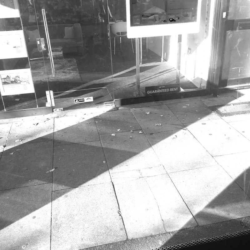
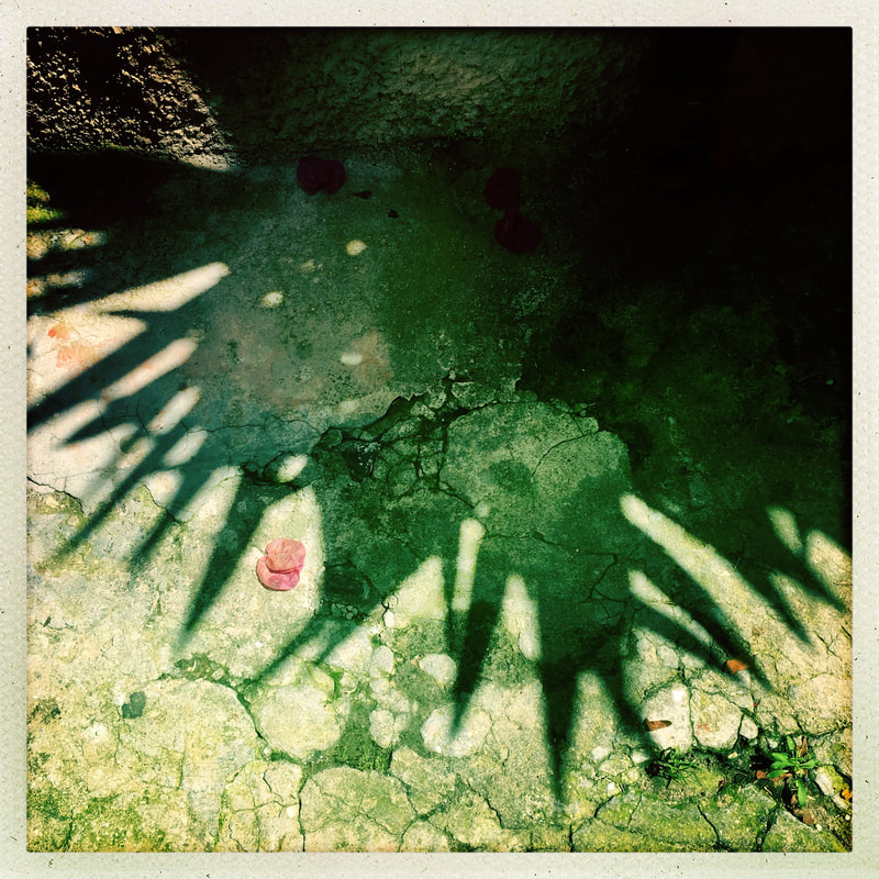
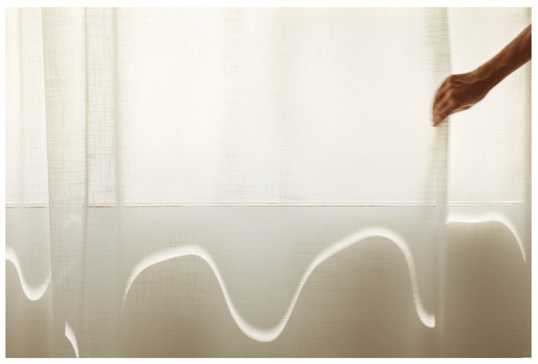
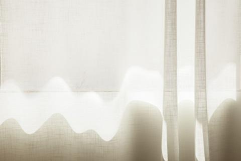
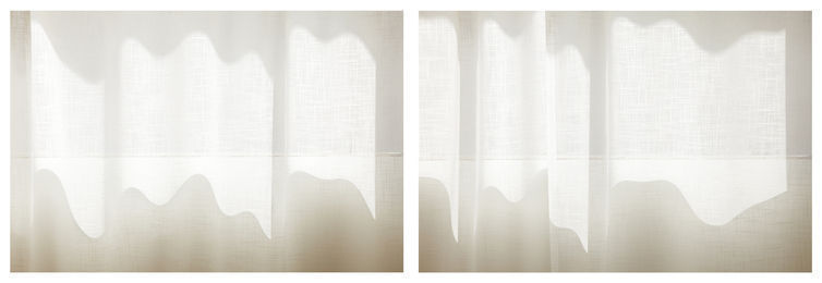
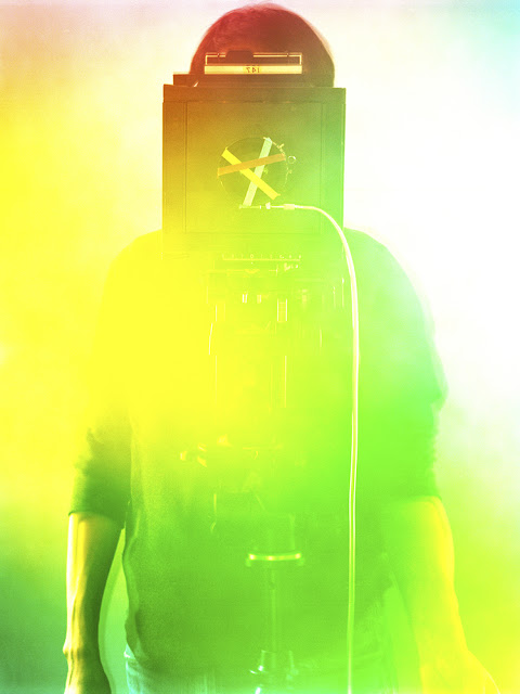
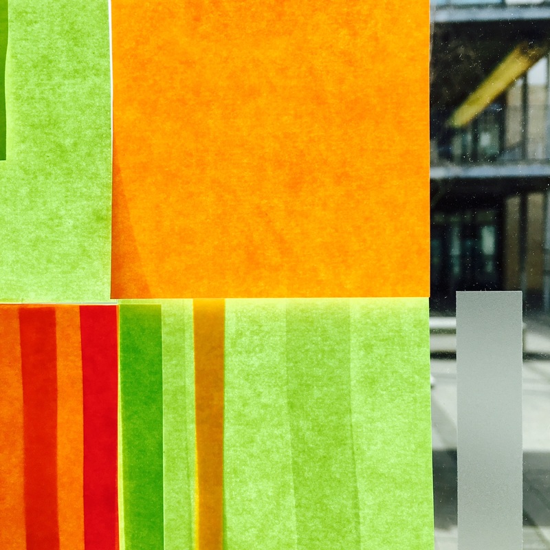
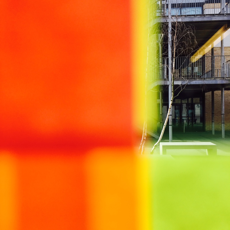
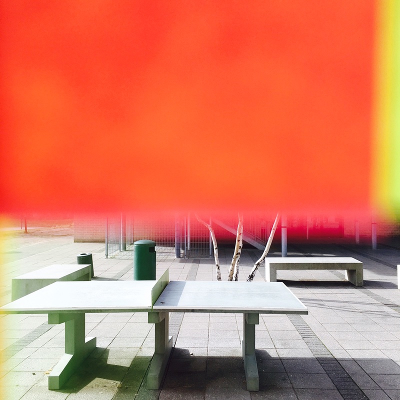
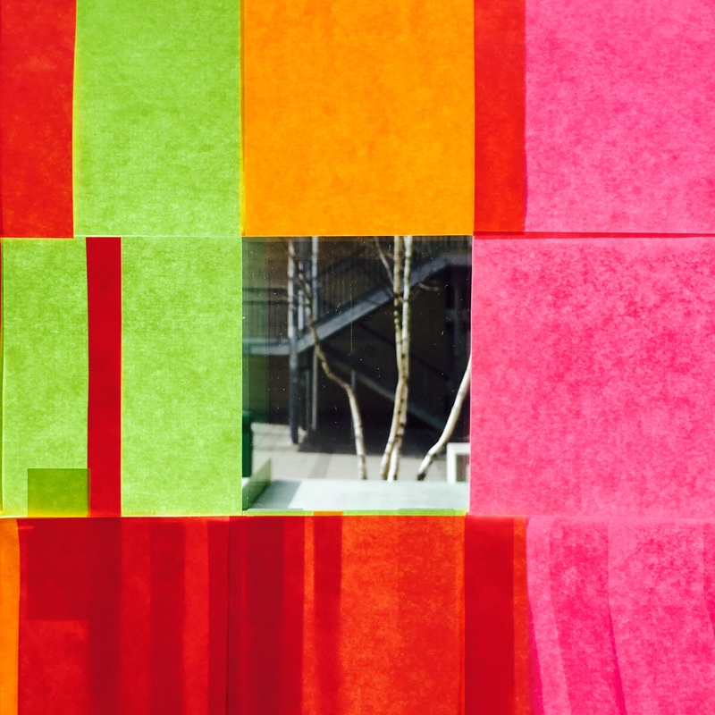
Post It Note AbstractionsThis sequence of images came from playing with a variety of Post It notes stuck to the window of my office. I was aiming to create a similar effect to that achieved by Saul Leiter in some of his photographs where the background is obscured by an out of focus object closer to the camera lens. I was also inspired by the photographs of Akihiko Miyoshi. I experimented by placing the lens of my camera (an iPhone) at various distances from the notes, almost touching on some occasions. I also overlapped the notes achieving various levels of translucency.
I edited the pictures on my phone, increasing the contrast and saturation. I then decided to create a collage of nine of the images in a grid format. Like Miyoshi's pictures, the photographs work more successfully as a series than as individual images. |
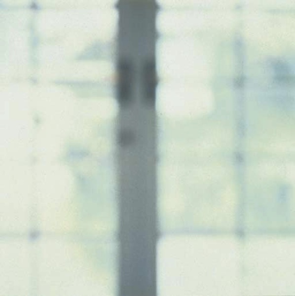
Akihiko Miyoshi - from Abstract Photographs, 2011-13
|
Akihiko Miyoshi - from Colour Fields, 2012
|


Resolving outcomes
By now you should have lots of 'abstract' photographs inspired by Saul Leiter and other photographers. The final challenge is to consider the best way of editing, selecting, arranging and displaying them as resolved outcomes.
Edit: You could experiment in iPhoto and/or Photoshop with converting colour images to black and white, altering contrast, saturation or colour balance. Remember, subtle changes can make a big difference to the effectiveness of your photographs. You may wish to layer your images, experimenting with the blending mode. However, this can look like you are trying to disguise a badly taken photograph with tricky effects. Be careful!
Select: It's OK to be really selective, working with just a few images from the many you have taken. Look for connections between images. Select the most effective images for some special treatment or display but think carefully about how they look together and how they convey your understanding of a particular subject or experience. Think about the sequence (order) of your images. Experiment with different selections and sequences before you make a final decision.
Arrange: Do your photographs need to be arranged individually or as a set? Do they need to be the same size as each other? Do they need to be mounted in any way? Perhaps 2 (diptych) or 3 (triptych) images look great together. Will you print the pictures or make them available online? Will they be static or animated? Would they make an interesting book or zine?
Display: How imaginative do you want to be with display? You may want to look at this Pinterest board for some ideas.
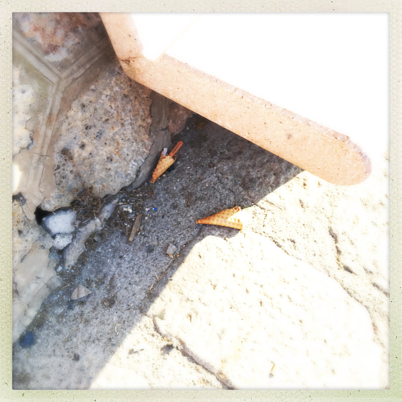
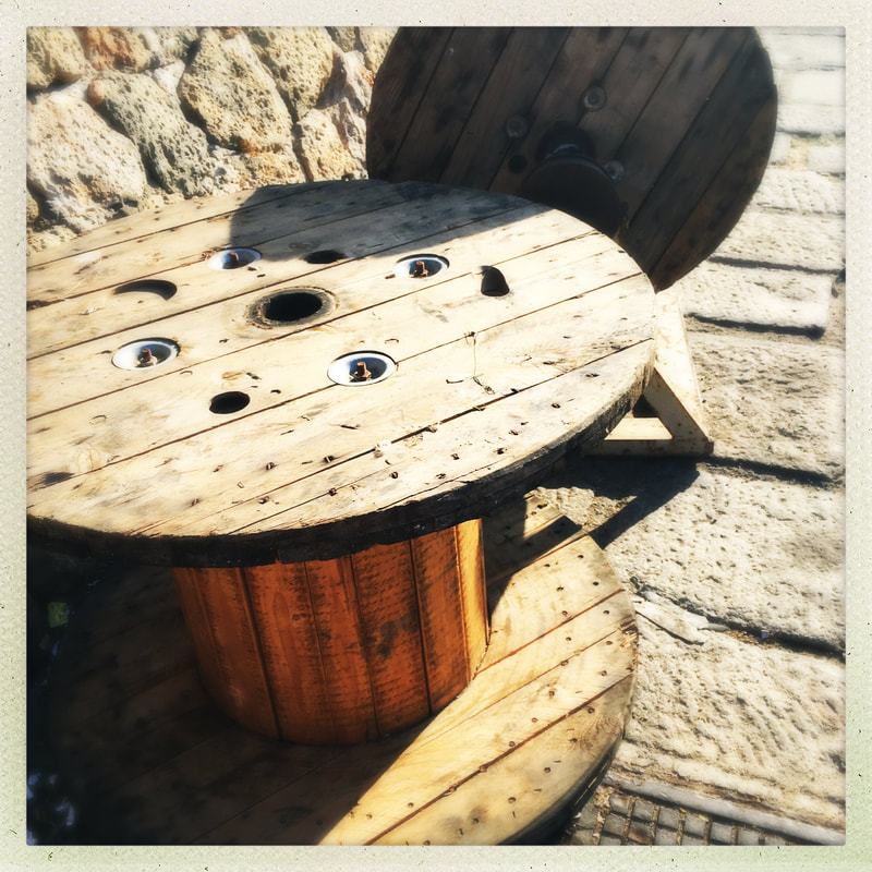
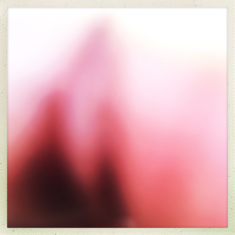
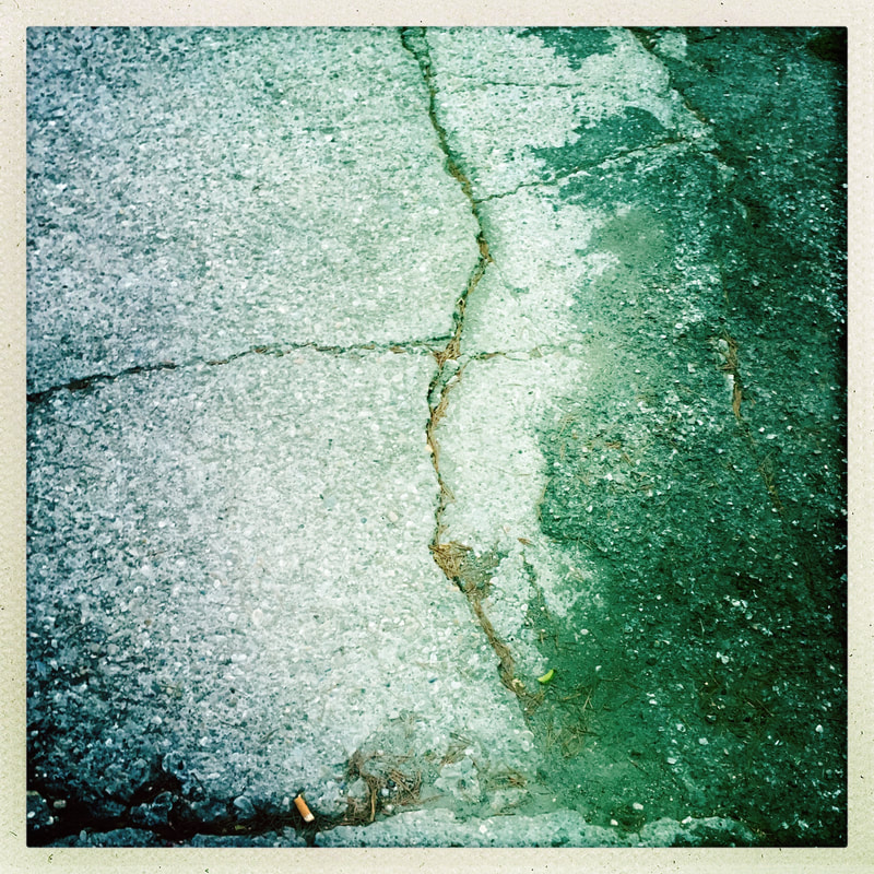
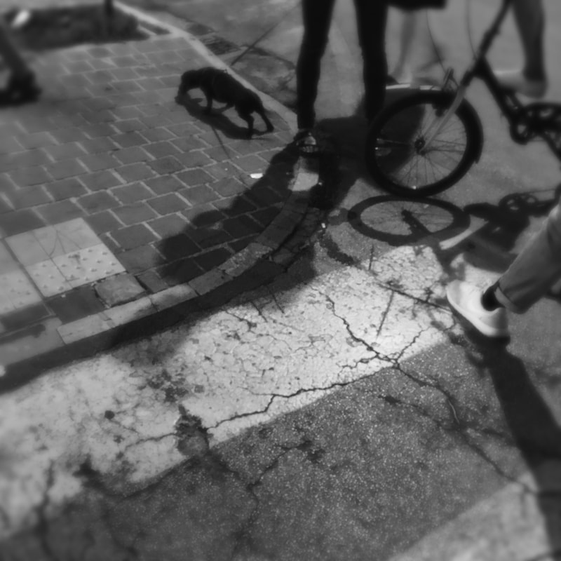
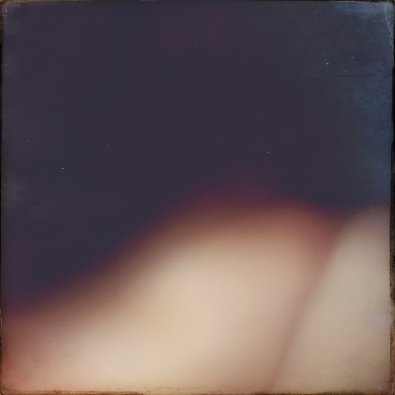
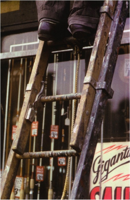
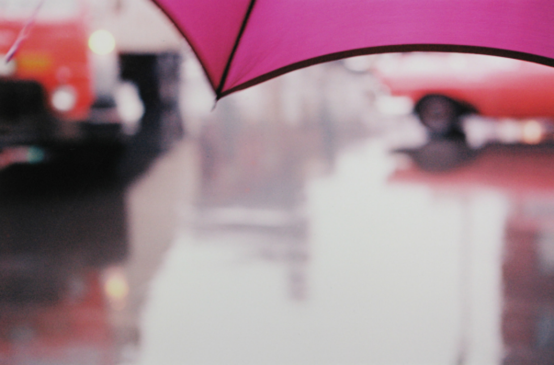
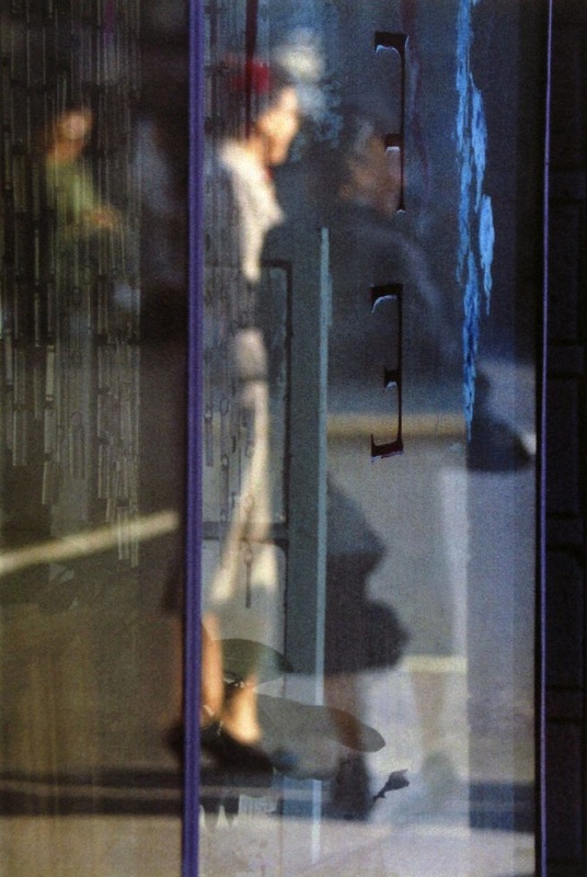
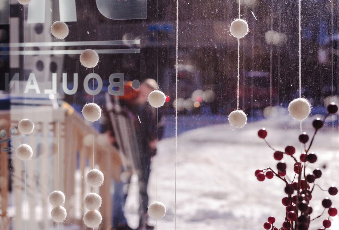
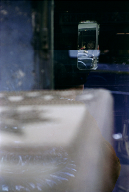
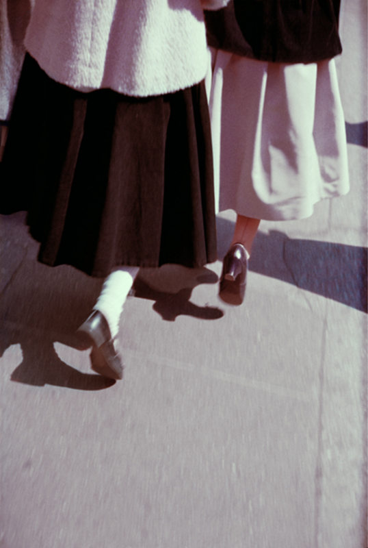
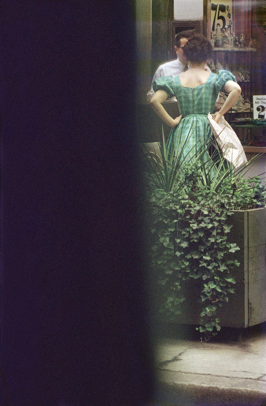
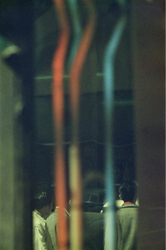
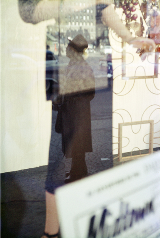
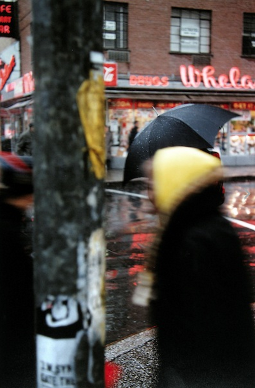
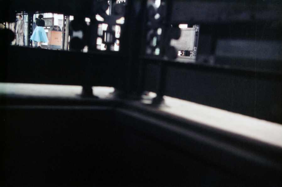
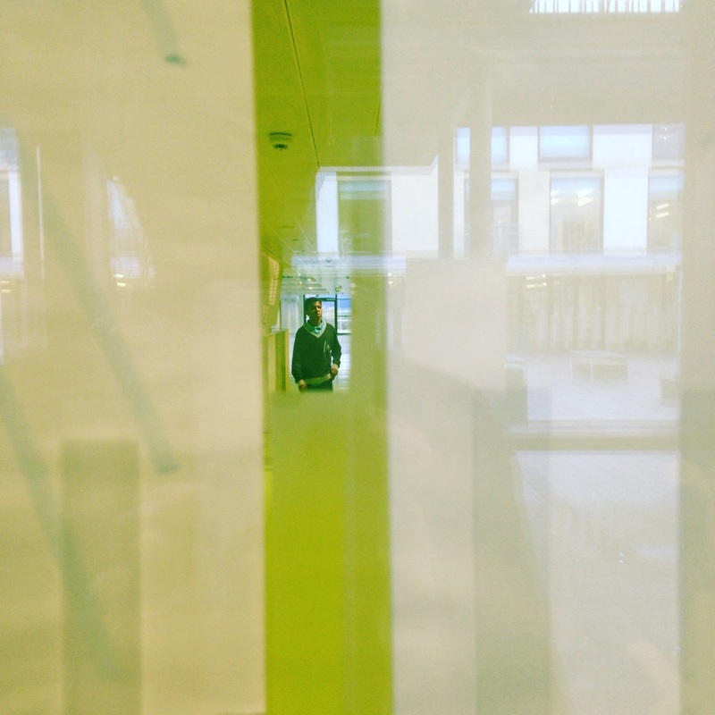
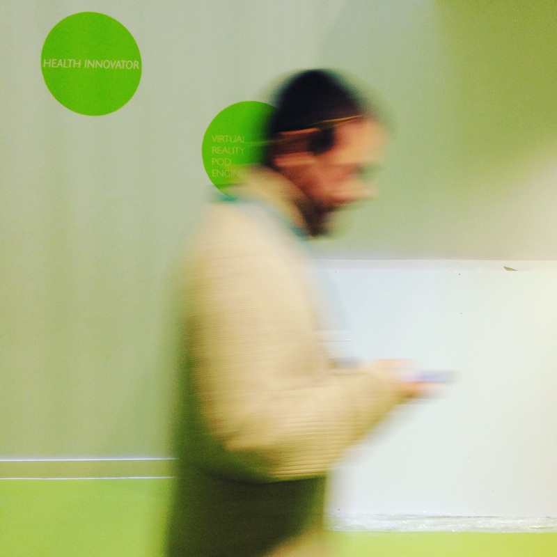
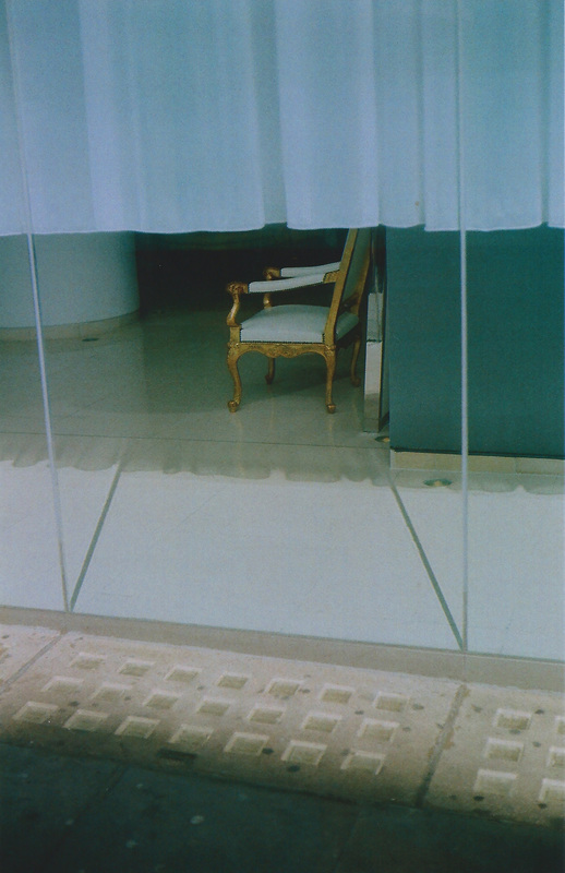
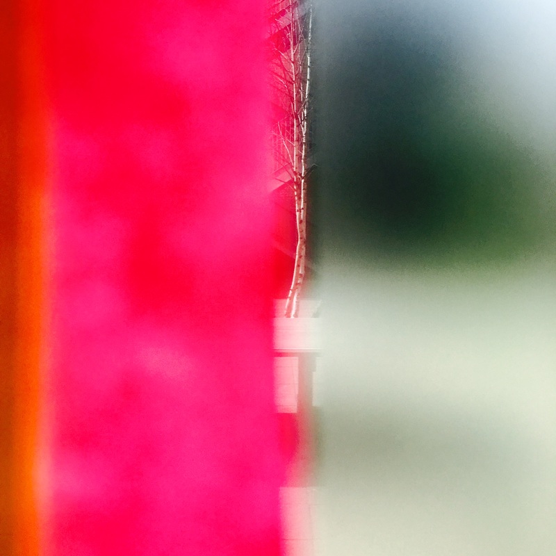
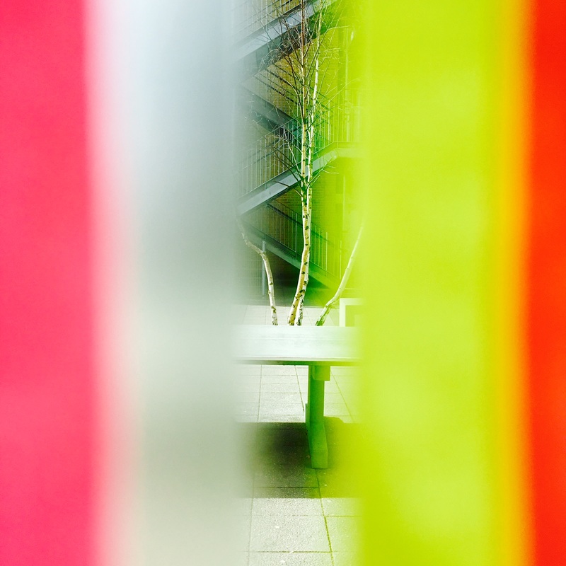
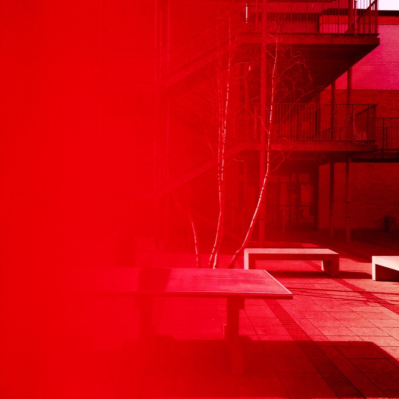
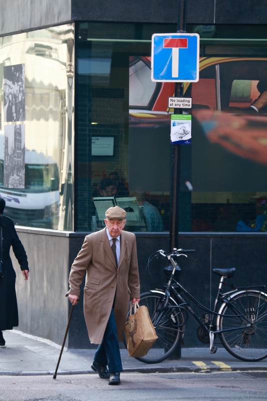
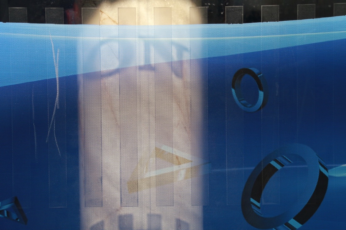
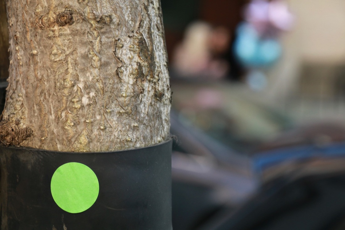
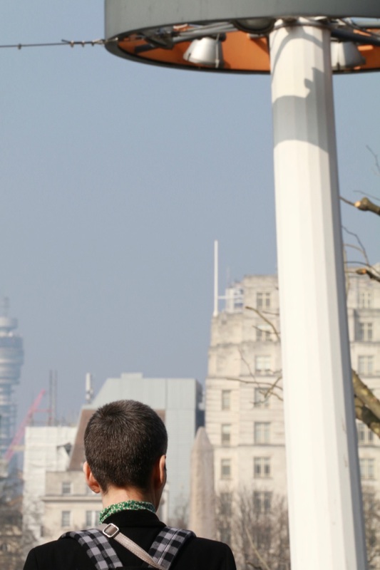
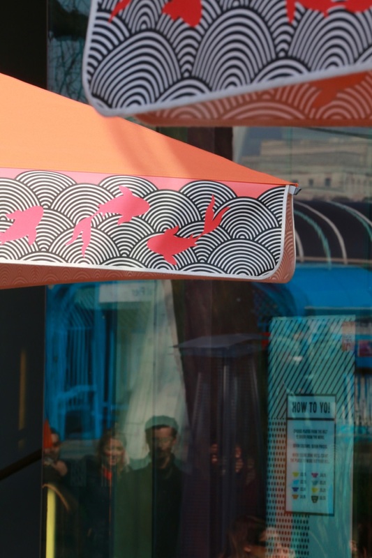
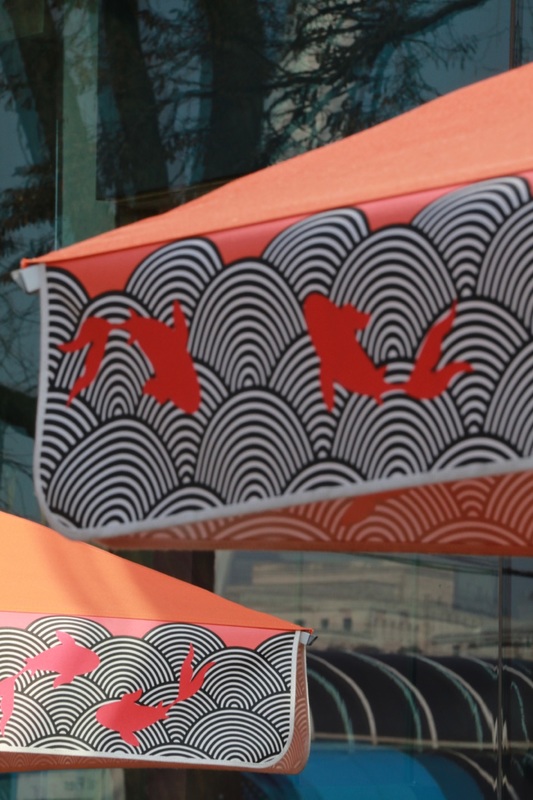
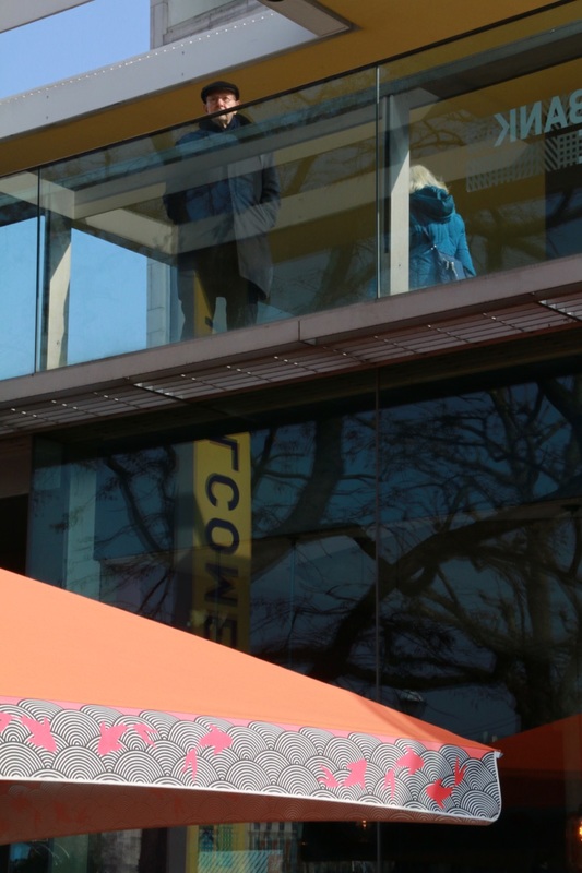
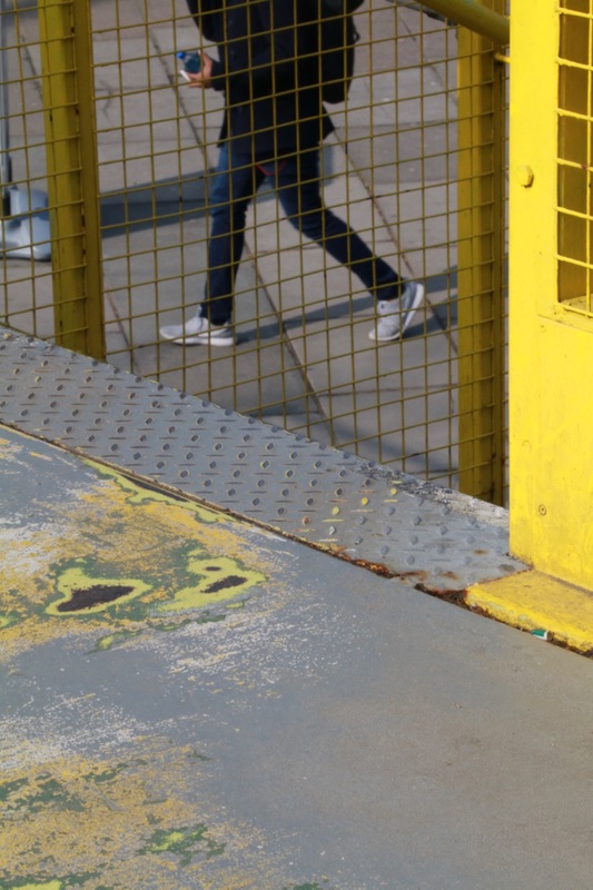
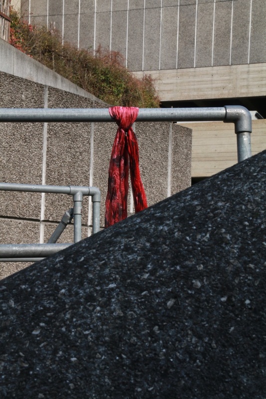
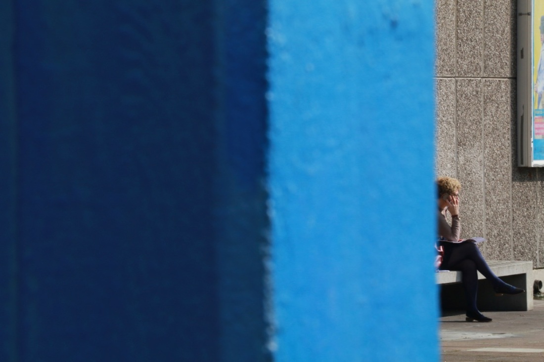
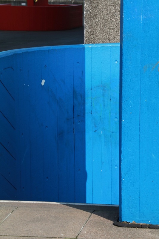
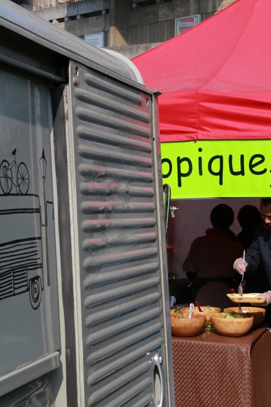
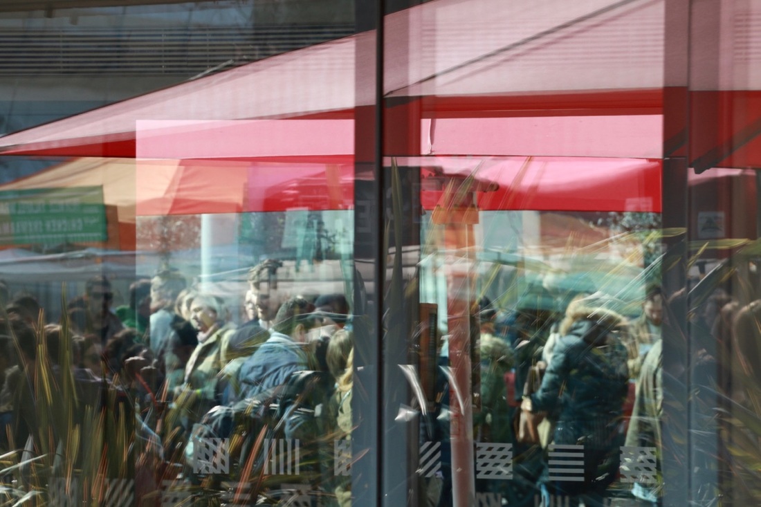
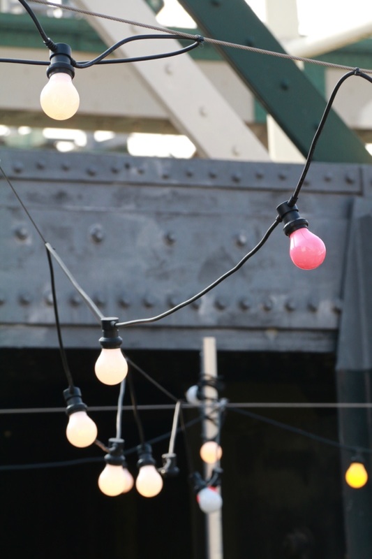
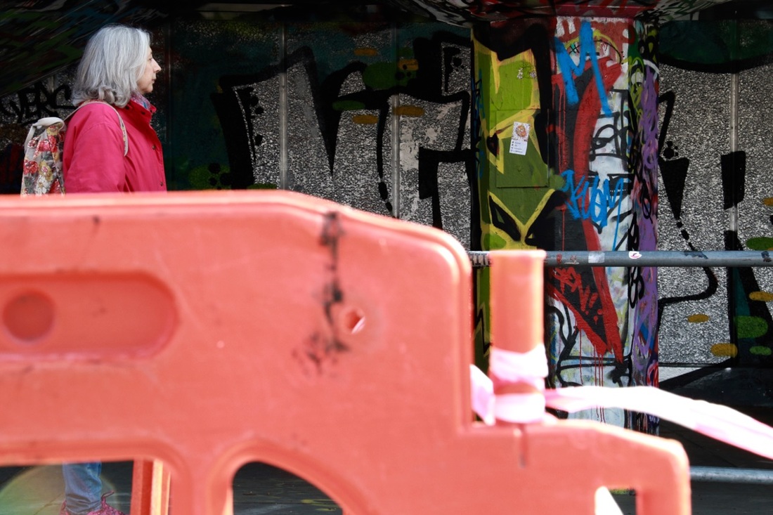
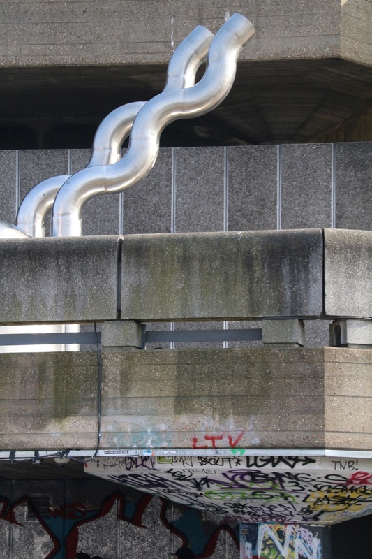
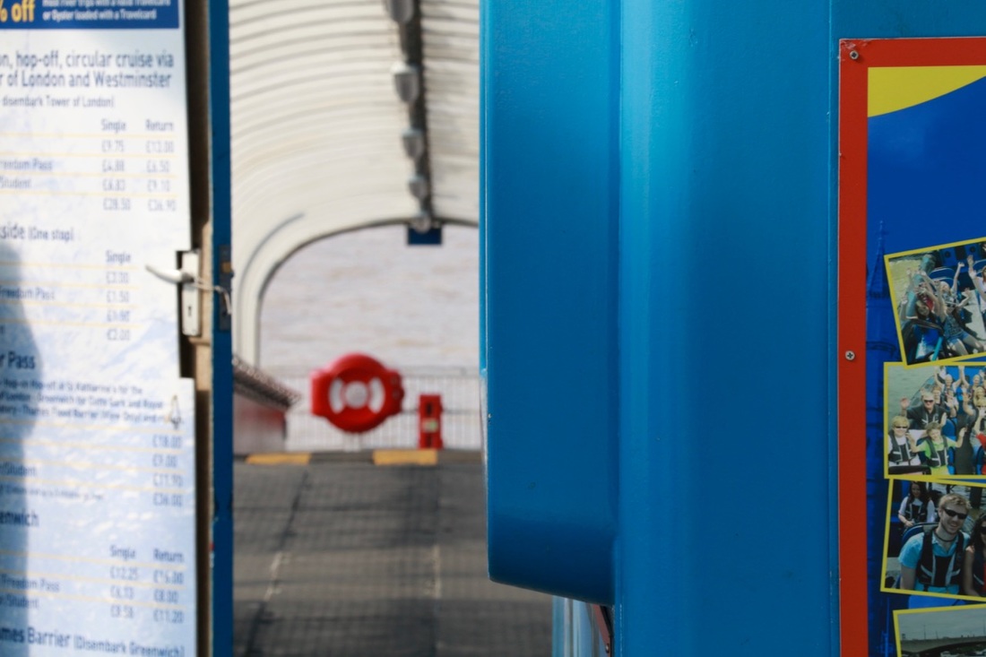
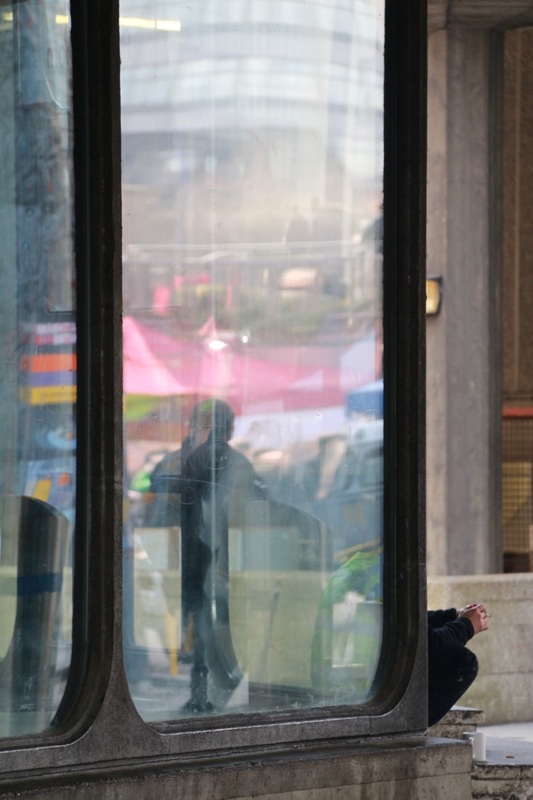
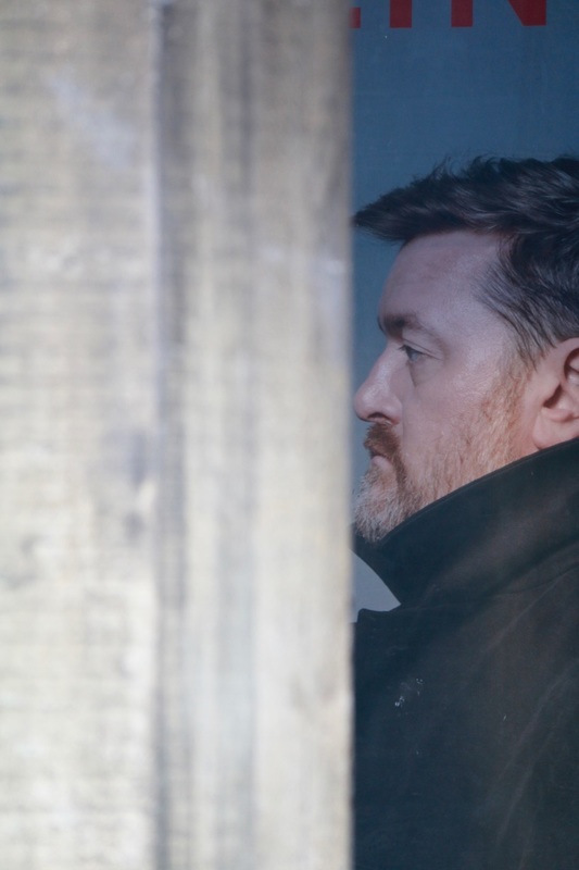
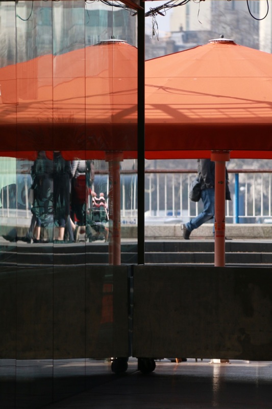
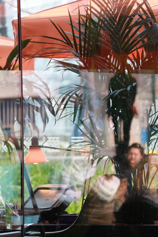
My Saul Leiter inspired photographs
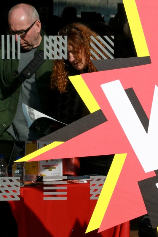
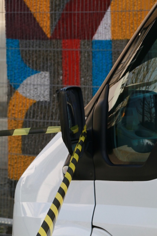
Set #1 - Soho & Southbank

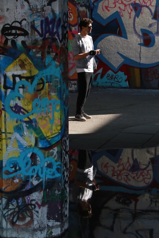


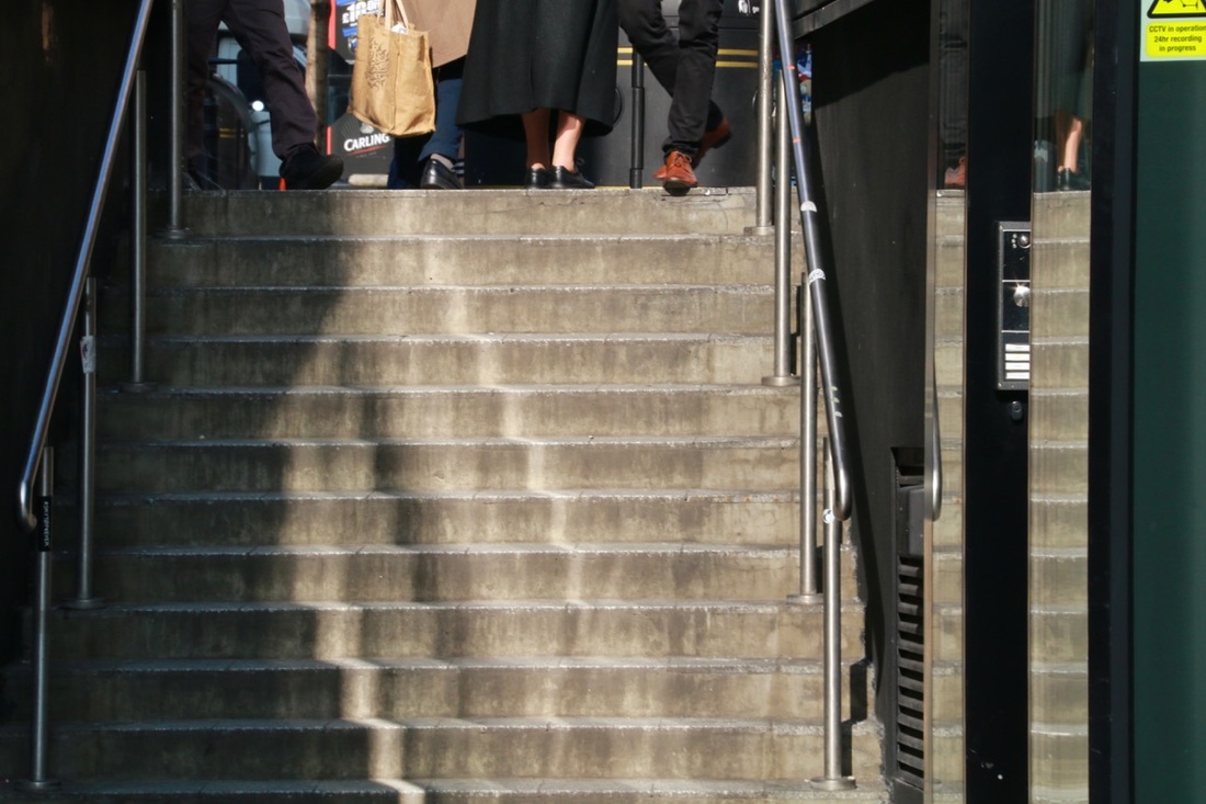
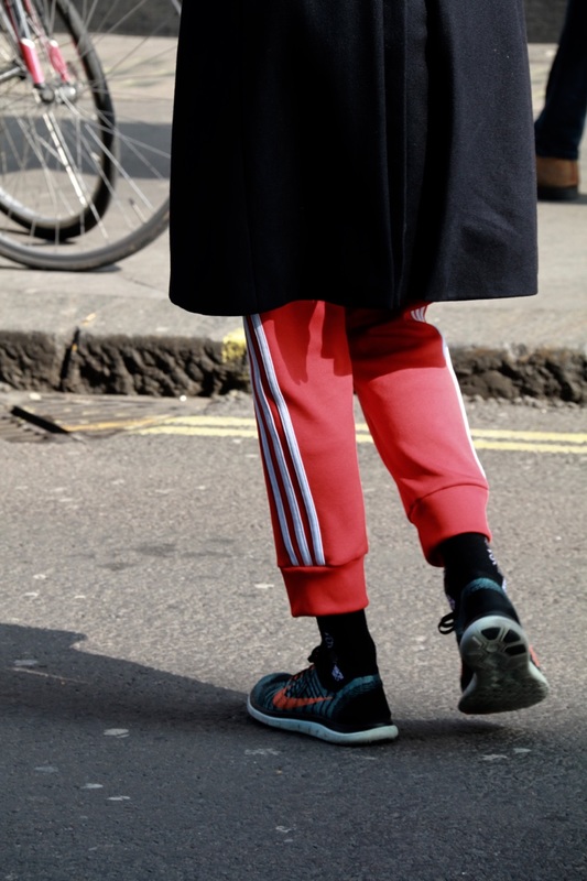
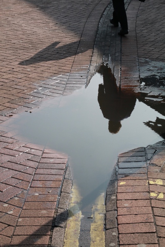

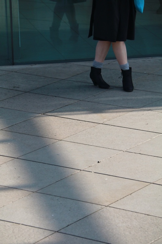

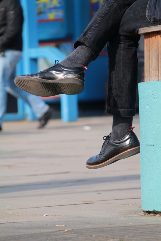
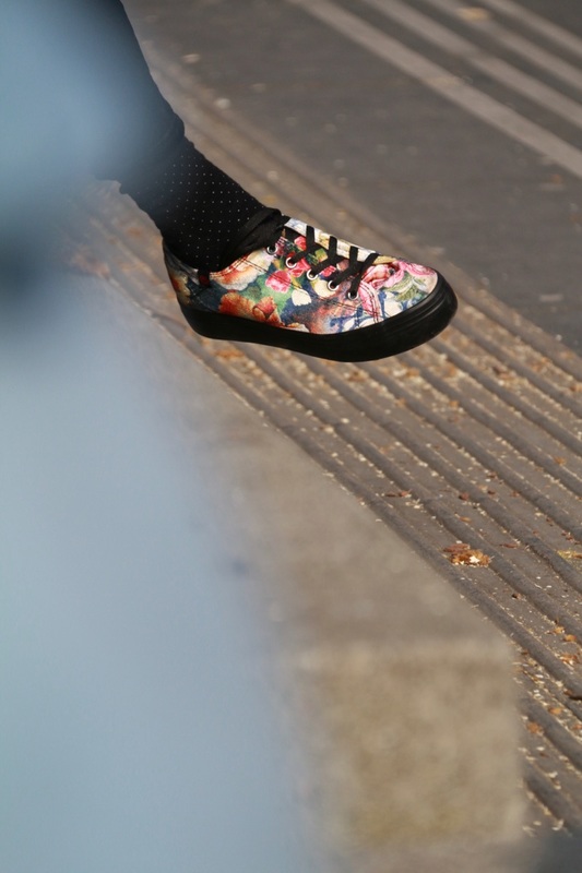
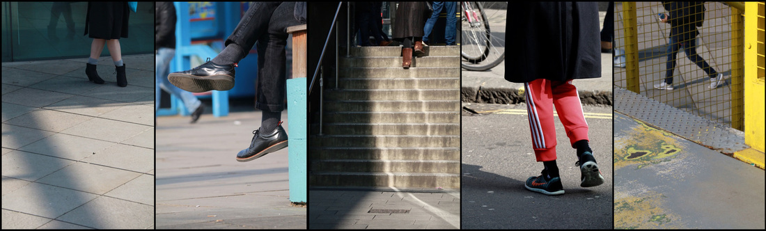
Legs sequence
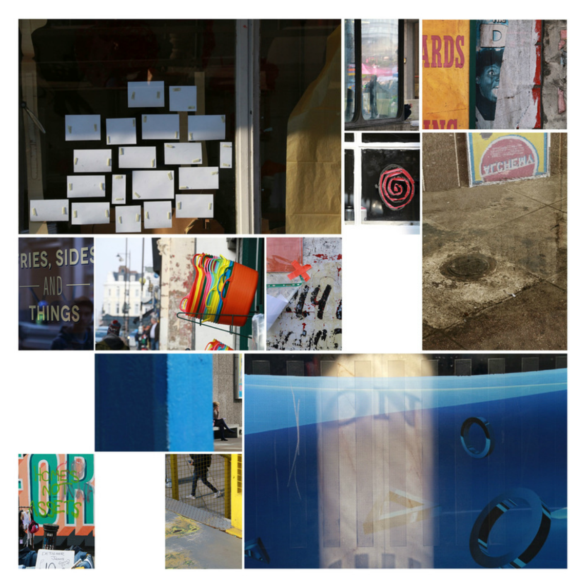
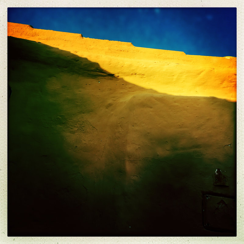
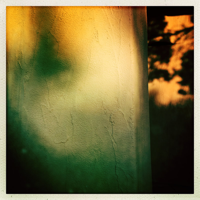
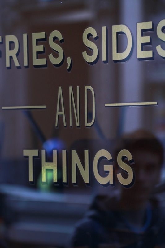
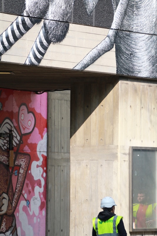
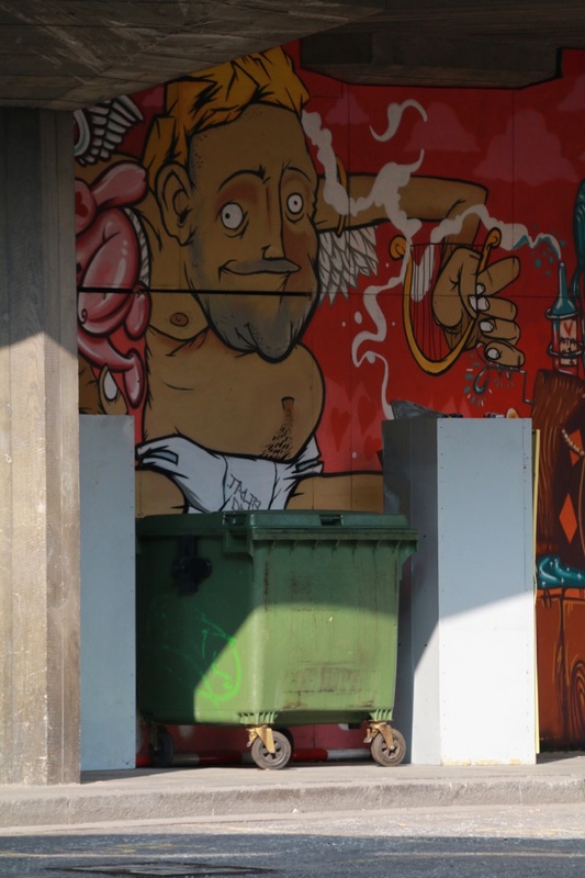
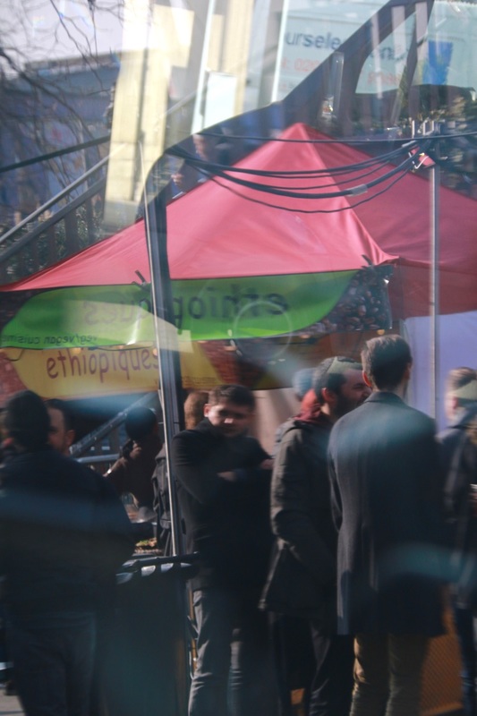
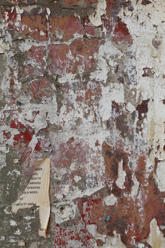
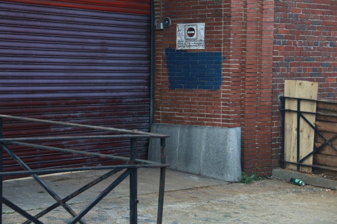
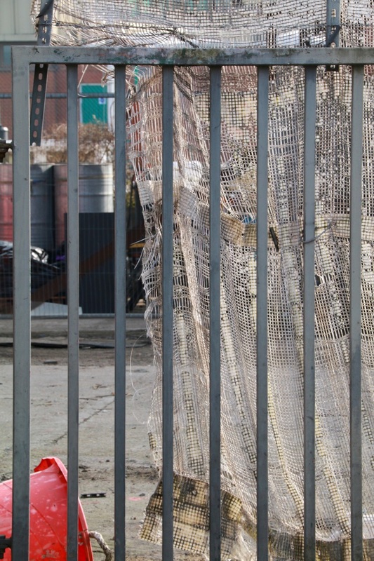
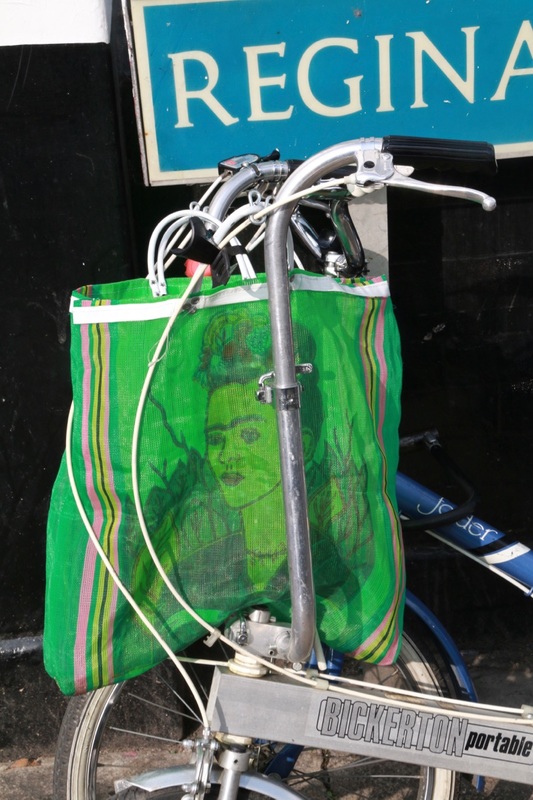
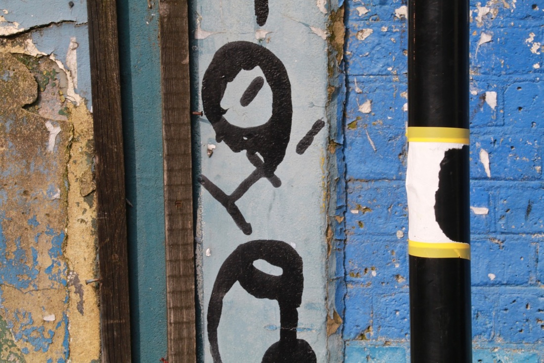
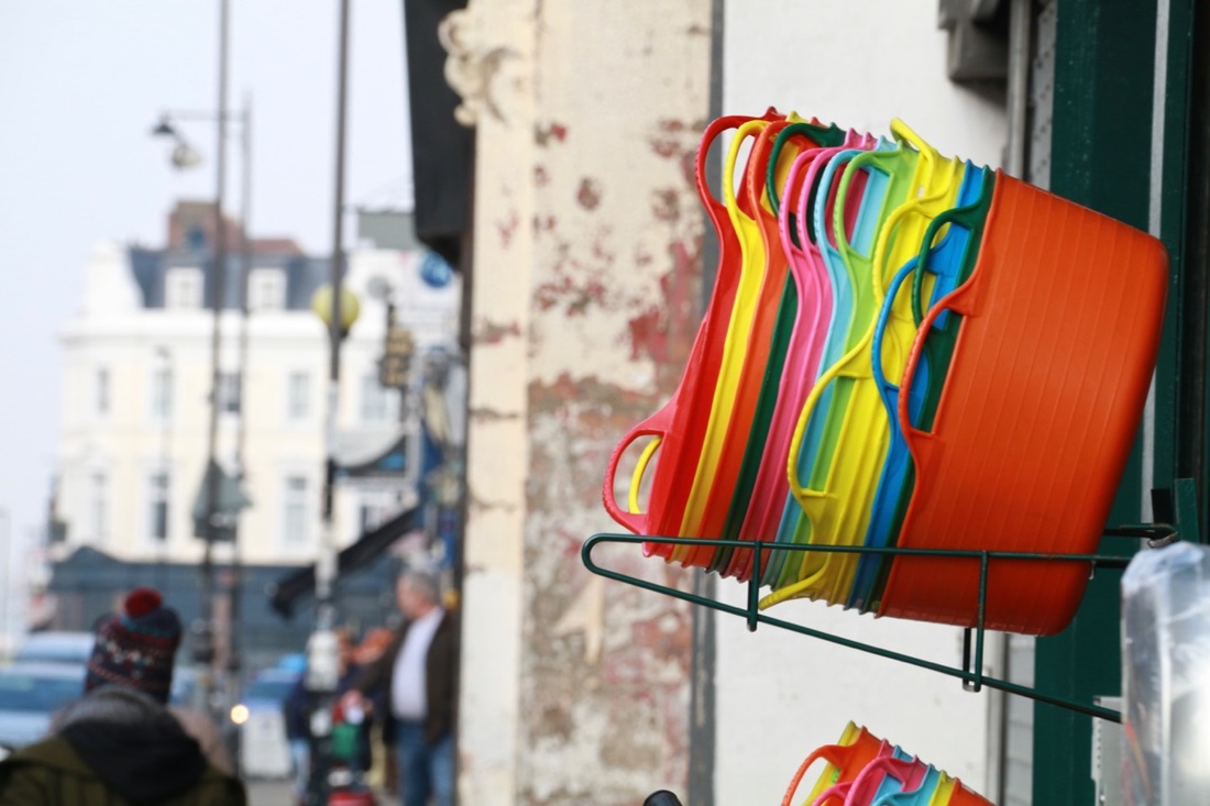
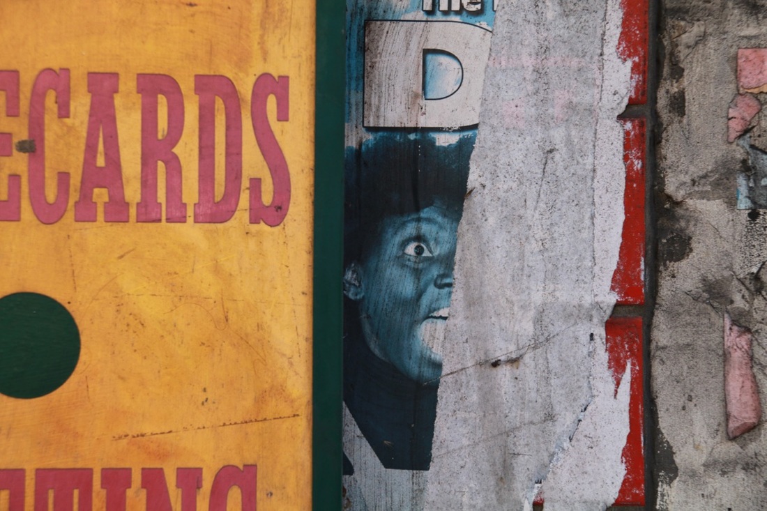
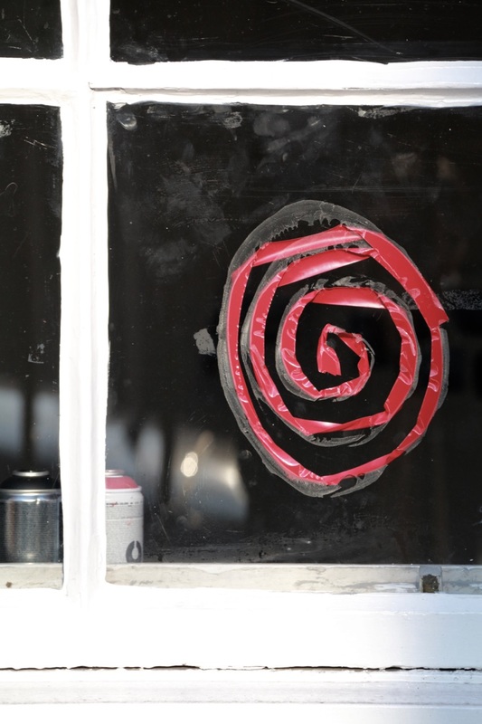
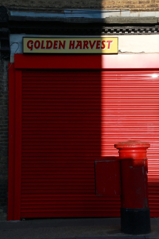
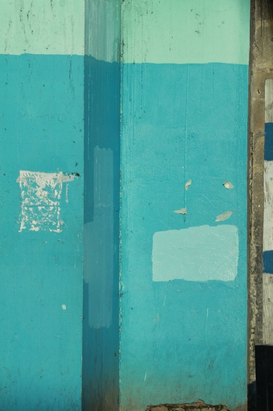
Set #2: Deptford & Camberwell
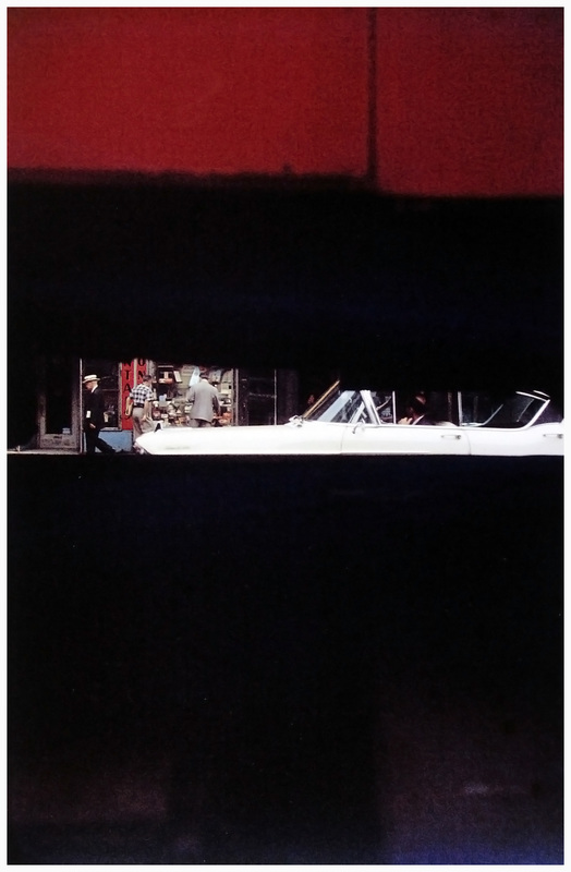
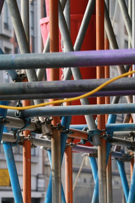
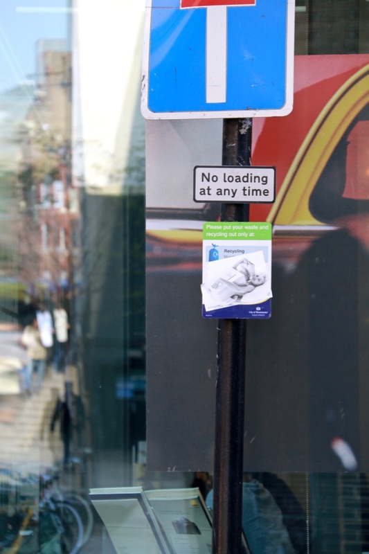
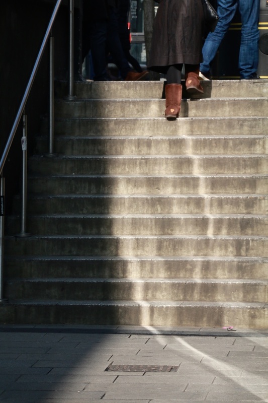
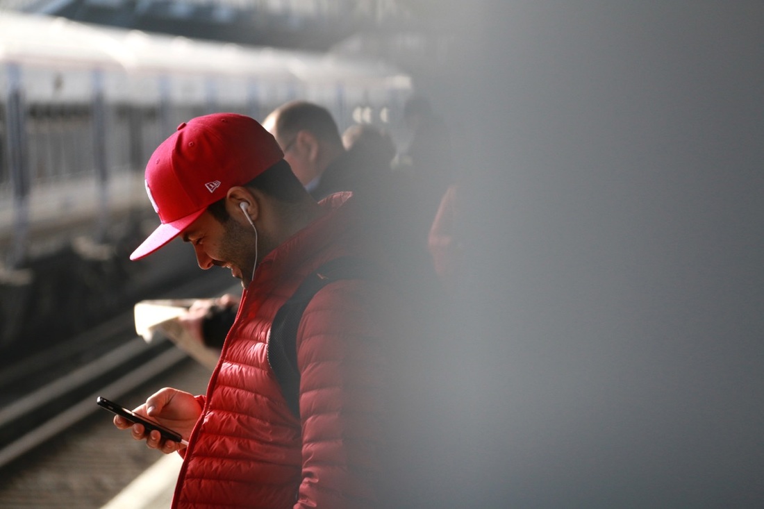
I decided to create another set of images inspired by Saul Leiter, this time closer to home in Deptford and Greenwich. I'm really pleased with the outcomes, especially the bold colour combinations and patterns. I like the sense of mystery in some of the images. This is something I noticed in Saul Leiter's photographs. Often the subject is not totally clear either because it's been framed in an unusual way or it's obscured in some way. For example, I noticed a fish in a tank in the window of a restaurant and decided to avoid showing its head, concentrating instead on the pattern of its scales and the bed of stones underneath. I've also enjoyed photographing patterns created by advertisements and other signs on walls and windows, framing them in such a way as to remove the context. In each photograph I have tried to emphasise at least one strong colour element. I think colour is an important way to communicate emotion in photographs. Despite the slightly run down urban backdrop for these photographs, I hope the strong colours communicate a sense of excitement or pleasure.


Alternative final outcome:
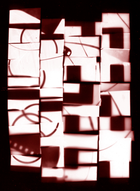
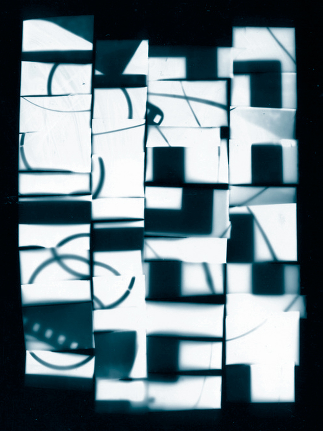
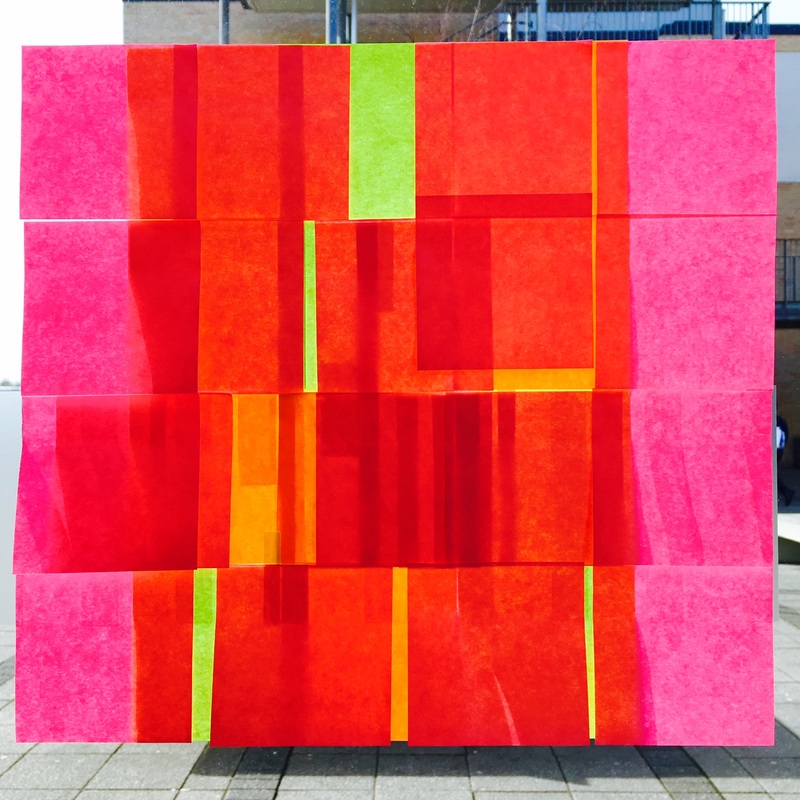
I decided to experiment with arranging a selection of images from both shoots. I used Photoshop to help me work out an arrangement that looked pleasing and emphasised the abstract elements of the photographs (see below). I really like the way they work together at different sizes in this grid-like arrangement. I intend to print the images at different sizes like this, mounting them individually on board, so that if my work is displayed on a wall it can be arranged like this.